Illustrations 。.:☆*:・'(*⌒―⌒*)))
THIS PAGE IS JUST TRIMESTER 2 (2025)
All of my illustrations shall be dated and have a little reflection on what I found to be challenging and what I found to be fun and just overall what I did just like my other pages for illustrations
for trimester 2 there is more animation projects that I did so I reccomend going there to see a lot of work :D!!
.𖥔 ݁ ˖ ✦ ‧₊˚ ⋅
⠀⠀⠀⠀⠀⠀⠀⠀⠀⠀⠀⠀⠀⠀⠀⠀⠀⠀⠀⠀⠀⠀⠀⠀⠀⠀⠀⠀⢀⡀⠀⠀ ⠀⠀⠀⠀⠀⠀⠀⠀⠀⠀⠀⠀⠀⠀⠀⠀⠀⠀⠀⠀⠀⠀⠀⠀⠀⠀⠀⠀⣠⢽⣆⠤ ⠀⠀⠀⠀⠀⠀⠀⠀⠀⠀⠀⠀⠀⠀⠀⠀⠀⠀⠀⠀⠀⠀⠀⠀⠀⠀⠀⡈⠅⣴⡿⠀ ⠀⠀⠀⠀⠀⠀⠀⠀⠀⠀⠀⠀⠀⠀⠀⠀⠀⠀⠀⠀⠀⠀⠀⠀⠀⠀⠀⠸⣿⡵⠃⠀ ⠀⠀⠀⠀⠀⠀⠀⠀⠀⠀⠀⠀⠀⠀⠀⠀⠀⠀⠀⠀⠀⠀⠀⠀⠀⠀⠀⢀⣿⡰⠒⣆ ⠀⠀⠀⠀⠀⠀⠀⠀⠀⠀⠀⠀⠀⠀⠀⠀⠀⠀⠀⠀⠀⠀⠀⠀⠀⠀⠀⠸⡄⢷⡲⠏ ⠀⠀⠀⠀⠀⠀⠀⠀⠀⠀⠀⠀⠀⠀⠀⠀⠀⠀⠀⠀⠀⠀⠀⠀⠀⠠⡄⢠⣚⣙⣿⡀ ⠀⠀⠀⠀⠀⠀⠀⠀⠀⠀⠀⠀⠀⠀⠀⠀⠀⠀⠀⠀⠀⠀⠀⠀⠀⠀⣷⡰⠛⢀⣿⡇ ⠀⠀⠀⠀⠀⠀⠀⠀⠀⠀⠀⠀⠀⠀⠀⠀⠀⠀⢤⡀⠀⠀⠀⠀⠀⢠⠿⡟⢤⣠⣿⡅ ⠀⠀⠀⠀⠀⠀⠀⠀⠀⠀⠀⠀⠀⠀⠀⠀⠀⠀⠀⢻⣦⢤⣤⡤⠔⠁⠀⠇⣠⡟⠁⡇ ⠀⠀⠀⠀⠀⠀⠀⠀⠀⠀⠀⠀⠀⠀⠀⠀⠀⠀⠀⢈⡏⢢⡀⠀⠀⠀⠀⣼⣏⡀⠀⡇ ⠀⠀⠀⠀⠀⠀⠀⠀⠀⠀⠀⠀⠀⣀⠀⠀⠀⠀⣠⠞⠀⠀⠹⣶⡤⠴⠞⠙⡇⠀⠀⡇ ⠀⠀⠀⠀⠀⠀⠀⠀⠀⠀⠀⠀⠀⠉⠛⢶⣖⡋⠁⠀⠀⠀⢠⠇⠣⡀⠀⠀⣿⣄⣀⡇ ⠀⠀⢀⣀⢠⣄⡀⢀⣀⣀⡀⣀⠤⢤⠀⠈⣧⠈⢙⣲⣶⣚⠁⠀⠀⣹⢿⡋⠙⡇⠀⡇ ⠰⣤⣏⣠⡶⣻⠟⡛⠲⢤⣬⣅⣏⠉⣀⣀⣾⡶⠋⠁⢹⠈⠙⢶⣶⡋⠀⣹⣴⢻⢚⡇ ⠀⠀⠋⠀⠀⠀⠀⠡⠤⠼⠛⠉⠛⠻⠻⠿⠥⠤⠤⠤⠯⠤⠤⠤⠧⠤⠽⠷⠬⠿⠿⠇
THURSDAY LESSON (the projects I did this trimester are bellow!!!)
⊹₊˚‧︵‿₊୨ᰔ୧₊‿︵‧˚₊⊹
CAMBRIDGE FOLK FESTIVAL - > live project ≽(◉˕ ◉ ≼マ
3 week project - week 4-6 (started after experimental animations for the moduel sequential project) ⋆。𖦹°⭒˚。⋆
Being given the guidelines of the brief (week 4) (˵ ¬ᴗ¬˵)
────── ㅤ♡ྀི ₊
ꪆৎ
・・・・・


The brief is actually quite awesome, of course there is restrictions that working around will be difficult like strict rules on colour and a design choice of not going for the traditional view of 'folk' as a concept to try and reach out to other possible enjoyers and not just loyal old people who have enjoyed this festival for the many years it has been running.
The brief also has some requirements that you don't have to use. It's just what the client and the team that are setting up the festival have already been using which is stars clouds and herons. I am not sure if I want to use them. I am not entirely sure how to merge them all together or even use one of them due to the briefs restrictions.
After thinking about the brief, I was sort of panicking. If i can’t do traditional folk then what do i do?. It's not like I know a lot about folk and my knowledge is of the media's mass view on bare foot people dancing in the mud and having fun. It caused me to get super duper stressed and just the more I looked into the past of the festival and the brief and what folk was I came up more stumped and stuck. We as a class also had the original people who made the old posters of the festival that it was and with these old people who wanted it to stay the same then a new leader wanting it to be different there were a lot of conflicting ideas flowing around my head, and none of them felt very poster-like.
I have never really designed a poster before, I mean I have in college for fun but not for an actual project and suddenlyI felt lost. I love creating ideas but for this because I was so lost in the brief I just felt blank and empty and all out of ideas which was super unnerving because my favourite thing is well developing an idea. Though as the same time I am glad its making me feel this panicked because it means I am being completely pushed out of my comfort zone and I want that to happen, I want to explore more and if I want to be an illustrator when I get older and leave uni working for briefs and clients will be sort of my whole shtick.
⋆⭒˚.⋆
──── ୨୧ ────
Planning before research... ( ;´ - `;) (week 4)
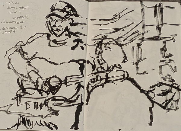


As I mentioned above we had the original makers of the festival posters from the 1980's. Something that did happen was one of the people talking to us about poster design and how to get ideas on a folk festival by doing observational drawings. This guy called John Holden did a little show in class where we got to do life drawing of him. He only did three short songs.
I mean he is an old man and performing is trying. But doing this was super fun, I liked that I was getting a free show and two drawings. It was just super fun. I enjoyed making the art. The only thing that wasn't very fun was the noise. I have autism and ADHD and lots of noise sort of makes me loose my marbles and this task proved to not be as fun as I thought it was gonna be, I thought I would be fine because it was just me and my class and like 3 speaks and a a lecturer but it was just too much so I only managed to get done 3 drawings which annoyed me and I then realized that I would have to do observational research again in real life for this project and instead od what the speaks told everyone to do which was go to live music nights at pubs. That thought of doing that made me panic so bad, I hate pubs they are my least favourite environment it's just all too much, so instead of asking for a solution I thought the easiest way would be to try and develop ideas with out doing any research (not really sure why I thought this was a good idea at ALL considering. I need the research for marks and grades but hey I made mistake it isn't the first and wont be the last)
.𖥔 ݁ ˖𓂃.☘︎ ݁˖
୭˚. ᵎᵎ
༝༚༝༚
⋅˚₊‧ ଳ ‧₊˚ ⋅
╰┈➤


──────
⋆˚𝜗𝜚˚⋆
──────
⋆˚✿˖°
As I mentioned this is all work done without any thought behind it, I knew that the project had to do with Cambridge and the client wanted to go far from the traditional folk ideation, as well as be able to showcase that it is in Cambridge through a simple and minimal way. But at this point in the day of doing work in class. I was completely overstimulated and sort of losing it. None of these ideas are necessarily bad nor good, they are mediocre and don't really meet the brief well enough nor are clear they are all too metaphorical and have too look deep into the art.
As well as there was a requirement for the class that this is that it has got to be simple shapes and things like that because we will be using printmaking techniques as well as it needs to be changed from a landscape poster to a square to go on the clients social media and these drawings are just too complete, the ideas are too much and more like scenes from something, doesn't feel really like a poster.
This was all causing me great trouble. I had to talk to my lecturer and express my discomfort, especially with the observational task and research as it was causing me so much stress. I was just being stupid and missing out on important steps needed to get me marks. WE came to an impasse and found a solution because i struggle awfully with a lot of noise and live music, I can use videos online of live music because then I can be at my house or if needed in uni without being in an area that really does case me the most amount of stress and uncomfortable experiences.
/•᷅•᷄\੭
ᶻ 𝗓 𐰁 .ᐟ
Research and planning after finding a solution(´∇`'') (week 4)


꒰ྀི১ ໒꒱ིྀ
⫘⫘⫘⫘⫘⫘
☾𖤓
As we found a solution to me doing observational drawings I felt more comfortable doing work and I thought I should start with the observational drawings first because if I don't then I wont have any reference to go off from to develop things like modboards and mindmaps.
Even though the drawings I did in class overwhelmed me they did give me an idea on the kind of feeling you get from folk music and I suppose what a festival I like (I haven't ever been to a folk festival), it is a sort of non-conformative, romanticised, flowy, loud but also calm at the same time. So when I was doing these drawings (which all I did was watch insanely long 3 hour videos of people playing folk music in bars and pubs I wanted to try and encapsulate the beauty that is folk culture and the way the music feels to me. I think the best versions that worked to show that feeling were the pencil sketches and the crayon coloured ones I tried doing. Some of the ones are okay but. I felt that the dark thick lines for the type of music I was listening to in the videos as well as the type of feeling I got from folkmusic just didn't fit what I was trying to convey. It felt too harsh and more like it belongs with emo and rock music.
The crayon and pencil versions came with having to do it quickly but I could think about what I needed to do because I had the option to either go over it with a different colour or use a rubber. I had to work quickly to catch the pose I wanted but I could also add cool things like maybe shading and colouring with the ink and pens I used I just found it difficult to do that as it just didn't feel like the right medium but I wanted to try out as much mediums and techniques as I could because it just helped me think of ways to tackle the planning for this project


After I had done the drawings instead of panicking and freaking about not having any ideas, I actually had ideas and I thought the best thing to do was make a mindmap I could refer to once I started the concept, but the new concept with an actual plan now. I needed to choose a target audience that the client gave us and. I ended up on 2 choices: Cultural explorer or Heritage loyalist (which means people who are looking for arts or others that find the folk festival more of a part of their life and have been doing it for years). The reason I wanted to try out those groups of people for my poster design was because I usually always end up doing the family friendly child version because everything I draw is just very child-like and child friendly but I really want to push myself. I know in theory panicking about this project over and over again I should have already realised maybe I have already pushed myself to the limit of my comfort zone but I don't think so. If I want to get better at working in a professional world I need to expand my skill set and things that I can do as well as ways to do my work and produce ideas.
All of these ideas I tried to stay away from traditional folklore, and I wanted it to be sort of abstract or sort of a metaphor for the way that the folk festival makes people feel. Also hopefully from my mindmaps you can tell that I have lent more into the heron and the stars/clouds I can use, even though I said I didn't think I was going to use them. The research and the midmaps I have done I just thought of lots of ideas linked exactly to the brief and how to make it feel like Cambridge. Something that I did find was a flower called the Cambridge Scarlet and its native to Cambridge. I thought if I want to show the folk festival is in Cambridge and not directly find something that links ot folk... so nature and find something that would be recognizable :D
I also created a pinterest board of the type of ideas I was thinking for my poster design as well as references to the kind of style I want hinging my print that ri make will look like as U need to figure that out quickly considering I am starting the print workshop next week and I need to have final concept to show to the client next week.


Pinterest board (called Trimester 2 - folklore festival project)
૮꒰ྀི∩´ ᵕ `∩꒱ྀིა --->
˗ˏˋ ꒰ ✉︎ ꒱ ˎˊ˗
⫘⫘⫘⫘⫘⫘
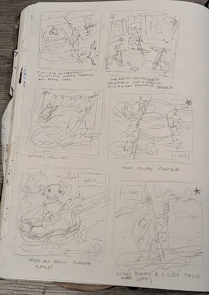

Making the concepts all started in the same way the old concepts started off more like full scenes but I asked my friends on how to improve them and they told me that I should try and simplify things. Now simplification is something I am SO BAD at all of my projects so far I have been told to simplify them because they are just too much. But I want to make sure that my poster can be accessible to all and I am thinking fully about the target audience "Cultural Explorer" and making it eye catching to them, is a challenge because I need to show of culture and art but not go too far with the illustration on the front otherwise the text like the logo when put over it will be difficult to read as well as set lists and information about the poster won't be able to well be read and understood. I am trying to take on all the feedback I keep getting and this time I will try my hardest to make something simple but something that I also like and is something I am proud of. Most of the concepts I drew were just me mainly removing ideas from my head until I found an idea that I felt was a combination of all of the ideas from each page.
The concepts that I lied in added a star next too and I think I did enough concepts to sit with them and really think about the kind of vibe I want to add to my poster. I went back to my pinterest board when making these concepts to make sure that when I do turn it into print whatever design I choose has very shapey like objects and things that I can make silhouettes out of as well as draw over the white ink and pen to make the designs detailed but also simple so I can add my own creative flair on things.
Each concept I wrote what they were to remind me and give context to what i was drawing.
Horray concepts (,,>ヮ<,,) (week 4)

˚.🦴 ᵎᵎ

(˶>⩊<˶)
༘˚⋆𐙚。⋆𖦹.✧˚
═══════
✎ᝰ.
・・・・・
' Final concept' (╭ರ_•́) (week 4)

The final concept sketch I decided to go with was a heron sketch that I did (original; sketch below). I like it because I feel like it still encapsules my own art style of adding as much as. I want it to appeal to me, but at the same time I feel like the shapes are so different and layering them on top of each other will make sure they stand out and be interesting to my target audience.
I also added the Cambridge scarlets because well they are literally called Cmabridge scarlets and it implies it's in Cambridge and it too with Cambridge. I like that I made the heron eat from the banjo I have drawn because I added music notes within it to show that even though it's a festival the music of folk is a very big part of it. I also added a star a cloud bored and I just think it makes everything look really cool. I am excited to experiment with colour next week as I have a strict colour palette I need to stick to and I think it will be interesting to explore the colours and use them for something like this.
I am trying to make something very graphic without losing my own creative voice. It's hard but also super enjoyable to be able to create something that I am proud of and feel good with. Of course next week when the client sees it they will give me ways to improve it and change it too how they want it but I think as I like this design so much fi. I have to alter it a little or change parts of it I wouldn't. mind, because i have proved to myself that I can do poster/graphic designs that are simple (of course. wouldn't claim this is the best poster nor graphic ever made, but it's my first try at something like this and I really like what i have ben able to come up with)

⫘⫘⫘⫘⫘⫘
🎧ྀི
*ੈ✩‧₊˚
・・・・・
Fixing mistakes I made/finding more final designs (。ᵕ ◞ _◟) (week 4 - pretty much week 5)
₍^. ̫.^₎
Now from the title you can already tell that there is gonna be more work.. before the hand in an email was sent out about the brief and I had just missed parts to do so. have done the last minute to be able to send off a document with everything in. I am kind of annoyed that the mail was sent out so late because I was feeling quite confident though I am happy that I have done this extra work. I also went into uni to scan literally everything I have done so then the document I upload to the client so she can see the ideas I have planned are clearly scanned and pictured. I feel like I should do that more often but I always forget. The main reason why I did a scanned image was because I tried out using the colour schemes for three of the chosen concepts that I made and the best way to do that is digitally so I can use the exact colours that have to be used.
For the extra work that I added , I added a. a few more thumbnail sketches as I needed to make 6-8 of the thumbnails bigger and then choose from those ones and work out different compositions or designs/ colours.
Even though the entire time I was struggling and this project has been so stressful so far I am glad I did the colour planning. To be honest I think without it next week learning how to use the printmaking machine would be difficult. The colouring that I tried out I did try multiple versions of things until I thought it looked good and I suppose doing the extra concepts were super helpful because 2 out of the 3 designs I developed with basic colour was a part of the new stuff that I drew compared to what I did only a few days ago.
Using the strict colour palette proved to be a challenge because I have to think about things. The only thing that I knew I didn't want to change at all because I picked the designs for a reason where the cambridge scarlets, they ae literally bright red and one of the mandatory colours is vermillion red and I want them to be the same throughout all of the colour schemes I try otherwise the hint that it is Cambridge is unclear because then the flower will look like a totally different flower if I don't use red.
the extra designs that I made were super helpful and I think just making 7 of the images bug really helped because I was sort of freaking out on layouts a few days ago when doing all of it but, even though having to produce more work in a day before the hand in is stressful it did help and I believe helped me create more imaginative and cool ideas for a poster. Adding the colour really did help me envision the poster easier and they are still all sketches and plans so the colouring is great especially in the final one with the dress because I didn't want to spend too long making it look finalized in case the client wants me to alter it.


Here are the extra thumbnails I did and the bigger versions of the drawings are all of the drawings that I put a black star next to. The first on ext too this text are the star people reading instruments I liked it but I felt like it was just not that great, I mean doing the bigger version really did help because it helped me understand how much of the instrument I would of been able to get in if I wanted to do a close up and that's why to me it just wasn't that good because I felt like if I made the instruments further away it would be difficult to understand what the little characters where but too close like it is in this drawing the instruments are difficult to understand.
ᰔ
⋆。𖦹 °.🐚⋆❀˖°🫧
These bigger thumbnails are from the new thumbnails I drew, I did some research into what food is quite popular in cambridge and it turned out to be chelsea buns and so I decided to draw some heavens dancing all merrily on a chelsea bun surrounded but cambridge scarlets, I really want cambridge scarlets to be apart of the final poster design not only because they are called cambridge but because I just think it also show folk in a non traditional way, the other drawing is a silhouette of someone with a huge dress doing a pose slightly nailed to different types of traditional dancing by lit up her skirt and underneath the skirt is mounting on the underside and on top is meant to be depictions of what happens a folk festival with people playing instruments and building a that are important like cherry hinton hall, I know the sketch is suepr bad and this is the one that i mentioned the colour is also quite simple and quick because I don;t know exactly what kind of building too add to the dress and I was think I oul ask the client if there is anything very specific they would like to showcase on the dress if they like this design.
ᰔ
๋ ࣭ ⭑๋ ࣭ ⭑
These bigger thumbnails are the beer one I did a few days ago with Cambridge falling from it and some children all holding hands, now these ones I thought the children one after I finished it was a cool design but one I didn't think it gave the impression of the folk festival well enough as well as my target audience I picked I just thought it wouldn't be. good enough for that kind of audience. I liked the beer idea a lot as it was pretty similar to the lady with the dress, but I fear depicting alcohol in a poster shouldn't really be a selling point. Although the drawing is simple just maybe the idea isn't the best as a promotional value so the dress idea is looking much more enticing.
ᰔ
-ˋˏ✄┈┈┈┈
SO these are from the first page of sketches that I did , of course bring in the guitar idea I liked a lot from a few days ago and I still do really like this idea but I think after doing just a few more thumbnails and drawing these things bigger it might be a bit difficult to understand which is MY favorite, of course I am not picking for this the client will be telling me which one she likes and giving me feedback its just for me myself I am struggling because I am starting to like the designs of each quite a lot now they are bigger and I can see it better. The other one is a heron riding a fiddle again the same problem as the star boat idea i just didn't know how big nor small I wanted it no matter if I retry doing the sketches multiple times it didn't matter, it was more just wanting to also portray the festival and Cambridge well and that one just didn’t feel right to me, even though i like the concept and drawing it just didn’t feel right in this context for the project.
ᰔ
༘˚⋆𐙚。⋆𖦹.✧˚
Planning coloured versions of the three from the big sketches that I liked the most ૮ ․ ․ ྀིა (week 4 - pretty much week 5)
₊ ⊹

.𖥔 ݁ ── .✦
‧₊˚ ┊
These are the big concepts that I then took to develop in different compositions then from those drawings I picked three of the concepts I learnt from each idea and practised with the colour scheme. I really like the ones I chose because not only do 2 of them include the heron which I mentioned. wasn't going to do but I ended up actually doing it, the woman on and just the overall vibe of these drawings i think fits my target audience much better than the other thumbnail I drew a few days ago, I just think these drawings/ thumbnails are the better of everything I have drawn :D
°⋆.ೃ࿔*:・


Here are the better version o different compositions again these sketches are not the greatest but I think they are clear enough to understand what is happening in each of them, I sort of just did them as best I could without over complicating it all, I have a tendency to do that, I love making things super complicated and busy but this is all about not doing that and making a simpler graphic or a poster. It was pretty difficult but speeding up and giving myself a smaller timeframe to do the drawings instead of mulling over them and adding a lot of different aspects that proved to be really helpful.

𝄞⨾💿✮˚.⋆
( •̯́ ₃ •̯̀)


🫧𓇼𓏲*ੈ✩‧₊˚🎐


₊˚⊹♡
・・・・・
Doing these sketches I used the same method that I learn with in the animation I am working on currently as I have just found it to be a really simple technique. How I got the specific colours was I just screenshot and pasted a screenshot of the colours from the presentation that everyone was shown in class. I did the one I wanted to do originally first and this one was sort of the understanding of how all of the coloured harmonised with each other and how I thought things would look and how to make things stand out!! I mess up quite frequently on this one but because one of the other ideas also included herons I found it almost as the understander on how I would also make the other one look.
WHat I found out was that the yellow was sort of a really good background colour or a colour to really draw the viewer's attention to the graphic on tip or coexisting alongside with the poster. So the other images you will see are the process of choosing colours and the final three are the ones I think work the best!!!
˚. ᵎᵎ
⋆˚𝜗𝜚˚⋆


Here are the colour schemes that i tried that i thought didn't work the reason being is because felt that the design sort of where hidden and too confusing and not clear enough to look at, though i do like the way they are looking, it feels very professional as well as it feels like the target audience that i am going for in my opinion. The red that i did was just too over powering i think in each other these rings as well as the brown and they are very dark and even though muted harsh eye catching colours that you focus on more than the design I have made
With all of the red as well it gave sort of a rembarance day vibe which isn't what I am going for I am trying to showcase summer and fun not the sad realtiy of war and death
ᰔ𓎢𓎠𓎟𓎠𓎡ᰔ
'final designs/concepts'
⊹₊⟡⋆

The colour schemes that I liked the most I put a bit more effort into them looking nice I just felt that the yellow and the white being a heavy contributor felt more summer like and this festival is in summer and the designs just seem more well put together and not like i have just thrown colour together hoping they will work. I really like the border on the fiddle image. I think I would like to use it for the image in the end, but at the end of the day I may like these drawings and edits but I also need my client to agree and I hope he does because. I think these ones look the best personally.


﹌﹌﹌﹌﹌
。𖦹°‧
all of these are being complied into a PDF that I am going to send off in canvas that the client will see and 'all' means everything I have done so far
₊˚⊹ᰔ
Feedback from the client ٩(^ᗜ^ )و ´- (week 5)!!
So the client came to uni and spoke to everyone in class and for my feedback I was told to develop the idea next to this text. This idea was the idea that. thought wasn't going to be picked because it is quite abstract due to the fact i chose chelsea buns and herons. I thought maybe it was too far from the original brief but the feedbackI was given I was told that this idea was very unique and shows Cambridge in a way that the client didn't think of. As well as she knows a person who works with making the food chelsea buns so I guess it was just a really good guess. I am glad that people liked this one.
The other option was the guitar drawing but I wanted to go with the one that felt more unique and something that I thought hard about including with my research. I just thought this idea is tho one that combined the most of the research that I did which I am glad I got to include throughout the concepts because I spent a long time on the research and usually through projects I lose the research and end up going too far off from my idea and especially with clients I usually get really caught up in making it something they like and not something that I like as well. I just want to appease the client. But for this i feel quite happy with it and it is something that I have really pushed myself forward with and pushed myself to think outside the box and tired doing things I don't usually depict in my work which would be food (i never really draw it but I found it to be quite cool to represent things through food and things like flowers because I love symbolism) and drawing birds. I never really draw animals like ever due to the fact that I can never put my own style into them and they end up looking super realistic but this time I made the herons feel more like something I would draw and I like the way everything looks.
Something that everyone liked was the flowers that I'd added as it shows that I did research I was told not to add them in the final design because it looks a bit cluttered but I thought it was nice people recognizing my effort into the research.
✩°𓏲⋆🌿. ⋆⸜ 🍵✮˚
﹌﹌﹌﹌﹌
Experimentation for the printing process and how I am taking my art from digtial form to phyiscal ฅ^>⩊<^ ฅ (week 5)


⋆.˚ ☾⭒.˚
┈┈┈┈┈┈┈┈ ˙⋆✮
➜
⋆。‧˚ʚ ୨ৎ ɞ˚‧。⋆
Before I planned the printing process and got to play with ink and make an absolute mess. I planned out different ideas in my sketchbook because I wanted to try out merging the 2 ideas that people liked before solidly choosing the Chelsea bun idea. I tried out doing a stage of chelsea buns (plural) because I thought it would be fun, and I also did that twice, one with the buns being at dynamic angles and one where they were more in the front of the image along with the flowers. As you can see in these designs I added flowers to them because I was adamant on using all of the research I did at the time. I made 4 other ideas that where more abstract one where the herons where dancing in a lake and eating chelsea buns (but i was told that the buns would be all soggy and that's sort of a gross thing to advertise, one where the idea of the buns and the heron picking the music notes out of the buns as I thought about the raisins you get in chelsea buns and to connect it more to music I made the raisins music notes (and later one buttons as well), I made and ida where they are dancing on the chelsea buns but their bodies are fiddles and they are playing their fiddle bodies to produce music (but that one I was told was getting really far away from the original idea and was becoming too abstract and confusing) and finally one where there is a guitar counting in the background and the herons dancing on the chelsea buns and they are sort of like rocks. I quite liked all of the merged ideas but when asking my lecturers on whether I should go with them or not. I was told that I shouldn't due to the fact it was all way too abstract and becoming too cluttered to be a poster. which sure made me upset as I liked the other ideas but I understand that it was becoming too cluttered and this is when I finally understood I needed to drop the flower border idea as well because, this image has to be stretched to go on different social media platforms and having a border could cut some things off but also make things too elongated. I realize that I need to not make things too cluttered because it will be a poster and lettering will eventually go with it. But still doing these sketches helped the ideas get out of my head so I could focus on the fact that I liked the stage idea of the bun but wanted to include more buns as then the space and the competition would be more dynamic and full.


﹌﹌﹌﹌﹌ ˗ˏˋ ♡ ˎˊ˗


⤷ ゛ ˎˊ˗ ‧₊˚♪ 𝄞₊˚⊹.
˚˖𓍢ִ໋❀


⋆˚☆˖°⋆。° ✮˖ ࣪ ⊹⋆.
. ݁₊ ⊹ . ݁ ⟡ ݁ . ⊹ ₊ ݁.


⋆.˚


╰➤ˎˊ˗
໒꒱ིྀ༝⁺ °❀⋆.ೃ࿔*:・ ໒꒱ིྀ༝⁺
✮⋆˙
。𖦹°‧
˚. ᵎᵎ

(๑⃙⃘´༥`๑⃙⃘)
Here is all of the experimentation that I have done physically this week. I found this super stressful. I really enjoy lino printing and printmaking but for this process as we only have 1 weeks to do it and as well next week is the final week and I have to produce the final print and submit everything, the stress just felt really heavy and felt like it was piling on top of each other due to the fact that I also have other modules I need to do and everything felt a bit too much. SO when I was at uni and starting the experimentation, I kept losing it and due to the fact I have autism when this feels too much the real feel to much and i just ended up crying and not feeling like i could do this project and wanting to give upeventhough I really enjoyed the idea and what I was going to produce the printing experimentation was all too much and I just wanted it to go away.
Though after talking to my parents and my partner I was forced to take a break. A step back from work and thinking about it later, I didn;t want to take the break because I was afraid that once I took a break the ideas that I had wouldn't come out as good and be well.. bad and I would fail. But taking the break really did help. As I find working in uni quite stressful and. usually work better from how I did the rest of the experimentation at home and the image with the bright and lighter colour are the things I did at home. I found those much more enjoyable because I had taken that break and thought about what I needed to do and not look at it as one big scary task. I made my own fake ink with acrylic paints and copied the corpus from the brief as best as I could and I realised that also the reason why things idn;t work well at uni was because the colours were too dark. and not the correct shade.
The experimentation I did from home made me fall back in love with this idea and gave me the confidence and motivation to continue. I no longer wanted to give up. Instead I wanted to keep on trying until I got something that would be good enough that I liked. Now from this experimentation you can't really tell what the final idea i have in my head is going to look like because I had an idea that to do things repeatedly then edit them together on photoshop!! (which I also think will be a good idea for the the final print and i will edit it it together on photoshop because I think that minimises the risk of messing up the final print as well as mixing colours together because something I don't want is to layer too many colours over each other to the point where I create new colours not apart of the branding colours, as well as if some of the colours I do accidentally mix I can edit the colours on photoshop to be the right ones and also make sure that the print is the correct size :D)
When doing the experimentation I tried out multiple different forms of experimentation with the printing ideas, from stencils, to stamps to lino carving and cutting slightly into foam to make an indent into it to see how the ink would take to the different ideas. I found that stamps and lino were the best for the sort of idea that I wanted to create as well as the best for applying different thicknesses of ink to create different textures and different strengths of the brand colours. The other techniques I didn't really like especially the stencil work I started I hated doing that I just thought it didn't work at all, and the effect it made didn't look good and i didnt like it.
𓊆ྀི❤︎𓊇ྀི
જ⁀➴
Edited images that I made from the experimentation ᓚ₍⑅^..^₎♡ (week 5!!)


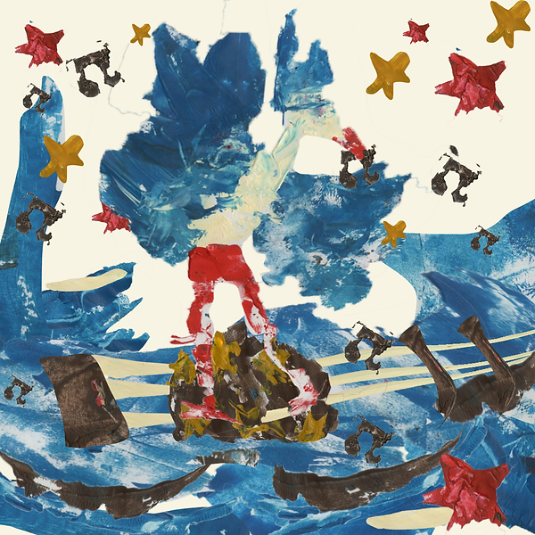
Here are the edited images. I know other 2 look VERY similar but one is more cluttered than the other but something I realised from those 2 is even though I minimized the clutter on one of the images, they just are way too cluttered and are sort of difficult to understand and visualize as Chelsea buns. I believe it is because there are three that are all very detailed alongside lots of stars and things in the background. So when I edited the other 2 together I kept the cluttered idea in mind. Now the one on the left is the original idea without the planning I did in my sketchbook. I thought it would be good to try and visualise that but digitally and with all of the physical elements of the printing. I do like it, I mean it was my original plan and I like my original plan. The only problem is I wanted to use the space more, that was the reason I tried out using 3 different Chelsea bins and wanted that to be my final idea because I just wanted to utilise the space that I have.
So the last image that i made is the one on the right above the text where I added multiple chelsea buns but this time I made a break up with in the buns with the different designs that i tried out with the experimentation as well as I wanted to play around with perspective so one of the herons are bigger than the other. I also want to bear in mind that when I do this as a proper final print the poses of the herons are going to be more dynamic. I just did this for the experimentation so I could know if I could even create them by printing. I personally really like the last image that I planned out in photoshop because I feel like incorporating everything that I wanted to do as well as incorporating what the client wants making it a combination of enjoyment and responding to a client. Though I did also like the other ideas even though I have a personal favourite I decided to send out a form to pretty much anyone I know to get their opinion on what idea I should pursue for the final print. I also thought it would be good to get other people who want me too look at this as this is a poster that will be viewed by all different demographics and ages, so I sent it to my class some friends of mine my parents my little brother, my nana , lecturers and the client to make sure I got a good range of peoples ages and who they are.

── ⋆⋅☆⋅⋆ ──
ᥫ᭡
𓂃˖˳·˖ ִֶָ ⋆⋆˙⟡⋆ ִֶָ˖·˳˖𓂃 ִֶָ
.𖥔 ݁ ˖𓂃.☘︎ ݁˖
(´∇`'')
The form responses and the change of my entire project
As I completed this idea/editing on Sunday I sent out a form as I mentioned above. When I did it I got a mass amount of response because I sent it to too many people but I had to wait for my teacher's response as it was the weekend. So Monday morning I woke up to check what they emailed me back and the responses for the form. The form had 39 responses and I was really happy with the responses, though there was a draw between 2 responses. Though besides that and my joy of the form responses and people actually doing it, I checked my emails and that's when I realized I always need to check with others and not go super far with my work otherwise something like this will happen.
Now my teachers liked the concept with the water guitar and the heron picking out the notes, though the client liked the Chelsea bun idea. So I went with what the client wanted and not what my teachers wanted because I mean this is for the client. Though the guitar idea even I would say is m y strongest design, it has a composition that is a lot better and it is abstract but still understandable. Now chelsea burns even though the client liked it, you wouldn't KNOW they are chelsea buns unless you knew about well cambridge as a whole and food that is popular and for my target audience cultural explorer they may not do that. Though I went with it and jumped into the creation as the client liked it the most and ignored the fact that maybe the other one was the strongest. Even though I did merge the ideas together in this experimentation, they were too much and that's why I just went with the basic first idea of the herons dancing upon a chelsea bun.
The email said:
Hi Flyx,
I'm not sure about this creative process by polling. You as the artist need to be able to trust in your own design knowledge and choose the solution that most clearly communicates the message. That said, I think you should also trust your teacher and try the guitar/pond idea as that was one of the strongest concepts in the class. You could use the heron and other assets that you already made and just create the guitar-shaped water feature.
Hearing this sort of did make me u[set I mean I have put a lot of effort tin to the chelsea bun idea and making sure that it still worked and people enjoying it with the responses also made me upset and afraid that the work I had done was bad. I didn't realize that using a polling system would be a bad Idea I thought that it would be a good idea because it gets responses from the public and different audiences, but I guess that trusting my own creative liberties and trusting myself to create something that is understandable and not having to rely on other people's opinions, but it still feels disheartening for the amount of effort I put into my work and the fact that i have already stressed over this work multiple times due to the tight time constraints.
Though with this response from my teacher I will make sure I keep trying until I get a good poster design so I have made a decision on the bun idea that I am picking in case the new experimentation and new "final' concept doesn't work. Though I appreciate everyone who did my form and helped.
But I am going to choose the one I like the most, which is actually option 4 in my form so it still got the most responses which is good. But the one I chose is the one under his text.
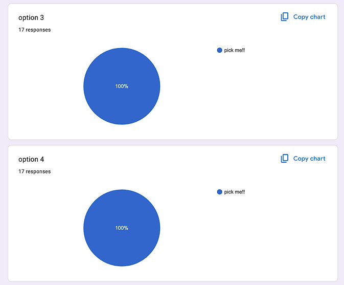

As I have chosen this one I did actually make stencils and all of the pieces I need for the final print just incase I might have time to do both but also incase the new experimentation doesn't work out and I still prefer using this one.
﹌﹌﹌﹌﹌
୭˚. ᵎᵎ
𝄞⨾💿✮˚.⋆
*ੈ✩‧₊˚
⫘⫘⫘⫘⫘⫘
.𖥔 ݁ ˖⊹₊⟡⋆── .✦
New experimentation to respond to the email !! (,,>﹏<,,) (week 5)
This is the one I am going to to the new experimentation for and before I did that I made a plan on what I needed to do and complete before my next lesson and as well as I decided to try out different compositions in my sketchbook just to see if there is any other way I could improve the idea. Luckily due to all of the experimentation I did for the other idea I know exactly the kind of techniques I want to use to experiment on how to make this idea. Something about this idea is I think that the flower that I did research into can actually be used as it just fills space and gives a range of colours in the strict branding colour scheme

﹌﹌﹌﹌﹌
𐔌՞ ܸ.ˬ.ܸ՞𐦯

‧₊˚♪ 𝄞₊˚⊹


As I mentioned I did sketches before I did the main experimentation. This helped a lot because I mean I like the way the concept that I drew looks but I just felt like everything was so disconnected with each other and I didn't like the usage of the space being filled. I tried to keep the flowers that I said I thinkI would use, but even in the sketches just looking at them I decided I need to let go of that idea of using the flowers, It works in a sketch because I feel like I have more control on making lies and the flow of a pencil but with printing its quite heavy and I learn that from doing the experimentation earlier on in the week. But I quite liked the new ideas that I drew.
I felt like it didn't abandon the idea of the heron plucking music out of the water that sort of looks like a guitar. I felt like they all incorporated that idea in its own special way and instead of things feeling unconnected everything felt like it belonged. I will say when I do this as a print I think it may be a bit difficult to show the difference in the water compared to the heron but I will see how it goes and I will try to show that there are different layers. I think still doing everything separately and adding the pieces together in photoshop is just better. I like how I can also manipulate the layers to look how I want if I think that I messed up a little bit but I want to keep the part of the print that is effective and works.
There was just one problem though the fact that I dropped the flowers and decided I wasn't going to do it for the new experimentation that I was doing I new I was going to have to work hard to showcase that the poster is based in cambridge, and i think the one with the bride where the punting happens in Cambridge will become a crutch for the recognition that the festival is in Cambridgee.


﹌﹌﹌﹌﹌

. ݁₊ ⊹ . ݁ ⟡ ݁ . ⊹ ₊ ݁.


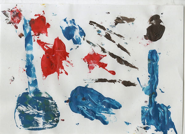
Here is all of the experimentation that I did. I told myself i was only going ot about 5 pages and just use the other pages that I made in the other experimentation to make sure that I didn't do loads and loads of work to stress myself out, But when I started doing it 5 just wasn't enough I had ideas that I needed to get down on paper and try things out. All of these experiments are done with the way that I liked to do and learnt that I like to do it that way from the other experimentation, I used a lot of foam stamps and lino to create these pages, I know that most of these don't really make sense but I had ideas on how I was going to edit things together. Some of the pages. I just made marks with spare foam I had because I wanted to make sure I had organic shapes that ifI needed to create things like water ripples or give detail to them. (as well as some of the water ripples that I practcied where from the other experimentation I just reused the lino shapes I cut out to see what would be best to create that feeling of water. I liked using hte foam the most because putting a thin layer gave it this see through visual that was all misty and thats sort of what water is like)
The shapes I did for the instruments I made were really simple. I want the heron to be the most intricate shape to make sure that the eye gets more interested in the shape. I did try out to make this water wibbley effect with lino and adding a load of pain on top to make sure the pan would squish everywhere but I thought the shapes where cool eyes but it was all to fine and detailed for the kind o vibe that I established with in the other experimenting and knowing what kind of feeling I wanted to create. I made new herons just in case the heron pages that I did for the other experimentation didn't give off the correct stance that I wanted to have for my new ideas. Everything here is very blue, because I wanted the yellow to be the background and considering I am editing it all on photoshop it's fine I don't need to just paint a piece of paper yellow I'll just do that digital when I am editing it all together. As well as the white that I did physically I found making off white to just be a super hard task and I'll just fix that digitally. The colours here aren't the perfectly correct ones but it is all to make sure I know what proper colours I will use when I do the final print.
Even though that getting told to try this idea after find something that I was proud of was disheartening I am happy I did try it out and didn't totally ignore the comment and replying to the feedback was really helpful because so far in this experimental stage I believe the experimentation is going a lot better and I feel more secure with this idea as a whole because i feel like it expresses cambridge/the brief in an easier way and more understandable to a wider audience.


⋆˚꩜。
ִֶָ. ..𓂃 ࣪ ִֶָ🪽་༘࿐
⟡ ݁₊ .
── .✦
── ⋆♬⋆.˚⋆ ──
ೀ
. ݁₊ ⊹ . ݁˖ . ݁. ૮ ․ ․ ྀིა
Editing things together and choosing the compostion I like the most (*ᴗ͈ˬᴗ͈)ꕤ*.゚ (week 5)
Editing time!! I took some screen shots of whatI did because I did it a bit differently then I did last time. of course I made a canvas to the specs that is needed to make sure that I was making it all correct. But this time when I copied the prints I needed from one area so another I also used the transform tool a manipulated things to be more water like and to also change the shape of certain things/ perspective of things because I wanted to make sure that used perspective a little bit for this as. It worked for the last experimentation and made the image look much more alive and not so flat so this time with that previous knowledge I want to try and use it more.
As well as when making my work anyway I need to be working on proportion and I think maybe softening proteins and making things look a bit different to what they usually would do for this idea will work ad th water is create the effect of a guitar/ other instruments so applying other knowledge and feedback i have been given form other modules which is to work on exaggeration and being confident in how I make things look be keep it readable. For these edits I wanted to make sure I utilised the space given. I feel even though I liked the other edits I did for the other Idea I didn't use the space as well as I should. I liked that I left space for writing but I mean I don't really have to think about that. I as old especially not to think about the writing or the logo or anything just create the print and the Cambridge council editors will figure the rest out.

૮◞ ‸ ◟ ა
⋆˙⟡
𓂃˖˳·˖ ִֶָ ⋆⋆ ִֶָ˖·˳˖𓂃 ִֶָ

╰┈➤
・・・・・
⋆✴︎˚。⋆


⋆⭒˚.⋆
‿‿‿‿

═══════
૮꒰◞ ˕ ◟ ྀི꒱ა


-ˋˏ✄┈┈┈┈
Here are the edits. I really like all of them and decision making became really difficult. kept the original colour scheme from the concept that i made in the first week. though something about every single one of the edits felt off. I had utilised the space, I had made the concepts I wanted but something just didn't feel right.
Besides that, doing all of this editing was so fun and especially using different tools on photoshop really helped. I always get scared to do things like this because I am afraid that nothing will work together.Even though I have a feeling that something is wrong with these edits, the concept and idea I can read better than my other ideas that I did before. I think listening to my teacher was a really good idea, it just feels more complete and like a poster and not something that I am too unsure about.
The reason each image has either a yellow o white background is because I was unsure which was more readable but I think the yellow is more readable because the white is quite harsh and makes everything feel quite busy but the yellow makes it feel more calm and easier to look at. The thing for these edits, the only one that you could tell is from Cambridge, is the last one as I added the bridge. The other ones I feel like are better with the water and showing the fact that the water is meant to be instruments.
꒰ྀི১ ໒꒱ིྀ

── ⋆⋅𖤓⋅⋆ ──

── ⋆⋅𖤓⋅⋆ ──
Due to me not feeling like the last one conveyed the instruments the best but I think the middle one is the best for that as well as the usage fo the heron I would of used the first idea but i felt like the heron and placement of everything felt off and didn't work as well as I thought it would, it feels more like a pond instead of a river. I decided to just add the bridge to the edited image of the second idea. I felt like I was getting somewhere with it though it still felt wrong. The usage of the stars and music notes didn't work how the final one used them. I also felt like the horn in the front was too low down and the heron in the background was making the idea too cluttered and sort of difficult to see and understand.
It's to many herons anyway, it blends in too much. Though after doing this I was definitely sure to not try out the white anymore because the white version of this was way too busy and too much to look at and If I wanted something thatI ma happy with I should use the yellow to make it readable and not so harsh on people's eyes.
Though something is still off with this idea, I feel like I am in a closer direction and how I want it too long but the merging together just isn't working well together.
Because of that I decided I would take the bridge, heron nd the and decorative parts from the third idea and the water situation from the second idea due to the way it looks more like a river than a pond and I merged those parts together creating the final image that I do really like which is bellow this!!!
⋆.ೃ࿔🌸*:・


﹌﹌﹌﹌﹌
The 'final' design that I am going to do for the final print!!! ( ˶˘ ³˘)♡ (week 5)

Now this idea I believe is much more poster-like than the chelsea bun idea. I know that idea is original but this one still has that originality too is with the heron plucking the music from the river which I think showcases the connection that Cambridge has to this festival and how important it is for Cambridge to continue the tradition of doing the festival (I rmeber taling ot the old owners in week one that it shut down for a year because cambrdige wasnt sure if they should contuine doing it and it made people who genuinley enjoy the festival really upset). I did struggle picking this one as the final design though because even though this one did more of what I wanted to do for the chelsea bun idea.
That Chelsea bun idea is still a cool idea and i do like the way the one I chose looked. But this is the one I chose because the way it looks just feels more like a promotional or advertisement for the festival and not food. Also I have more security within this idea and there are more fun parts I get to edit and I overall had more fun designing this idea
Next week I will be doing this as a final print, using ink instead of acyrlic paint, as well as I shall have my stensils I have made so I don't have to make them in class and take up my precious printing time.
I also chose this idea because this edit next to this text is the square version with the dimesnsions of 1080x1080 which is what it will be on instagram or socail media but i believe this one works well in the larger format as well with the other ideas expecailly the cheaslea bun idea not realy having the option ot strech or cut it. (the larger version with the dimenesions of 1080x1350 to meet the breif is bellow this)
°‧ 𓆝 𓆟 𓆞 ·。
𓇼

Here is the larger version, I actually prefer the larger version to the square one, not saying I don't like the square version I just think the larger one has sort of a nice length too it showing the whole scene where as the square version only has the close up which isn't a bad thing I love both Just prefer the look of the whole scene !!
I think for the final version which I will be doing next week, I want the heron to be more thinner? Being all wide has the feel of a different water based bird, herons ae slender and proud,I want ot show that.
°‧ 𓆝 𓆟 𓆞 ·。
⠀⠀⠀⠀⠀⠀⠀⠀⠀⢀⣤⣤⣤⣤⡀⠀⠀⠀⠀⠀⠀⠀⠀⠀⠀⠀⠀⠀⠀
⠀⠀⠀⠀⠀⠀⠀⠀⢠⣿⠋⠀⠀⠙⢿⣦⡀⠀⠀⠀⠀⠀⠀⠀⠀⠀⠀⠀⠀
⠀⠀⠀⠀⠀⠀⠀⠀⣸⡇⠀⠀⠀⠀⠀⠙⢿⣦⡀⠀⠀⢀⣀⣀⣠⣤⣀⠀⠀
⠀⠀⠀⠀⠀⠀⠀⠀⣿⠇⠀⠀⠀⠀⠀⠀⠀⠙⠿⠿⠟⠛⠛⠋⠉⠉⠛⣷⡄
⠀⠀⠀⠀⠀⠀⠀⢠⣿⠀⠀⠀⠀⠀⠀⠀⠀⠀⠀⠀⠀⠀⠀⠀⠀⠀⠀⠀⢸⡇
⠀⠀⠀⠀⣀⣤⣶⠿⠋⠀⠀⠀⠀⠀⠀⠀⠀⠀⠀⠀⠀⠀⠀⠀⠀⠀⢠⡿⠃
⠀⣠⣶⠿⠛⠉⠀⠀⠀⠀⠀⠀⠀⠀⠀⠀⠀⠀⠀⠀⠀⠀⠀⠀⠀⠀⠀⣠⡿⠃⠀
⢸⡟⠁⠀⠀⠀⠀⠀⠀⠀⠀⠀⠀⠀⠀⠀⠀⠀⠀⠀⠀⠀⠀⠀⠀⢠⡿⠁⠀⠀
⢸⣧⡀⠀⠀⠀⠀⠀⠀⠀⠀⠀⠀⠀⠀⠀⠀⠀⠀⠀⠀⠀⠀⠀⠀⠀⠘⣷⡀⠀⠀
⠀⠙⠿⣶⣤⣀⠀⠀⠀⠀⠀⠀⠀⠀⠀⠀⠀⠀⠀⠀⠀⠀⠀⠀⠀⠀⠀⠘⣷⡄⠀
⠀⠀⠀⠀⠉⠛⠿⣶⣄⠀⠀⠀⠀⠀⠀⠀⠀⠀⠀⠀⠀⠀⠀⠀⠀⠀⠀⠀⠘⣿⡄
⠀⠀⠀⠀⠀⠀⠀⠀⠘⣿⠀⠀⠀⠀⠀⠀⠀⠀⠀⠀⠀⠀⠀⠀⠀⠀⠀⢸⡇
⠀⠀⠀⠀⠀⠀⠀⠀⣿⡆⠀⠀⠀⠀⠀⠀⠀⠀⣠⣶⣶⣦⣤⣤⣄⣀⣀⣤⡿⠃
⠀⠀⠀⠀⠀⠀⠀⠀⢹⡇⠀⠀⠀⠀⠀⣠⣾⠏⠀⠀⠀⠈⠉⠉⠙⠛⠉⠀⠀
⠀⠀⠀⠀⠀⠀⠀⠀⠘⣿⣄⠀⠀⣠⣾⠟⠁⠀⠀⠀⠀⠀⠀⠀⠀⠀⠀⠀⠀
⠀⠀⠀⠀⠀⠀⠀⠀⠀⠈⠛⠛⠛⠛⠁⠀⠀⠀⠀⠀⠀⠀⠀⠀⠀⠀⠀⠀⠀
・・・・・
Final design creation!!! ᝰ.ᐟ (week 6)


⊱ ۫ ׅ ✧
──★˙🎸̟!! ๋੭﹕﹒
-ˋˏ✄┈┈┈┈
﹌﹌﹌﹌﹌
✦•┈๑⋅⋯ ⋯⋅๑┈·✦
࿐ ࿔*:・゚


✃𓄧꒷꒦
.☘︎ ݁˖
Just like the experimentation I had to make all of the pieces separately, this process was actually the greatest out of all of the stamping and linoI have done for this project because I didn't have to mix the colours they were always pre-mixed. I have already cut out all of the stencils and things beforehand so when going into lesson I was prepared and also, I have done it so much I just got on with it without hesitation because I knew what I wanted it to look like and how I wanted to use the supplies at hand.
Now as you can tell the colours blue here are way too dark for the final print like it is for my experimentation as well as like it is for the branding colours, but I thought maybe it would dry differently, it didn't as you can tell from the images above.
So I was sort of lost on what to do, causing me to get incredibly stressed and worried that everything was gonna go awfully and I would have to restart the whole printing process and idea all over again. Which in turn caused me to create something so awful it gave me so much less confidence on creating the final port. I was confused on how to change the colours and how to make everything just look how it did. Though I thought this was going to go much easier because the pieces I had looked a lot more like instruments and also the heron pieces looked a lot slimmer than the experimental stuff. I just became so un enthusiastic and nervous to complete this even though I had the idea in my head I just was worrying way too much.
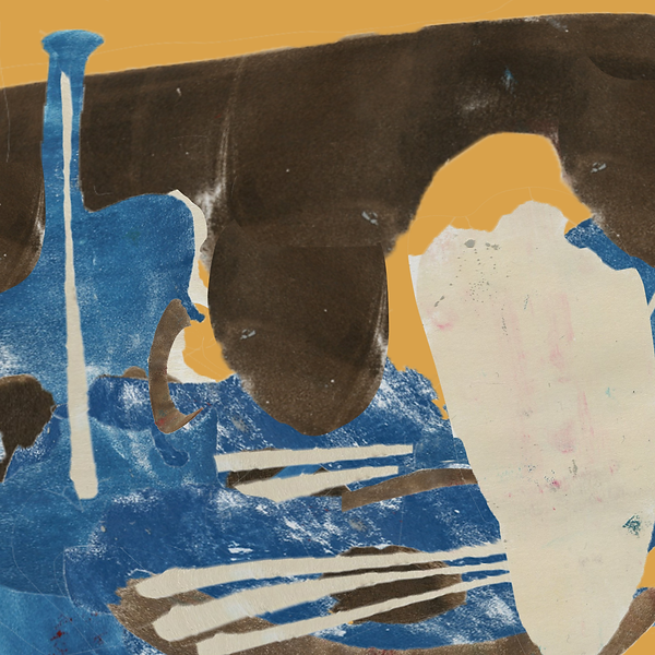
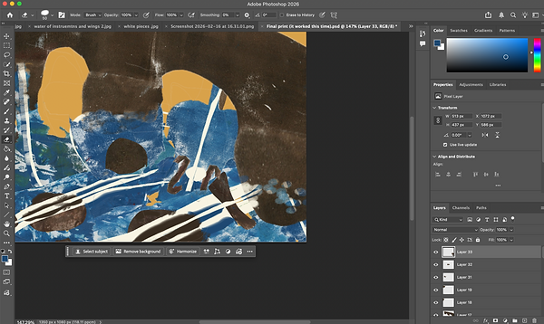
Here is the first version that I tried doing for the final print, this was the only pause of my experimental work as reference and made sure that things looked like that but better. I really like the water effect I made on the other one. I was just told that I needed to make sure that the water with the instruments actually looked like instruments and maybe maybe the whiter lines implying water ripples to be more and thinner. I didn't mind completing that so I did, I was also told to give the effect that I have printed over all of this physically so I had to use a rubber tool on photoshop to rub out certain parts but really carefully so it gave the illusion that everything was all done together and not digitally.
I messed up on because after this I went to go and take a break to come back with a better mindset and for this final print I decided to create the final print in the cut version first and not the larger version to then be cut after wards which I think was the thing that was stressing me out and causing issues because I wanted to fit as much as I possibly could within the small print but the more i kept trying to put in, the worse and more crowded it became and the colours were wrong as well so it was making the whole thing feel impossible to complete. Though after the break I took I found that I should do it in the larger size first so I could spread everything out and make it look more empty and effective with the space and then just keep checking the sizing with the canvas side and cutting it to see how the smaller version would look. Doing that really helped, as well as referring back to my experiments and how to make the image look to make sure that it matched the vibe and feeling I wanted to create.
For the final print, I thought the colours still looked bad but.. I didn;t know how to fix it so I assumed I was finished.
੭﹕ ̊ ̟ ꒷꒦
────
˚˖𓍢ִ໋❀
≽^• ˕ • ྀི≼
⋆˚✰ ݁˖⭑.ᐟ
'final print'
. ݁₊ ⊹ . ݁˖ . ݁
——⭑⋆⋆⋆⭑——


So here is what I came up with after having a break and spending about 3 hours editing and merging different things together. Now the colours are all wrong and I didn't know what to do. I just sort of kept them and went with it claiming I was finished, as if the ink I used was that colour. How was I meant to change it? I mean I have already scanned it and I was happy with how this all looked and I didn't want to have to redo it. Well turns out you can actually just edit the colour on photoshop for the images.
Because I figured that out as well as I emailed my lecturers about what to do when I was done and they specified that I needed to make sure the colours were correct. I used the editing colouring part of photoshop and I messed around for about 2 hours fixing the colours and referring back to the branding scheme that me and my class were shown when we were all first told about the project. I feel like if I had known how to do this when I was doing my experimentation I would have been more confident in my creation of the final print but I mean I am glad I figured this out because I now know what to do in the future.


✩₊˚.⋆🕸️⋆⁺₊✧
Final print !! (week 6) ⭑.ᐟ
╰┈➤.
˚ ༘`✦ ˑ ִֶ 𓂃⊹
𓂃 𓈒𓏸
☆

✩₊˚.⋆☾⋆⁺₊✧
✩₊˚.⋆☾⋆⁺₊✧

⋆。゚☁︎。⋆。 ゚☾ ゚。⋆
⸝⸝
‧₊˚♪ 𝄞𝄢₊˚⊹
˙⋆✮
Here are the final prints there are 2 versions of course for the larger version and the smaller cut version for social media. I am glad I fixed the colour and didn't just give up because I feel like not only does of course it fit to what the client wants but at the same time i think it just looks more lively and friendly for an advertisement of a folk festival and not so dull and muted to the point where it just sort of feels like a scene instead of a poster. Now even though I say it's the final point I still have to show my teachers and I hope they like it and I don't have to change anything else, as I really like this idea, like a lot it's finished to me and I also tried my hardest to ensure that the instruments actually looked like instruments. I feel like I got to use my own clutter that I usually place in my work but also making it simple to understand from an outside source as it isn't so cored to the point where you can't see things like I have done in the past in trimester 1.
If there is nothing below this work that means that this really isn't my final print and I have sent it off to the client though is there is stuff underneath this, i have altered it to make sure it is as good as it can be but currently i think it really is the best it can be and I like it ALOT. Much more than the idea I was going to do before I got given the email from my lecturer but tying the other ideas I had planned in the concepting stages.
Fixed the final prints (week 8) (˶˃ ᵕ ˂˶)
・・・・・
⚝


As you can see a week has passed, I was told this week that forgot to add the logo which i didn't think I needed to add I thought that the people I was submitting it too would do that but it doesn't matter it was simple I just took the logo graphic that was given to us as a class and chose the one that worked the best with my print. There were many options for logos but I prefered this one as I felt that it matched with the vibe of what I have created as well as everything feels right together, and honestly I didn't think the logo would do much for the print but it has made it feel more final and finished.
I also saved the old final print images as PNG's when they needed to be JPEGs so they are now that as well.
𝄞⨾𓍢ִ໋
✮ ⋆ ˚。𖦹 ⋆。°✩
⋆˙⟡
﹌﹌﹌﹌﹌
⋮
⋆⭒˚.⋆
(´∇`'')
₊˚⊹⋆
───
FRIDAYS LESSON (the projects I did this trimester are bellow!!!)
⊹₊˚‧︵‿₊୨ᰔ୧₊‿︵‧˚₊⊹
MAYA - 3d building (˶˃ ᵕ ˂˶)
weeks 10-12 (Animation skills)
Disclaimer - this is my first time using Maya as well as this is sort of a porject that could fit into both illsutration and animation as it is sort of like a 3d illustrations as I am not making it move but USALLY with 3d model softwares you will make some parts move/use it for animation, but I wont be making a fully completely crazy stroy or animation (I am making a 3d scene that wont move as that us what I have understood from this porjects brief) as thst isn't the task as well as I only have a short amount of time ot create the 3d Model.
Playing around with the software (week 10) .·°՞(っ-ᯅ-ς)՞°·.
༘˚⋆𐙚。⋆𖦹.✧˚
‧₊˚ ┊


༉‧₊˚.
⋆˚𝜗𝜚˚⋆
✮ ⋆ ˚。𖦹 ⋆。°✩

⭑
・・・・・
This is a new project, I thought it was pretty weird to be starting a whole new project the day before easter holiday but it makes sense, its not like I have to create something complex or super, duper, incredibly thought through I just have to learn this new software/have an introduction to the new software so the next year I will be using it more.
Now the software I have never used before, I have used blender in the past but I found it really frustrating and hard to use. I came into this lesson believing that the software was going to be awful and I had literally no hope for anything. But the brief is to just make a building, a 3d building not the interior just the exterior making a little scene. That gave me more hope and I felt a little bit better knowing that it wasn't that I have to learn how to animate in a 3d software in 3 weeks, well I do have easter to work on learning Maya but one I really need a break my health isn't doing well as well as I don't want to go to uni in the first week and learn it just forget, when I am learning a new software I like to learn it like really close to when I have to use it so all of the information is in my head and it sticks better so then when I go to the lesson I feel more confident and understanding fresh information, so my plan is to go in on monday and tuesday of the 11th week and practice using Maya as I am not at uni on those days and I would of hopefully gotten everything else that I have to do done in the easter. I also could learn it during the holidays but in the first week the uni is closed and in the second week I am doing things with my family, but I could always use a spare day to go back to Cambridge to uni. I am not entirely sure what I will do but I am totally definitely going to do the idea of doing the work on the week of the 11th week in the trimester.
Anyways, enough of the plan for what I will be doing, messing around in the software, was actually not too hard. I mean most of the time I was just watching the lecturer do things really confused then for the last hour of the day I messed around a little bit super confused but it is so much simpler than blender, things arn't hidden its just A LOT to remember and to look at its pretty overwhelming but the keybinds arn't too confusing its just certain things I am unsure on but the lecturer has sent the presentation and recorded how to use the software and it is sent to everyone; when I am practising I am totally using those resources as even though I did listen in lesson and did try my hardest to intake all of the information, I am really bad at understanding things like that and usually ALWAYS have to ask for a one to one on how to do things as it's just a lot of information.
Planning what building I am going to create (week 10) (*ᴗ͈ˬᴗ͈)ꕤ*.゚


Even though I didn't really understand the bunch of presentations and showcase the software, what I do understand is planning. I love planning ideas and being told I just had to plan something simple I had many ideas, I decided to write them all down as well as my strong of thoughts on how I would be doing this project as everything is new and unknown as well as its 3d and 3d digital modelling is something I really am not confident with. I enjoy 3d modeling with things like clay and physically just on digital software. I always get really confused and it just doesn't feel right to be doing it like that. But all of the ideas I had I made sure to think of things that were simple, simple shapes, simple ideas. I wanted to do something that was easy enough to do in the remaining 2 weeks that I will have when I go back to uni but something that had a flyx style!! I love making things for ideas that I could eventually continue using and during the time where I was writing my string of thoughts for the idea I wanted to pursue I thought, a hotel... they are simple but a hotel for something different to humans... I need references.. my favourite movies, inspirations... it all started to come to me. With the decision of doing a hotel I want to do a raccoon hotel. Im not really are why I was so fixed on it I mean I love !! racoons and at the time everyone was talking about favourite movies so that sort of transitioned into my own work. To create this idea I want it to be heavily based on the style of the building because sure the building can look normal but I assume (well I hope so) that on maya everything doesn't stay grey and I can colour things and I want the style of sort of studio ghibli to shine through, green, simple ideas that show the beauty in normal life things.
From this idea I made a moodboard (link bellow) and I did a bunch of physical drawings this week - I plan for in the easter to do digital drawings of the building but better I just wanted to sketch down the ideas I had to make sure that the references are then for when I start drawing more ideas digitally. The drawings I did I started off with just drawing building images I found to understand how the shapes work together, and then.. I moved onto ideas. I really enjoyed how hotels have different compartments and I feel like for racoons making a hotel for them is sort of ironic as people associate them with bins and rubbish so making a cute little hotel I feel like fits. I am sort of trying to give it the sort of bathhouse feel in Spirited Away and the squaller humbleness that comes from Pom Poko and just raccoons in general, they give off homeless vibes but being little sweethearts.


Something that I am happy with when doing this project is that I am pretty awful at things like backgrounds/buildings an I guess making them in 3d and having to really understand each side of the place I want to create helps me work on my skills of buildings
<--- link to the pinterest mood board called 'Trimester 2 - Maya building scene'
‿‿‿‿
-`♡´-
˙⋆✮
-ˋˏ✄┈┈┈┈

Here is the sketch that I like the most. I do like the other ideas I had mainly the ones that had many different parts to them but I really have to concentrate on the fact that I will only have 2 weeks and its all a new software, though I am thinking for this idea when I draw it digitally and think about things like colours and what things may look like as a proper building not just a quick bad sketch that maybe it will be a bit more compact?? with different sections. Something I really do want to incorporate are little racoon statues like gargoyles in the idea and I think to make it more bathhouse feeling that I will need to make it a bit taller?? but the way this hotel looks and the one I like the most is good and I just know that I want to change a few things and I want it too not be so flat I think if I was a racoon I would want a fun place to stay in like a fancy bin with lots of different sections to look into and clean in (because raccoons are pretty clean creatures when it comes to things like food), though waht I do like is I think it is simple and effective, it has charm but isn't too complicated!!!
⋆˚☆˖°⋆。° ✮˖ ࣪ ⊹⋆.˚
⚡︎
⌞ ⌝
Easter Holiday work !! 𐔌՞. .՞ 𐦯
Drawing more ideas and practicing drawing buildings!!


‧˚꒰୭ ˚. ᵎᵎ
⋆.˚
. ݁₊ ⊹ . ݁˖ . ݁


✮⋆˙


── .✦
°❀⋆.ೃ࿔*:・°❀⋆.ೃ࿔*:・


⋆✴︎˚。⋆


⟡ ݁₊ .゛ ⸝⸝.ᐟ⋆


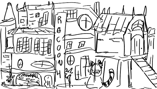
Over the easter I knew I had to do research into buildings, it is my most weakest point in drawing (besides vehicles, but I HATE drawing vehicles I am SO awful at it at least when I draw a house it is sort of readable as a house), so I made sure I not only drew my ideas but I used references and pictures I had on my phone and form my moodboard to draw from and practice just a bit of building drawings. I would go outside and draw the buildings but currently I am in my home town and there is literally nothing interesting to draw at all that would assist me with this drawing task as my health is getting worse so this is easily accessible for me at the moment.
Doing this research was quite refreshing. I mean I got to do it digitally whichI never really do for the research half of the work, I always do it physically but doing it digitally I want. to get more confident in this format of work and get better at using brushes on photoshop so it was just enjoyable to use photoshop and keep trying to improve my sketches. All of these drawings are sketches, they aren't like completed drawings, but something I am noticing from doing this task is I have gotten more confident with brushstrokes and making decisions. Even thoughI know that that isn't important for this project as it's brand new and I am learning maya not photoshop, I am trying to make sure I keep working on all of my skills in each project to keep up my progress in art!!
For the drawings of the ideas that I was progressing from last week's drawings, I wanted to keep the simplicity that I really liked from the 'final' sketches I did last week for the one i liked the most but I also wanted to include a more organic and squished together feel as I felt like that had no only a racoon feel but gave the impression of my references which from last week have grown and the reasons are I was just looking at those things to come up with my final sketches that you see above this text. I really enjoy the final sketch that I made this time, it feels more like something little animals would like in as well as it carries that simplicity feel as I liked the ideas I came up with in the digital sketches but I felt like they were still too much, too much going on for my first 3d project as well as just too much going on for the sort of calm simple feeling I wanted to go for. I also think that even though this design is simple it will still be a good challenge to do in the last few weeks as sure the shapes aren't complex and there isn't much going on, but there's lots of different shapes that I need to create for the windows and make sure that some of the shapes are rounded at the edges. As well as I need to somehow simulate grass on top of the buildings in the sketch. (I will practice all of this when I use the Easter break for practicing Maya) I also think from the physical sketches from last week that it feels more natural like, something about the other drawings that were very square and rectangular and VERY clearly would be made of bricks and it would look run down. I mean I liked it because people associate raccoons with dirt and the fact that the hotel is grimy would be a good effect but even with that effect that I originally was going for that one it portrayed the racoons in negative light and considering my references it also didn't make sense why I was doing that, but also the building sketches before hand felt human made and just too industrial, I prefer the rounded buildings much better!!!
Here are all of the inspirations I was using and I wrote down why I was using them to ensure that when I was doing my drawings and also colourng and final design that I stuck to my plan for this 3d model.
── ⋆⋅☆⋅⋆ ──
.𖥔 ݁ ˖
。𖦹°‧
₊˚⊹♡
・・・・・
(,,>﹏<,,)
Easter Holiday work !! 𐔌՞. .՞ 𐦯
Planning the final colours for the 3D model!
˚₊‧꒰ა ✦ ໒꒱ ‧₊˚
𑁍ࠬܓ
*ੈ✩‧₊˚


°❀.ೃ࿔*
‧₊˚ ┊

☆⌒(ゝ。∂)
ﮩ٨ـﮩﮩ٨ـ♡ﮩ٨ـﮩﮩ٨ـ


So what I did after figuring out what I wanted the model to look like. I was going to do the colour schemes now due to not knowing much about maya and also when I was in the lesson the only thing that we as a class was show is how to make shapes (which I was pretty awful at, well not like awful awful it just was super confusing) i assume you can add colours to the 3d model otherwise it will be pretty boring looking, so I planned the colour schemes using the ones I found on pinterest as they always help me alot as its alway alongside my moodboard so it helps me see visually what I am thinking.
The colours that I worked with a lot of them were very earthy and i tried to go the bright route but it felt wrong for what the idea was which is a hotel for racoons just something about having really bright colours didn't feel right so I tried muted colour schemes and I felt like they felt more professional as well a s easier to just look at as a whole building and not sections of a building. The one I ended up choosing is the red and green one 4th in the row of six colour schemes and I chose that one as it felt one the most like moss and grimy but also had a friendly vibe that fit with nature and the cuteness simplicity that I wanted to keep with the first physical drawings that I did. I think my favourite thing about this design is the little raccoon statues. They are grey and blend in so well but also are so cute and just enough to give a hint of detail but not too much that the visuals are overcrowded with different shapes and things.
Along with just the sketch being something I am proud of I am really happy I drew it all different angles so I can refer to it when I make the idea as well as when I am drawing a more detailed back and front version of the design that I am going forward with.
final drawing of the design (˶ > ₃ < ˶)
᭝ ᨳଓ ՟


Here is the sketch for the final design. I included this not to just show my process but to explain how I did the backview. The way I did the backview was instead of drawing it all over again to make sure that everything was the same from the first drawing and exactly how I wanted it too look I just flipped the canvas to work on the coloring and l from the sketch that I made which also proved to be so time saving and helpful I am not sure why I have never done that before

⋅˚₊‧ ୨୧ ‧₊˚ ⋅
˚ ༘ ೀ⋆。˚

Here are the final drawings of course no the final thing as I will be doing that 3d modelling but i usually hate doing background or atleast building but for this I really do like the design, I sort of want to keep designing it to show the inside but that isn't the task, but what I think this has shown me is that when I do in-depth research and look at many references and not just give up straight away with the house ideas and draw simple houses that I can create something visually interesting. Now I did test what this design looked like with lines and I like both versions.
I think with the lines it looks like it could be in a children's book but without the lines it helps me see the shapes more clearly that I am going to need to create in Maya after Easter. I didn't do a side version because I felt like as long as I have just the front and back the shape and size come to me later. I am not really sure if I have any idea on how big it should be because I have never done 3 modelling in an easier software than blender and also I have never done it by myself. I know it isn't a good tactic but that's what I usually do when I haven't understood something I get a design down first and then do for it the sizing comes later during the process as it just helps to focus on the shapes not it needs to be this exact dimension, but of course in the future once i have become more confident and know how to use Maya I will make sure things are how I want them to look size ways.
═══════. ⋆˚𝜗𝜚˚⋆
ꫂ ၴႅၴ
Easter Holiday work !! 𐔌՞. .՞ 𐦯


Maya practice (╥﹏╥)


<------this button will take you to the tutorials I followed to learn the basics of Maya!!!
From these screenshots as well as the big yellow rocket image next to this text, I went into uni and spent a whole 6 hours just messing around with maya and learning controls. I am not going to lie, this is the hardest thing I have done so far this year. There are so many different controls to remember and different things that can happen when clicking different things on the keyboard as well as multiple different menus to remember to change it otherwise things won't work how I want them to. There is also a big play in left and right and up and down now a little fact about me that is a personal problem that really makes my work take AGES.... is that I struggle with lefts and rights really badly up and down not so much that's easy but lefts and rights I am super bad at.
Of course that doesn't excuse work load or anything it just means this took probably longer than it should opt for as for around 2 hoursI spent ages fiddling with the wings you can see in the rocket to be the correct shape as I kept getting the rotating tool going the wrong way and considering I wasn't using normal deforming and shaping I was using a tool called unitized deforming so make sure the shape was bent properly without spending ages going through every single point in the wire frame to move out. Honestly I was already struggling so much with the wire framing and in the tutorial to make this rocket the guy pulled out this move and I was even more lost making the whole process a lot harder. Now in the tutorial the person actually coloured it properly but I was incredibly frustrated and super tired after spending literally so long making a simple rocket as well as for the first 2 hours of the time I was at uni.
I tried to just familiarize myself with the controls moving around random objects and changing how big they were. You can move multiple different faces all at the same time as well as learning how to copy things and just general skills that I think for this project will be helpful. I am not going to lie one thing that makers maya alot harder to understand is I dot understand whatsome of the words of the buttons means like at all and why they do certain things, im not really sure what extrude means as well as all of these fancy attribute words hidden in all of the menus it made me very confused.
Due to spending a while learning things about maya and trying out a tutorial to make something i thought back to my old idea and I did say I wanted it gave making a building a go after i felt a bit more confident and even though the confidence I had was very low it was there and I was determined to make something that I made myself from my own head. Now I actually really like 3d modelling... physically. When it is physical safe and digital drawing I just find it a lot more easier to have control over things as its in front of me, I prefer physically working then digitally (im not counting sound editing in that I love doing that, as well as editing colours in software im talking about actually drawing or building things). This year and while I am doing this current project I am doing a puppet project as well so I had to model a puppet to move and be articulate and honestly that was so much more easier than this.
I know if I make a mistake digitally it is easier to change but like there is something about 3d modelling software that I just don't really get along with. Though I am determined to be able to make something thatI am proud of, in college I couldn't do it, and I really want to learn 3d. It just seems so fun to be able to create 3d buildings or things like characters and see them differently then 2d and honestly s much as I don't like it I believe that 3d modelling would help me just get better and understanding proportions/understanding things like movement as I struggle to visualize how 2d things would look 3d.
As well as I could use it to make my own references for drawing which is something I didn't really think of until I made my own building in Maya not using a tutorial just the knowledge form all of tutorials and things I had already learnt.
⤷ ゛ ˎˊ˗
๋ ࣭ ⭑
﹌﹌﹌﹌﹌﹌﹌
ꉂ`𖦹.
── .✦
═══════ ⋆˙⟡
☁︎‧₊˚
┈┈┈┈┈┈┈┈ ༘⋆⭑.ᐟ
⋆.𐙚 ̊
My own try at Maya (·•᷄ࡇ•᷅ )


・・・・・


── ⋆⋅☆⋅⋆ ──
▀▄▀▄▀▄▀▄▀▄▀▄▀▄▀▄
‧₊˚ ⋅
⟡ ݁₊ .
As I wanted to try to do something I thought I would choose a building that sort of matches what I learnt with the rocket which was a light house that was the closest thing I could think of that reminded me of a sort of rockety shape. I really like what I have made, okay granted it really isn't amazing and I do hate how I spent so long doing it for it to just look.. a bit low effort and bad. But for a beginner who has used 3d modelling once and it didn't work I am proud of what I have created. The idea was meant to be this magical light house that was being held up by spells and stuff, but I [refer to the image on the left where the building is well together and things aren't floating. The thing I am most proud of is the rocks in this model, I just think they worked really well, I am a bit upset with how the body of the lighthouse came out I feel like I should of modelled it larger, this was modeled quite small for some reason I am not really sure why I did that I just did which I do regret heavily as it made doing the shapes a lot harder as they had to be a lot smaller than they probably needed to be. But besides that I made this and it inspired me to change my idea for simplicity and to improve upon what I have built.
⋆˖⁺‧₊☽◯☾₊‧⁺˖⋆
Easter Holiday work !! 𐔌՞. .՞ 𐦯
Idea change (๑•̀ㅁ•́๑)✧
✦•┈๑⋅⋯ ⋆˚✰ ݁˖⭑.ᐟ ⋯⋅๑┈·✦
*ੈ✩‧₊˚


Even though my other idea was simple and had simple shapes I really liked the light house I built in maya for the practice and the idea is now i've practiced and I understand the basics of small parts of maya (hopefully enough to make the lighthouse) I want to improve upon the practice model I made )I will be remaking it not destroying the one I have already made I want to keep that one the way it is) I also wanted to change it as from the tutorial and from the practice I found it quite fun to add things like ledges made of cylinders and making rocks or spikey objects.
I also thought the racoon statues and lettering would have been way too difficult for the first ever proper 3d model. I used a brand new moodboard I made to generate these idea, I still used the ideas of what I originally planned with the racoon house keeping it friendly looking but I lent more toward magic I don't know why I was leaning so hard to magic for this idea I was just imagining a sea witch living in the middle of the sea and this is their house. I also kept the idea of a hanging out building from the side and there was a lot of that idea in the original idea and I didn't want to get rid of that as i spent along time making sure I could incorporate something like that into the hotel so I wanted to incorporate it into the lighthouse!!!
this is the button to take you to my new mood board on pinterest it is called "Trimester 2 - new Maya project moodpboard" --------->
ˋ°•*⁀➷
⋆⭒˚.⋆
──────── 🕸️๋࣭ ⭑
Easter Holiday work !! 𐔌՞. .՞ 𐦯
New colour schemeing for the 3d model (。· v ·。) ?
——⭑⋆⋆⋆⭑——
⏾⋆.˚


⊹₊⟡⋆

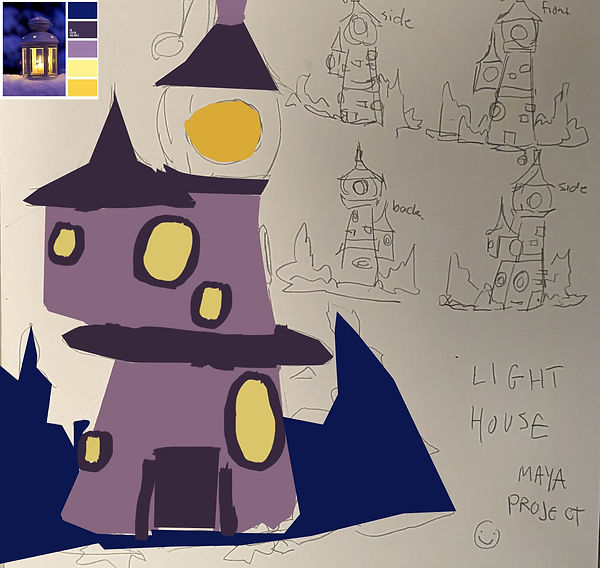
⊹₊⟡⋆


⊹₊⟡⋆


⊹₊⟡⋆


⊹₊⟡⋆

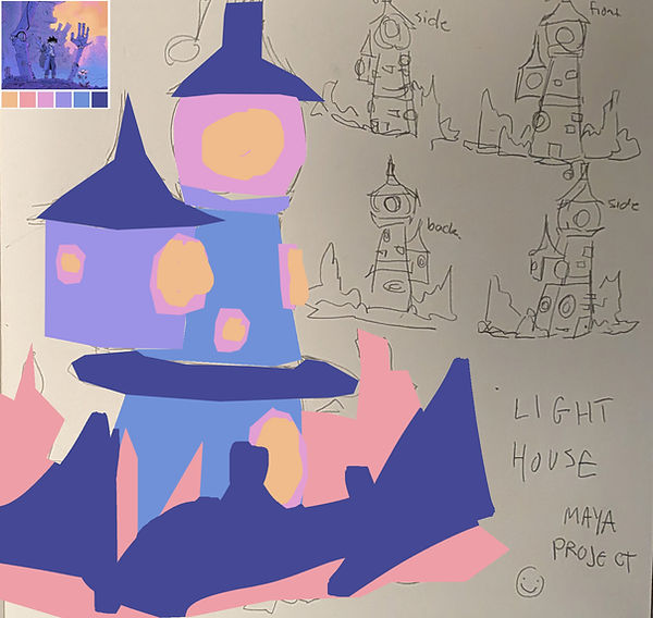
⊹₊⟡⋆


⊹₊⟡⋆


⊹₊⟡⋆


⊹₊⟡⋆


⊹₊⟡⋆


⊹₊⟡⋆
I took the sketch I did physically and decided to colour it in on photoshop so I didn't have to do another drawing of the same thing again just for a colour scheming test, of course when I do the final drawing it will be drawn again but I didn't want to do it again for the colour scheming. I used quite a lot of colours for these drawings now some of them are completely finished and others aren't completely finished because when I start doing colour schemes if it isn't really giving me the right one that i want I just sort of move onto the next one as I used to get so stick on drawing and making sure everything was perfect but I learnt to just move onto the next task if it isn't sticking or working. Now there are 2 versions of each colour scheme.
The reason is when I used the multiply layer to see the lines underneath the colour the drawing turned darker and without the lines it was brighter as well as I could see the shapes a lot more clear without my messy sketch underneath. Not only did it give me more colour schemes to choose from but it taught me that when I use this technique to colour things inI need to check the colours before settling on the mask, multiplying the layer causes the colour to multiply and turn darker. Honestly, these colour schemes weren't hard to do, they just took a long time as I had to decide what colours went where and how I wanted things to look. I tried new colour schemes and i also chose a few of the colour palettes I liked from the original idea I thought the colour palette that I chose for the racoon hotel would be the clear choice as I already really liked that colour scheme but I didn't finish it as the colours just didn't match the feeling of a light house they feel alot or beachy like as well as I wanted it too feel witchy/magic like and the colours were too friendly and too nature like
.
The colour schemes that I used were from the pinterest moodboard(s) that I made and credits to the art moodboards that were used by all of the artists and the uploaders on pinterest as all I did was take inspiration from the color scheme that people used and used it in my own way. I enjoyed finding colour schemes and making the colours for this building design way more than the original idea, even though I do like the original idea of a racoon hotel I think this design of a lighthouse is just a lot more thought through, the idea has more whimsy and looks a lot more building like and not just a bunch of shapes together. To help me with the colour scheme and the vibe I kept imagining a sea witch was thrown out of society and lives in a lighthouse falling in love with mermaids. Why that was the thing I was thinking about I literally have no idea but it helped a lot with the designing and choosing the colour scheme I liked the most (which you can see below as that's the final design drawings !! ot these simple blocky coloured things ,actually got like you know detail but what i did choose was the brighter colour schemes compared to the darker ones because the colours just felt more alive compared to the darker ones and created a friendly vibe even with the kind of vibe I was going for as well as I wanted to make sure I kept the inspirations from the research. I did so I didn't lose all of that work I did)
˚ ༘`✦ ˑ ִֶ 𓂃⊹
Easter Holiday work !! 𐔌՞. .՞ 𐦯
Final drawn design ready to be created in Maya (∩˃o˂∩)★
⊹₊⟡⋆゛₊˚⊹ᰔ༘⋆ ⸝⸝.ᐟ⋆
⟢


To make the final design I just loaded up the same size canvas as the colour scheming was because it was a good size to draw on and I pretty much copied what I drew physically but made it a lot cleaner and not so wibbly wobbly looking like it does for the colour scheming. I also added some lines and things but I wanted to keep minimal lines on the final design because I felt like it will aid me when I do the 3d model because the drawing shows more of the shapes no the liens and a 2d digital pretty drawing, this needs to be turned into something 3d and I really want to be able to do better than my practice try and I want to be able to get better at 3d really badly.
The way I did the shapes to look pretty perfect and clean and not so much like my shaky hands I used the same tool I did to colour in the physical drawings on photo shop and I have never drawn like this before and i feel like i should do it more often I quite like the outcome I mean I think if i was to make this a better and cooler illustration I would add things like shading and make the drawing look a bit more detailed but this is just an outline for the final product that looks cleaner and easier to understand than the colour scheming. The colour scheme I picked out can be seen below and. I think it fits the kind of witchy, sea life vibe that's also friendly enough to be in a cartoon or something similar!! I am trying really hard to work on my background work as it something that I can do but I am really bad at merging things together with backgrounds and characters and I am also bad and making sure background look effective butI think the colour scheme that I have chosen the simplistic design just works and I really do want to be able to create a story based around this light house (I won be as thats not the task but thats how much i prefer this design over the original idea i had)
。𖦹°‧
𝄞⨾𓍢ִ໋⟡ ݁₊ .ּ ֶָ֢.── 𝄞⨾𓍢ִ໋⟡ ݁₊ .ּ ֶָ֢.

⋮
⋆✴︎˚。⋆
༄.°°❀.ೃ࿔*༄.°
✦
Making the model (Week 11) ദ്ദി◝ ⩊ ◜.ᐟ
✮ ⋆ ˚。𖦹 ⋆。°✩


This week I made the model for the lighthouse that i planned, its no longer easter its the last 2 weeks of uni before the hand in so i made sure to be prepared and ready to start 3d modelling! I didn't think that I would be able to finish this model this week I thought I was going to have to use a lot of next week dedicated to this project but the fact I already had small amount of knowledge I felt a lot more comfortable with using the software this actually wasn't too stressful. Considering I practised making a kind of light house structure last week I just used that as part of the base on how I was going to do it. I wanted to make sure that I tried my hardest on the shapes and how it looked, I didn't want it to look like shoes that weren't well shaped into the shape I needed. I wanted the building to have a lot more thought and time put into how everything reacted with each other. I also really wanted to make sure it looked my sketch as I do quite like the way it looks.
I would say this is the most successful I have ever been in any 3d software. Usually I can't even manipulate things to look like anything that I want it to but this time I really do like it. Of course there are parts im not the most proud of the extra part of the lighthouse coming out from the side I had to change the shape of the whole light house ot fit it in and its on the wrong side to what I planned it too be on but that's because I just looked better on the other side. I also found making the cone for the top of the lighthouse to be really stressful for a very long time while i was making this I couldn't make the shape the right size in comparison to the lighthouse body o I had to keep going back and forth to alter the body to match the cone but then everything was too large and didn't resemble my drawing very well. It brought a lot of confusion but I wasn't stressed as I knew how to change it, it's just a long tedious process.
I am really proud of the overall body of the lighthouse. I decided to add a little title to it as I felt it looked more like a witch's hut as well as it just made the lighthouse look a lot more interesting. I didn't think about the bricks. would add would of turned out as well as they did I assumed they wouldn't look very good because I felt like things sticking out of the model wouldn't work very well but I actually really like it, it does look and feel like my sketch it also feels very whimsical and this whole process even though it was tiring and I did get quite confused at times with where certain object ended up in the software but I managed to do it and it was just overall really really fun to do. It made 3d seem a little less intimidating of course this is a very simple thing thatI did make but as its my first successful thing I have ever made in digital 3d software that I truly does like.
‧₊˚♪ 𝄞₊˚⊹
ᯓ★
. ݁₊ ⊹ . ݁ ⟡ ݁ . ⊹ ₊ ݁.
⤷ ゛ ˎˊ˗✶⋆.˚
.⋆♱
ೀ
𓏵‧₊˚ ┊
。𖦹°‧ּ ֶָ֢.★
જ⁀➴˚.🎀༘⋆
How the model looks currently !!
.𖥔 ݁ ˖໒꒱ིྀ༝⁺


﹌﹌﹌﹌﹌✶⋆.˚

Ი𐑼
☁︎

Here is the model. Currently it isn't finished, of course it needs colouring but the fact that I have managed to complete the actual shape and the dac that it looks like my drawing I even managed to add the spikey 'rocks' that were a part of the drawing. I really like how it looks. Things in 3d have such a different feeling to them than they do as a 2d illustration. I actually quit like it. It feels like something from an indie game and I have always wanted to do something like that!! I would love to turn this into some form of completed scene with characters but making characters seems really difficult, making this even though yes fun there were a lot of problems and it was really difficult, and there are areas to be improved it isn't perfect but this has just made me feel more confident about using it again, I want to use it again even though at the start of this project and for years prior I hated the thought of 3d modeling an doing anything to do with it.
Next week i plan to colour it too finish it off and hopefully I can draw on certain parts I want to add like swirly parts ot the top if the lighthouse and i want to add sort of like texture with my own digital drawing skills but that's the challenge for next week, I am not quite excited as. I feel like I was when creating the model because colouring in the test rocket that I did I had lots of issues and was very confused on what I needed to do but hopefully with tutorials and asking for help I can figure it out!!
Something I also really like about just using maya besides that it is much easier than pat thing I have done is that it has a front back and sides cube in the top corner so I actually made this in correct way that it should be because usually when i have used 3d software in the past i never do things on the correct face.
──── ୨୧ ────
Finishing making the model (week 12) (⸝⸝๑﹏๑⸝⸝)


The final week of uni. I mean it's really weird considering this project was not even this long but I have learned so much form just these last three weeks. I think what I have made looks a bit silly but I plan to work harder next time I have access to maya and make the colouring job a bit better. I mean i have never coloured on a wire frame before so I didn' t really know how it worked and what would happen when I could end it. I was very nervous that when I coloured it, for some reason I had feared the odour would be separate from the model and it would just completely mess up because when I tried to paint on aya itself I was so confused. To do this process I spent a long time trying to. find a suitable and understandable tutorial online. I find tutorials the test of time confusing but for this, I mean this whole process was even harder than making the module.
Making the module sure was hard but once I got the hang of moving things around I felt comfortable continuing, there was no point in this process that I felt comfortable. Everything I did felt like a step I was taking with my eyes closed. I was so nervous about it. Nothing worked for the first like 2 hours doing this as I just didn't understand how to make the wire frame that you can see above in the pictures that I coloured. Every time I loaded it up, it just looked like a mess that I couldn't understand what was what. Once I had figured out how to lay them all out separately (all of the rice frames) I then had the problem and what was what. Turns out I just used the maya software to point out what shape was what on the module I could just hover over it with my mouse. Getting this texture on to the model that I had made myself was probably the worst process.
The colouring of it on photoshop is actually quite nice. I know how to do that but for actually transferring it onto the module. I kept getting confused, it kept going on the whole module and not just the lighthouse part. I had to fiddle around with the tools for quite awhile until I found the correct settings. I really have enjoyed making this project. I mean sure it has been frustrating and I don;t think I am skilled at all but like everything that is a new skill it is hard but once you keep practising it gets easier. I would practice over the summer holidays but I don't have access to maya over the summer which is a shame but in the section of my website it has links to the videos i watched as well as i am going to put the videos I watched to help me colour my object here too because then when I need to refresh my memory I can come back here. Something that I did get suepr confused about was the lighting. I still really know how that works but the lighting wasn't the focus nor did it matter. I just needed a module that was completed and there I made it and completed it, sure not the best but I really like it, being my first ever 3D project that has survived and worked correctly !!
Overal I realy want ot contuine learning how to build 3d moduels even though it isn't my favoruite thing I have ever done, I would kike it to be as, it is still pretty cool to create and get a final result!


𓍯𓂃𓏧♡
˚ ༘ ೀ⋆。˚
‧₊˚ ┊
⋆˚✿˖°
⋆.˚✮ꫂ❁✮˚.⋆
・・・・・
૮ • ﻌ - ა
⋆˚🐾˖°
═══════
(っ- ‸ - ς)
𐙚⋆°。⋆♡


<-------- These eyes will take you to the videos I watched
(っ˕ -。)ᶻ 𝗓 𐰁
Final render!! (week 12) ◝(ᵔᗜᵔ)◜
⋅˚₊‧ ଳ ‧₊˚ ⋅
⋅˚₊‧ ଳ ‧₊˚ ⋅


Here is the final rendered version. To render it I had to export it as this file I have never heard of before and it opened in this 3d exporting software I have also never seen before but it made it look so much cooler then I thought it was gonna look after it was rendered. I am really proud of it, it is very cutesy and it sort of gives me hope. I will be able to branch out my style. I always want to branch out but I can never seem to understand how to draw differently but with 3d modelling I mean its got to be different, and even though i do like the black detail I gave it I think maybe next time i do something like this I want to try a whole new style of creating something.
I really really enjoyed this project even though I was very stressed and very angry while doing it. The outcome overrides that feeling. I just feel proud.