☆*゚゜゚*☆*゚゜゚*☆*゚゜゚*☆*゚゜゚*☆
˖ ݁♬⋆.˚𝄞★࿐࿔
Illustrations !
•·················•·················•·················•
♡ ╱|、
(˚ˎ 。7
|、˜〵
じしˍ,)ノ
⋆˚꩜。
This page consists of all of the illustrations i have done in the uni year 2026!! there are BIG headers at the beginning of every section to show which lesson and I did each project in!! Hope you enjoy!
⠀⠀⠀⠀⠀⠀⠀⠀⠀⠀⠀⠀⠀⠀⠀⣀⣤⠶⢞⣟⣯⠶⣄⠀⠀⠀⠀⠀⠀⠀⠀⠀⠀⠀⠀⠀⠀⠀⠀⠀⢠⠀⠀⠀⠀⠀⠀⠀⠀⠀⠀⠀⠀⠀⠀
⠀⠀⠀⠀⠀⠀⠀⠀⠀⠀⠀⠀⣠⢖⡛⠥⠒⠋⠉⠀⠈⢻⡫⣧⠀⠀⠀⠀⠀⠀⠀⢄⠀⠀⠀⢠⢄⠀⠀⠀⠇⠀⢀⠄⠀⠀⠀⠀⠀⠀⠀⠀⠀⠀⠀
⠀⠀⠀⠀⠀⠀⠀⠀⠀⠀⠀⢸⣥⠋⠀⢠⢾⠿⠿⢿⢳⡀⢳⡽⣇⠀⠀⠀⠀⠀⢀⠈⠢⡄⠀⠼⠏⢧⡀⡼⢀⡔⠁⠀⠀⠀⠀⠀⠀⠀⠀⠀⠀⠀⠀
⠀⠀⠀⠀⠀⠀⠀⠀⠀⠀⠀⠘⡧⠇⠀⣏⡧⡴⢳⡄⣾⡇⠀⢣⡺⡆⠀⠀⠀⠀⠀⠈⠲⢌⠃⡟⠀⠪⠳⠥⡥⣤⣤⡦⠀⠀⠀⠀⠀⠀⠀⠀⠀⠀⠀
⠀⠀⠀⠀⠀⠀⠀⠀⠀⠀⠀⠀⢹⣼⡀⠈⠙⠓⣋⡰⢙⡇⠀⠀⡧⢻⡄⠀⠀⢠⡶⣦⠶⠒⠘⣡⣦⣴⠢⡌⠁⡡⠔⠁⠀⠀⠀⠀⠀⠀⠀⠀⠀⠀⠀
⠀⠀⠀⠀⠀⠀⠀⠀⠀⠀⠀⠀⠈⢯⣜⣶⣯⠵⠖⠒⠋⠀⣠⠔⣩⡞⠃⠀⠀⠀⠉⠓⠦⣄⠐⢧⡘⠬⠟⣹⠆⡇⢀⠀⠐⠒⠂⠀⠀⠀⠀⠀⠀⠀⠀
⠀⠀⠀⠀⠀⠀⠀⠀⠀⠀⠀⠀⠀⠀⠀⠀⠀⠀⠀⠀⢠⢛⣸⠼⠃⠀⠀⠀⠀⠤⠤⠤⢘⡘⡇⠀⠻⣤⠿⠃⠀⠘⢇⠛⠛⠀⠀⠀⠀⠀⠀⠀⠀⠀⠀
⠀⠀⠀⠀⠀⠀⠀⠀⠀⠀⠀⠀⠀⠀⠀⠀⠀⠀⠀⠀⠀⠀⠀⠀⠀⠀⠀⠀⠀⡀⠀⠒⠁⡰⢀⣀⡤⠚⡖⠦⣤⣠⢊⡧⡀⠀⠀⠀⠀⠀⠀⠀⠀⠀⠀
⠀⠀⠀⠀⠀⠀⠀⠀⠀⠀⠀⠀⠀⠀⠀⠀⠀⠀⠀⠀⠀⠀⠀⠀⠀⠀⠀⠀⠀⠀⠀⠀⠀⡯⠟⠉⠀⢡⠘⡀⠀⠉⠉⠛⠝⠀⠀⠀⠀⠀⠀⠀⠀⠀⠀
Fridays lessons -4 page Graphic Novel !!
⠀⠀⠀⠀⠀⠀⠀⠀⠀⡀⠀⠀⠀⠀⠀⠀⠀⠀⠀⠀⠀⠀⠀⢠⡀⠀⠀⠀⠀⠀⠀⠀⠀
⠀⠀⠀⠀⠀⠀⠀⠀⣼⣿⣆⠀⠀⠀⠀⠀⠀⠀⠀⠀⠀⠀⣴⢿⣧⠀⠀⠀⠀⠀⠀⠀⠀
⠀⠀⠀⠀⠀⠀⠀⢠⣿⠉⢻⣦⠀⠀⠀⠀⠀⠀⠀⠀⢀⣴⠏⠈⣿⣆⠀⠀⠀⠀⠀⠀⠀
⠀⠀⠀⠀⠀⠀⢀⣿⠃⠀⠀⠹⣷⡄⠀⠀⠀⠀⠀⣠⡾⠇⠀⠀⠘⣿⡆⠀⠀⠀⠀⠀⠀
⠀⠀⠀⠀⠀⠀⣾⠃⠀⠀⠄⠈⠌⢿⣦⣤⣤⣤⣴⠟⠡⠀⠀⠠⠀⠘⣿⡄⠀⠀⠀⠀⠀
⠀⠀⠀⠀⠀⣸⡟⠀⠀⢂⠄⠊⠀⠀⠉⠁⠀⠈⠉⠀⠀⠐⠠⡀⠀⠀⠹⣷⡀⠀⠀⠀⠀
⠀⠀⠀⠀⢰⡿⠀⠀⠈⠀⠀⠀⠀⠀⠀⠀⠀⠀⠀⠀⠀⠀⠀⠀⠑⠀⠀⢻⣧⠀⠀⠀⠀
⠀⠀⠀⢀⡿⠁⠀⠀⠀⠀⠀⠀⠀⠀⠀⠀⠀⠀⠀⠀⠀⠀⠀⠀⠀⠀⠀⠀⢻⡆⠀⠀⠀
⠀⢀⣀⣼⣷⣤⣤⣤⣤⣤⣤⣤⣤⣄⣀⣀⣀⠀⢀⣀⣀⣠⣤⣤⣤⣤⣤⣤⣼⣧⡀⠀⠀
⣴⣿⠟⠉⠁⢠⣾⣿⣯⠙⠛⠛⠉⠙⠻⣿⡿⠿⢿⣿⣿⠟⠛⠉⣿⣿⣿⡟⠛⠛⢿⣿⡄
⣿⣿⡄⠀⠀⠸⣿⣿⡿⠁⠀⠀⠀⠀⣠⣿⠁⠀⠀⠹⣿⣄⠀⠀⢿⣿⣿⠟⠀⠀⠀⣿⠇
⠈⠻⣿⣷⣶⣤⣤⣤⣤⣤⣤⣤⣴⡾⠿⠃⠀⠀⠀⠀⠈⠻⠿⢶⣶⣾⣧⣤⣤⡶⣿⠛⠀
⠀⠀⣿⠀⠉⠉⠉⠉⠉⠉⠀⠀⠀⠀⠀⠀⠀⠀⠀⠠⠦⡄⠀⠀⠀⠀⠀⠀⠈⠀⢻⡆⠀
⠀⠀⣿⠀⠁⠀⠀⠀⠀⠂⠀⠀⣾⣁⣤⢷⣄⣀⣀⣀⡴⠃⠀⠀⠀⠀⠀⠀⠈⠀⢸⡇⠀
⠀⠀⢿⡄⠀⠀⠀⠀⠀⠀⠀⠀⠉⠉⠉⠈⠉⠛⠛⠋⠁⠀⠀⠀⠀⠀⠀⠀⠀⢠⣾⠃⠀
⠀⠀⠈⠛⠷⣶⣤⣀⣀⣀⣀⡀⠀⠀⠀⠀⠀⠀⠀⠀⠀⣀⣀⣀⣀⣠⣤⣶⠶⠟⠁⠀⠀
⠀⠀⠀⠀⠀⠀⠈⠉⠉⠉⠙⠛⠛⠛⠛⠛⠛⠛⠛⠛⠛⠛⠋⠉⠉⠉⠁⠀⠀⠀⠀⠀⠀
┊ ✩ ┊ ✧ ┊ ┊
┊ ┊★ ┊ ✩⋆
┊ ┊ ⊹˚
✩⋆ ✮
.𖥔 ݁ ˖๋ ࣭ ⭑
Graphic Novel week 1 - The beginning
A graphic novel project!! This is something I am very excited about. I have always wanted to get into comic/graphic novel/ illustrational work since I started uni last year being taught loads of different mediums. It was something I fell in love with telling a story without movement, just colour and visuals. I will admit I am not the best at doing it but it's something I am really passionate about and I am so excited to learn more about it during this project.
So the first task that we did as a class was draw characters off of shapes. Now even though I can draw I never really think about making things more shape based to create a certain feeling that I want. from a character I alway go for the realistic approach over semi realism I guess. Though the presentation that as a class we were shown really opened my eyes to the reason behind shapes in character design, I really would like to start incorporating it more into my work or at least develop another style that I can draw in all to do with shapes sort of inspired by Laika Studios/ Cartoon saloon.
Those are big inspirations of mine and I really want to take the shape feeling into this project, try it out, challenge myself to go beyond my comfort zone and make a character that I normally wouldn't. I feel like not only is it beneficial to my style that i draw in most of the time as I will understand how to add more show like features but it can help me create an even simpler style for things like comics because during the lesson in week one it was highlighted and made very clear that when creating a comic character or a graphic novel character it is better to go simple then it is to go super detailed as you have to copy that design multiple times and make it look almost identical each time so the panels flow and the reader knows what character that is. Doing this exercise really warmed me up and I started generating ideas to create as my comic.


✮⋆˙
⠀⠀⠀⠀⠀⠀⠀⠀⠀⠀⠀⠀⠀⠀⠀⢠⠀⠀⠀⠀⠀⠀⠀⠀⠀⠀
⠀⠀⠀⠀⠀⠀⠀⠀⢡⠀⠀⠀⠀⠀⢀⠇⠀⠀⠀⠀⠀⠀⠀⠀⠀⠀
⠀⠀⠀⣀⠀⠀⠀⠀⠀⢱⡀⠀⠀⠀⡜⠀⠀⠀⠀⠀⠀⠀⠀⠀⠀⠀
⠀⠀⠀⠈⠳⣄⡀⠀⠀⠀⠓⠀⠀⠀⠃⠀⠀⠀⡔⠁⠀⠀⠀⠀⠀⠀
⠀⠀⠀⠀⠀⠀⠉⠃⠀⢀⣠⠤⠤⣄⠀⠀⠀⠁⠀⠀⠀⠀⠀⠀⠀⠀
⠀⠀⠀⠀⠀⠀⠀⢀⡎⠁⢀⡀⠀⠀⢱⠉⢧⠀⠀⠀⠀⠀⠀⣀⡤⠄
⠈⠑⠒⠦⠤⠀⠀⢸⠀⠀⠀⠳⠤⠞⠁⠀⣸⠀⠀⠐⠚⠉⠉⠀⠀⠀
⠀⠀⠀⠀⠀⠀⠀⠀⢧⣀⠀⠀⠀⠀⣠⠞⠁⠀⠀⠀⠀⠀⠀⠀⠀⠀
⠀⠀⠀⠀⡠⠋⠀⠀⠀⠀⠉⠉⠉⠉⠀⠀⠀⢤⡀⠀⠀⠀⠀⠀⠀⠀
⠀⠀⡠⠊⠀⠀⠀⠀⠀⠀⠀⠀⡀⠀⠀⠀⠀⠀⠈⢳⠀⠀⠀⠀⠀⠀
⠀⠀⠀⠀⠀⠀⠀⠀⠀⠀⠀⠀⡇⠀⠀⠀⠀⠀⠀⠀⠙⠄⠀⠀⠀⠀
⠀⠀⠀⠀⠀⠀⠀⠀⠀⠀⠀⠀⡇⠀⠀⠀⠀⠀⠀⠀⠀⠀⠀⠀⠀⠀
⠀⠀⠀⠀⠀⠀⠀⠀⠀⠀⠀⠀⠁⠀⠀⠀⠀⠀⠀⠀⠀⠀⠀⠀⠀⠀
⛧° ⋆˚꩜。 ⚬
As i mentioned i started generating ideas which i ended up doing the wrong thing. I was sort of confused on what the brief meant at the beginning of the lesson I thought it meant we could make it about any time period, any area and anything I wanted to do it about so I starting planning out this simple story of this girl hunting a snow leopard for her broken family to find some normalcy in a family she doesn't want to belong in, though I soon found out that I had to pick time periods and other things. from a hat and felt a bit discouraged. I mean I really liked my idea, I wanted to use it because it was a small quick simple short story and I spent like 2 hours brian storming it all. All I had to hope is that I picked out something that would link to this idea as I really want to take it forward not for my own personal reasons but I think showing dysfunctional families and the attempt of fixing by a small child is a big impact. As well as most of my characters (pretty much all of them) don't really interact with others I mean they may have a counterpart but they don't have a family they aren't "people" usually doing their own thing not thinking about their family and I thought this idea was very interconnected for every person that I am thinking about so it helps me actually understand a character personality the reason they may do or look or walk a certain way and not just because 'i think this design is pretty' there is actual reason behind it.


So I got new prompts Incan Peru, dishevelled and fierce. I felt like I couldn't have been more lucky with the ones that I picked out because Peru, even though yes, isn't freezing cold where snow leopards live like my other idea that I wanted to do! The incan people worshipped Jaguars and they are spotty and a big cat so I thought of an amazing idea.. just switching it to that place and time and era in the world. With these new prompts I created more mindmaps based around the words just jotting down everything in my head so when it gets to designing stages and thumb nailing I am able to pick and grab things out of my mind map and give it a go. The idea was altered a bit to the girl who is hunting not understanding the religious animal and once she hurts it it sort of gives her a wake up call to the world and she then defends her mother from her father. Even though I have this idea now this is all a work in progress and I expect changes and for it too not look how I am imagining it currently (I am imaging sort of a small 6 year old doing this but that doesn't seem very realistic, I still want it to make sense, as well as I am currently thinking of making my own tribe or society/community with the Incas as an inspiration but I don't know, maybe I will just set it ion a real financial society that existed I have got to do more research into my period of time so I know exactly where I want to take this idea what path i want to take it down.)
Making mind maps for the words dishevelled and fierce was much harder than i thought but I tried my harder to think about how I want my character to be presented to the viewer and the sort of feeling I want the majority of my viewers to get from my main character/ Something I really liked doing was the fierce part where I thought about that big cats have big paw pads and claws and I was thinking I could make the main character have a special jaguar based like weapon that sort of acts like a paw.

Here is the idea a bit more tidy and lining to my prompts that I have!!! making a story idea even if its loose and I expect changes always helps me build a starting point in my work so doing this much jotting down ideas for this project really really helped me create some form of loose idea in my head on the feeling i want the comic to create even if the storyline does change a small or large amount.
/> フ
| _ _|
/` ミ_xノ
/ |
/ ヽ ノ
│ | | |
/ ̄| | | |
( ̄ヽ__ヽ_)__)
\二)
⠀⠀⠀⠀⠀⠀⠀⠄⠀⠀⠀⠀⠀⠀⠀⠀⠀⠀⠀⠀⠀⠀⠀⠀⢀⠀⠀⠀⠀⠀⠀⠀⠀
⠀⠀⠀⠀⠀⣠⣆⡐⠄⠀⠀⠀⠀⠀⠀⠀⠀⠀⠀⠀⠀⠀⠀⠀⢌⣀⠀⠀⠀⠀⠀⠀⠀
⠀⠀⠀⠀⢆⣹⣐⢯⠀⠀⠀⠀⠀⠀⠀⢀⡀⠀⠀⠀⠀⠀⠰⢀⣼⣿⣶⣶⣤⣄⡀⠀⠀
⠀⢀⠀⠀⣼⣿⣞⣫⠀⠀⠀⠀⠀⠀⠀⠀⠠⢗⡶⣦⣀⡀⣠⣿⣯⡷⣟⣾⣯⡿⣿⡇⠀
⠴⣱⢾⣼⣽⣿⢛⠅⣀⠀⠀⣀⠀⠀⠀⠀⠀⠀⢈⡛⣽⣟⣿⣰⣯⣷⡿⢉⢱⢻⠜⠁⠀
⠀⠀⢨⣟⣿⣽⣿⡛⠖⠟⡜⠁⠀⠀⠀⠀⠀⢀⡎⡟⠗⢟⣞⡳⣽⢲⡣⢛⠉⢇⠀⠀⠀
⠀⠀⠀⣬⣿⡷⣯⢿⣻⣶⣄⡀⠀⠀⠀⠀⠈⠈⠀⠐⠀⢺⠩⠸⢳⠙⠀⠀⠀⠀⠀⠀⠀
⠀⠀⠀⠙⠻⢿⣽⣿⢯⣷⣻⢿⡄⠀⠀⠀⠀⠀⠀⠀⠃⠙⠈⠀⠀⠀⠀⠀⠀⠀⠀⠀⠀
⠀⠀⠀⠀⠳⠴⠏⡙⠛⠿⡝⠛⠁⠀⠀⠀⠀⠀⠀⠀⠀⠀⠀⠀⠀⠀⠀⠀⠀⠀⠀⠀⠀
⠀⠀⠀⠀⠀⠀⠀⠀⠀⠀⠀⠀⠀⠀⠠⢀⣀⠀⠀⠀⠀⠀⠀⠀⠀⠀⠀⠀⠀⠀⠀⠀⠀
⠀⠀⠀⠀⠀⠀⠀⠀⠀⠀⠀⠀⠀⠀⢒⣼⣿⣷⣶⣶⣤⣌⡀⠀⠀⠀⠀⠀⠀⠀⠀⠀⠀
⠀⠀⠀⠀⠀⠀⠸⠶⣶⢦⣤⣀⣤⣠⢯⣿⢿⡿⣿⢯⡿⣿⣿⣧⡄⠀⠀⠀⠀⠀⠀⠀⠀
⠀⠀⠀⠀⠀⠀⠀⠄⠀⢻⣺⣽⢿⣯⣟⣯⢯⡙⠏⡙⢡⣭⣹⡚⢣⠀⠀⠀⠀⠀⠀⠀⡀
⠀⠀⠀⠀⠀⠀⠀⠀⠀⣔⣾⡟⣿⡞⣱⡏⡶⠙⡷⠊⠉⠀⠈⠀⠀⠀⠀⠀⠀⠀⠀⢰⡇
⠀⠀⠀⠀⠀⠀⠀⠀⡠⠞⣵⠋⡋⠀⠑⠉⠐⠐⠀⠀⠀⠀⠀⠀⠀⠀⠀⠀⠀⠀⠀⢰⡇
⠀⠀⠀⠀⠀⠀⠀⠂⠁⠈⠆⠀⠁⠁⠀⠁⠀⠀⠀⠀⠀⠀⠀⠀⠀⠀⠀⠀⠀⠀⠀⠸⠇
. ݁₊ ⊹ . ݁ ⟡ ݁ . ⊹ ₊ ݁.
ততততততততততত
Graphic novel week 1 - research
I created a moodboard for research. I don't really want to create the Incas as they already exist. I would like to make my own area of the world (that yes does not exist) but is heavily inspired by Inca Peruvian people. The moodboard contains a lot of things and well I did this after I wrote all of the big mindmaps because I wanted to get initial thoughts down first then later thoughts from the moodboard to see how much it changed. Well from doing visual research I realised I wanted to change the tone of my comic completely, the incan people have a very colourful culture and lots of handmade clothes, having my characters as social outcasts seems a bit wrong due to the fact I am also trying work on characters within an actual community and how they interact with others. I still want to keep the meet up with the jaguar and the sense of motherhood but I want to show it in a different way.
I am thinking of it being a found family. With this research even though a small amount completely changed my view on what I would like to do so I created another mind map and this time I really connected with the idea, circled parts that I thought were really important and will help me with the character design and the better expansion of a short story.
I think the short story works better as something with a short a sweet quick beginning middle and end with the character realising they're different showing them chasing a jaguar and ending up within a happier area and the one works better as its own thing as I don't want to discard the other idea I created I do still really like it would be the original idea with the snow leopard because the subject matter is very cold so having it within a cold area to create good Pathetic fallacy so I am storing that idea for a different time, a project to make later. With all of the rich bright colours that I looked at I really want to incorporate that especially the market and community feeling that came with these colours, and being able to really work with a restricted tone of colour as that's something I struggle with even more than just a strict colour palette.
I made a new mindmap as I mentioned and i focused a lot more on identity taking the ideas within the other mindmaps i made in the beginning focusing solely on the pads and claws and spots of a jaguar, as I also think it links with how bright the peruvian incas are I want it to all focus around visual identity and finding a family who is just like you!!


This apple will take you to the full mood board!!
⡤⠒⢤⡀⠀⠀⠀⠀⠀⠀⠀⠀⠀⠀⠀⠀⠀⠀⢀⡤⠒⢤
⢣⡀⠀⠉⠲⢤⣀⡀⠀⠀⠀⠀⠀⠀⢀⣀⡤⠖⠉⠀⢀⡜
⢸⡉⠒⠄⠀⠀⠀⢉⡙⢢⠀⠀⡔⢋⡉⠀⠀⠀⠠⠒⢉⡇
⠀⠉⢖⠒⠀⠀⠀⣇⠀⣸⠀⠀⣇⠀⣸⠀⠀⠀⠒⡲⠉⠀
⠀⠀⠀⠉⠙⠫⠤⠚⠉⠀⠀⠀⠀⠉⠓⠤⠝⠋⠉
★❀₊˚‧ ۶ৎ ˚.
ʚଓ.𖥔♡̶ ☘︎ ݁˖꙳ ໒꒱·゚
⧣₊˚﹒✦₊⧣₊˚𓂃★⸝⸝⧣₊˚﹒✦₊⧣₊˚
Graphic novel week 1 - Initial character and story ideas
Before I sink my teeth into the character design I wanted to just sketch and scribble everything that I had been thinking about since the writing onto paper wanting to try out some mediums/mixed medias to see if it created certain textures that acted like fabric. I had a lot of fun doing this, usually I always go into this kind of stage with a least a little plan but no this time I just got everything out of my head regardless if it looked good or not, if the colours worked together I just needed to visual everything before I tried out thumbnails and silhouettes of the character. From these drawings I realised I had a very specific look in my head for this character, sort of long and blocky but rounded features to sort of match the visual stature of a jaguar.
I also really want to keep including the shape stuff I learnt so I tried a new style of working but still trying to keep my own style of drawing to include all of the inspirations I looked at in my moodboards and mindmaps. With the colour studies of just throwing colours down it helped me realise what sort of vibe i want to go with for this project. I think I want the character to be very orange and yellow to sort of match the vibe I get from a Jaguar, their yellow fur and the way they camouflage from prey, I thought it would be cool to make them a similar colour showing they are just like their new family, knowing that that is where they belong with the colours that are used. I tried out different kinds of outfits and colour combinations though sticking within what I had seen from my moodboard. It was quite a challenge but I would say it was quite effective to do this and I want to do this more often where I just go for it immediately. It really helped to sort through all of the ideas that were going through my head.


I really enjoy the look and colour combinations the ending drawing on the right of this page, it feels very jaguar like? and the colours feel jaguar like but also not too similar to show she's a human. I also LOVE the little hat I gave her as in my moodboard a lot of the Incas wear hats and lots of layered clothing!!
ヽ`ヽ`☂o(•ω•。)`ヽ、`ヽ、
⠀⠀⠀⠀⣠⠤⣄⣀⣠⠤⣄⠀⠀⠀
⠀⠀⠀⡼⢡⠖⢦⠉⡴⠲⡌⢧⠀⠀
⠀⡴⢋⣁⡘⢦⠾⠀⠷⡴⢃⣈⡙⢦
⠰⡇⢯⠀⡷⠀⢠⠤⣄⠀⢾⠀⡽⢸
⠀⠹⢬⠉⢁⡴⠋⠀⠘⢦⡈⠉⡥⠏
⠀⠀⠘⣆⠘⢧⣤⠤⣤⡼⠃⣰⠃⠀
⠀⠀⠀⠈⠳⢤⣀⣀⣀⡤⠖⠁
౨ৎ
(˵◝ ⩊ ◜˵マ


I needed to do observational and silhouette drawings, I actually didn't plan to do these drawings when I was out, I was doing a completely different task not related to this work at all, but sitting in a beer garden there was a meet up of 6 families and it was perfect to use this opportunity to draw well people interacting and children.
Something I learned from these sketches is that I am getting more confident in doing life drawing, managing to capture moments while people here moving around fast are actually quite proud of these drawings. I also found out that when children are with people they either do their own thing with no one topping them unless it is dangerous or they cling to their parents like a life line. I thought this was a good thing to focus on for my comic due to my character being a street rat from the new moodboard so it made me think maybe she uses the community or a specific person where she lives as a stand-in parent.
Also something I realised while drawing children is that it is HARD. I mean I thought they were just small people but now their portions are all squished and they look a bit strange when you really focus on them, so small and round. They also move really fast and toddle, they don't walk like an adult, their legs are too short, they have to really work hard to catch up with people. Looking at my drawing compared to the initial ideas that I created I now know that when I properly develop my main character she needs to be more disproportionate and smaller as if she's not she just looks like a small adult. As well as her facial features need to be close together but small besides her eyes. The eyes are the biggest thing on babies and children and I also think that works well with the Jaguar idea because they have massive eyes as well so I can make the character's facial proportions look like a jaguar's as they sort of match the way a baby's face works.
⋆˚꩜。
﹌﹌﹌﹌﹌﹌﹌﹌𐔌˙.

. ݁₊ ⊹ . ݁ ⟡ ݁ . ⊹ ₊ ݁.
✶⋆.˚
So with my observational drawings the silhouettes showed me a different side of drawing. I really enjoyed doing these as it helped me just focus on shape nothing else, which okay yes some of them look like blobs but that is what I saw sometimes seeing peoples limbs in a shape isn't what you see you see them inside the shape instead. It helped me look at what I want to draw in a more objective and simpler way.
Children are really just heads and fat blobs and when they are with their parents, they always cling onto them sort of blending into their parents, holding children and the height difference is also something I could never really get right but doing silhouette drawings it really helped me understand the height differences between adults and children because again I was just focusing on the overall shape that I saw. I did these with watercolour as it is an easy medium to sort of dab off if I have made a mistake but what proved to be the most helpful for me was the silhouette that I did of my mum's cat Ziggy. As I want to draw a jaguar and animals for this comic (I know this is something I want to do that will not change when I get to develop the story as a full short comic).
As i don't have a jaguar in hand or any bug cat the next best thing is a house cat because they all move in a similar way and this is my first time including animals in my work. The water colour helped blocking out the different limbs and certain facial features that were important when looking at Ziggy. Ziggy is a black cat so when she moves sometimes it's like her limbs fade into her body but something that makes them stick out is fluff. Trying to capture Ziggy's movements was a pretty hard task as she never stops moving, really always wandering and smelling but u thought that was fun to try and capture because it shows curiosity and I could include that curiosity within my own work. I am not sure how I want to portray the jaguar(s) in my work but looking at the way Ziggy can be prideful and also just like a kitten is something worth taking note of and remembering for my graphic novel.
(,; ⩌ ;,).✦ ݁˖


. ݁₊ ⊹ . ݁ ⟡ ݁ . ⊹ ₊ ݁.
✶⋆.˚
To continue on from the observational drawings and the initial idea that I had I made 3 pages of thumbnails. I have never actually thought of doing something like this but these thumbnails were really helpful to get all of the ideas out of my head of the different ways I would interpret this idea and just general things I have been thinking about floating around in my head. Lots of these thumbnails made the child character that I am thinking about having look like a teenager? I don't want them to be smaller children around 8-9 and from my practising and observational work those children or sort of have similar facial features to younger kids just a bit more proportionate to their face though still quite small. These thumbnails made me think about the character's personality that I want to develop and possible side characters in the comic. with these quick sketchesI got an understand of possibly what the environment could look like as well as I was able to think more about backstory possibly this child was given to a family growing up always reckless and attached to the forest finding her family within the jaguars her adoptive family looking for her finding her in a better place, happy and free.
To link to some of the references I looked at as well I was thinking maybe she could ride a jaguar or maybe there's a `'god like' jaguar that is in their area and that's where she comes from. I also looked at jaguars eyes they are very oval shaped with small pupils. They are also quite tricky to draw so when I got to expanding this idea even more I thought maybe I could draw some jaguars just as practice. I had this idea in a few of the thumbnails that the child should be the focus and the sense of community can be a bit different to what you would usually think a community is. Not seeing their face staying at the height of the child so there is a separation, showing that this girl is different from the rest? I also thought that Idea would be fun because I could focus on patterns and the colour of the incan clothing and society. I never thought thumbnails could be used in this way. I thought they were mainly for environmental drawings when you do a small thumbnail to understand how you would want to set out a scene but I guess they can also be used for the vibe and the story building of a character.graphic novel. This has taught me a lot and is something that I definitely want to use taking forward, in my personal projects and in every project that I do from now on. This was way easier to visualise in my head then just drawing initial character ideas like the ones I did above. Even though yes they were helpful and I did them because I had loads of things floating around my head from the research that I did. But I think the thumbnailing was the most effective in visualising the story and how the graphic novel will be when developing it.
°❀⋆.ೃ࿔*:・°❀⋆.ೃ࿔*:・
Graphic novel week 2 - expanding on the initial ideas (designing)


Designing the main character I looked at the initial ideas that I did last week and I thought about how I would turn the sketches that I made into a character that could be effective and understandable with the prompts that I was given. The drawings that I did last week I felt didn't work well enough with the feeling that I wanted and by this point I was trying to really think of the story as even though I had an idea for the story it just didn't feel right there wasn't enough to go on from what I was thinking. So to start up with my designing I talked to a lecturer about where I should go from where I was at. I knew from the initial ideas that I really wanted oranges and reds to be the focus of this character design due to the visual research I did with my moodboards and I knew that the hair had to be a dark colour; it just felt like the correct way to go. But something about my initial ideas just didn't give the childlike feeling. I know they were only quick rough sketches but they didn't look like the visual research I had looked into the clothing wasn't right. I felt as though it started too far away from the Incan Peruvian place I was passing this off of. My lecture told me that with my work I work with a lot of energy but something I really need to think about is the difference between the backgrounds and the characters creating the foreground and midground and background. This further influenced my ideas on the colours that were flowing around my head before I even started drawing because if i am setting it within a jungley area it will be quite green and blue and yellow so the orange reds and warmer colours just fit better not make the characters distinct and eye catching to the viewer. Getting into the actual design I started on photoshop looking at different types of brushes to make sure I was using the correct pen for my drawing to give it the right feeling. Some of the brushes I looked at I was thinking when I get onto making the actual graphic novel I could use to create the background or include it within each panel to give it texture digitally. I started from the initial ideas from last week and drew some quick head shapes and it just didn't feel like it was right, the style was wrong I was going completely away from how I drew. I wanted to keep the shape stuff I had learnt in lesson but the style I was drawing in originally for this project was just not pleasing to me. SoI thought why couldn't I just include shape design with my style that I already draw in. With that Idea O came up with a design that was loosely based form my initial ideas, I gave her a hat and dark hair though her eyes weren't nearly as big but they still were far enough apart and sharp looking I think to link with a jaguar. I kept the hat because I know I said that the initial ideas didn't give me the right feelings besides colours but I did really enjoy it. The character wears some form of bright orange hat because within the culture I am looking at most people actually wear hats.
From my observational and silhouette drawing that I did last week as well I thought about the character's body type and how old she should be to be the lead of the mystery but also young enough as a child but independent enough to understand how to do certain things by herself. I chose to put her around the age of 12 because I felt like you are entering puberty and you're starting to become/learn who you want to be as a person and for the fierce dishevelled prompts I was given just having a young child felt right with those prompts. the body type I went with was slender due to the fact that by now the story was morphing and changing in my head even with a couple of sketches, yes she may be a street rat but what if I push that further she's fierce because she's alone, alone in a jungle with no family no protective guardian so she's had to grow up a little faster than most kids, what if she lived in the jungle by herself and something happens to her to show her the jaguar to give her that family the warmth and the care of an adult and a child. I really thought that I was going to go with the long skirt idea like I did in my initial designs but with the characters face and body type it just felt too posh and how would she run around effectively or traverse the jungle in a long skirt that could get caught in bushes or trees. Skirts and dresses like the ones in the cultures that I researched into just wouldn't work for the dishevelled feeling. So instead of giving my female character a traditional female look I decided to go with what the boys in the culture look like. I found out that they sort of just layer a lot of shirts and things, always wearing coats/cardigans and the boys seem to wear knitted hats more than the girls, the girls have things like bows and pretty hair. This is where I started having doubts about gender. Should I make her a boy?? But I thought I could just.. give her masculine clothes. I don't have to make her a boy, a girl can wear those clothes too. I tried out more solid ideas with purple over the top of the body sketches that I had done, falling in love with the simple design of a cardigan top and long trousers. I felt that it would be more effective to move around in the jungle as well as it felt right for her to not really understand her own culture as she is all alone no one has taught her things so why would she wear layers upon layers of dresses or shirts and cardigans, she's had to learn and grow at the age of 12, her outfit just made it see more mature like though had childish undertone as everything is oversized.
Now as i mentioned the story was morphing in my head at this point and I knew that I really wanted my character to have a weapon to traverse through the jungle, the weapon i originally thought about was paw gloves sort of like a jaguar but after figuring out how I made the character look it felt to basic to give her sort of boxing glove as well as she is a small child she would not have enough strength to pull punches that would deal a lot of damage anyway. Developing the weapon helped me think about her as a character, her personality and I searched up online what sort of insects are native to the area that I am basing my story off of and something that kept popping up was dragon flies. THe reason I searched this up was because due to the alone feeling I want my character to have I wanted to make it that she really enjoys simple things like insects crawling around being her only source of interaction in a jungle all alone. The weapon that i developed was a long range small throwing blade to look like a dragon fly. It attaches to her via a bracelet being the only weapon she has. I like it being a throwing weapon with a chord attached to it because she can fling it around and make it seem like a dragonfly flying around though it never loses it. I also felt that this weapon described her a person being alone close combat or just closeness in general isn’t something she would be used to having a long-ranged weapon to swipe though tress fight her way through things felt like she doesn't even let the jungle get to close.


⚞^. .^⚟
Figuring out the colour scheme was the hardest part. I ended up grabbing images from my moodboard and using the colours from the images as I thought it would make it more accurate to the culture as well as I am really bad at finding colours that work well together so this made the process somewhat easier. For the character there is images that look pretty much identical the only difference is that when I had completed the colouring I really liked the first and third idea though the first idea seems to not stand out as well enough as I put a green background onto make sure I was responding to what my lecturer had talked about The first one I liked though the trousers were just wrong they blended too much within the skin tone and I felt like it didn't make the outfit special so I took the red trousers from the first one and included it with in the third colour palette adding an extra detail so the bright orange at was carried throughout the outfit but not too much to make it overpowering and that was it the colour palette I liked it was perfect it felt like it could stand out well enough from the green though the colours were too happy and bright to give off an optimistic feel the way they look have this dishevelled feeling to them.
Now for the weapon I decided to develop it off of just like actual dragon flies and the only ones that I have ever seen were blue iridescent ones I didn't really know where to go from that thought but I search up precious stones on the internet that are apart of the culture and I found out that in that area they have their own type of jade that isn't like ours and it stands for immortality. This research suddenly shot my idea until full force it felt like my story finally had a meaning it was all coming together, I wasn't sure how i was gonna show that the jaguar wasn't just normal jaguar and i wasn't sure how the girl would get led to the jaguar either but oddly with the discovery of the stone, it made me think about magic, well immortality is sort of magical and the jade could lead her towards the jaguar the immortal god that her culture worships is just a tale but turns out to be real. Also the usage of the jade like colouring also just linked well with iridescent dragon flies as they sort of have that greeny look to them in the sunlight so everything fell into place, giving me the motivation and the next ideas for that came next in my expanding process.


✩₊˚.⋆☾⋆⁺₊✧✩₊˚.⋆☾⋆⁺₊✧
⋆˚☆˖°

₊‧.°.⋆✮⋆.°.‧₊

Next stage of expanding my characters well I had the main character sorted out and I wanted to make sure I had a supporting adult characters as well as the jaguar with the discovery of the jade and the idea of the finalized main character for simplicity I wanted to make the adult character a complete opposite to the main character for juxtapositions but also so I didn't get too wrapped up within this character as she sin;t the main focus. I started with quick sketches on paper to figure out what direction I was going in. I know the direct opposite would have been a male character but I really want to include the dresses and things that I looked at for the main character that I didn't use so I decided a female character would be the way to go. With the creation of this character it really got me into the mindset of this story: how do these 2 characters meet? How is this woman related to the jaguar ?? What significance does she have? I had an idea of making her a sort of witch or the creator of the weapon that my main character had but I wasn't sure how that would fit within the short amount of time and space I have for this story.
It would definitely be more than 4 pages if I did that. Though I tried not to think too much into the logistics of what this character was for because I knew I wanted her just unsure of how to fit her within the narrative I was cooking up in my head. As my main character is quite thin and sharp I wanted my adult character to feel welcoming, protective and kind though has an underside to her some form of strength. In the initial sketches I sort of immediately decided on a rounder body type as it creates that kind feeling visually but I was struggling on how to give her a mysterious feeling. I give some of the sketches, piercings and things that are common in the culture that I looked into but everything like the jewelry she had I knew I wanted to be jade so the immortality jade meaning was carried throughout the designs. I thought maybe making her look like a crazed woman with spikey hair would give her a mystery feeling with the roundness and I decided that was where I was going to branch off from.

Due to already knowing what kind of vibe I was going with for the style and how I wanted this character to be opposite from the main character, there wasn't half as much confusion in where to go from the initial sketches, I had an idea and ran with it. Keeping the spikey hair but letting it follow the contours of her body, rounded but large enough to give her a crazy feeling. With the outfits I knew I wasn't there to be a lot of layers so with the outfits that I originally draw over the top of body sketches for my character. I felt like there were not enough layers, not enough hilarity or busyness going through this character to show the optimism, the happiness the rich extravagant feeling that I was going for though also enough to feel like a motherly protection figure.
I decided to add more layers onto the outfit ideas like the one where I chose to put a sort of layers fabric covering her head. I mentioned I want her to have this mysterious feeling as well as welcoming and a pear shaped body with a sort of cloak like hidden features clothing felt correct enough to see her face giving her a very rounded blob like silhouette but having it feel like a mystery.
⠀⠀⠀⠀⠀⠀⠀⠀⠀⠀⠀⠀⠀⠀⠀⠀⠀⠀⠀⠀⠀⠀⠀⠀⠀⠀⠀⠀⠀⠀
⠀⠀⠀⠀⠀⠀⠀⠀⠀⠀⠀⠀⠀⠀⠀⠀⠀⠀⠀⠀⠀⣀⠀⠀⠀⠀⠀⠀⠀⠀
⠀⠀⠀⠀⠀⠀⠀⠀⠀⠀⠀⠀⠀⠀⠀⠀⠀⠀⠀⠀⠚⣿⠃⠀⠀⠀⠀⠀⠀⠀
⠀⠀⠀⠀⠀⠀⠀⠀⠀⠀⠀⠀⠀⠀⠀⠀⠀⢀⣀⡔⢐⣿⣧⢢⣀⡀⠀⠀⠀⠀
⠀⠀⠀⠀⠀⠀⠀⠀⡴⣶⠆⠀⠀⠀⠀⠀⣞⣯⢯⣅⣘⣿⣿⣿⣿⣿⣳⠀⠀⠀
⠀⠀⠀⠀⠀⠀⠀⠰⠆⣿⡤⠀⠀⠀⠀⠀⠈⠛⠳⣶⡄⠀⣶⡿⠟⠛⠁⠀⠀⠀
⠀⠀⠀⠀⠀⠀⢀⠀⡌⣿⣧⢁⠀⠀⠀⠀⠀⠀⠀⠘⣿⢸⡟⠀⠀⠀⠀⠀⠀⠀
⠀⠀⠀⠀⢀⣤⠟⠐⠀⢹⣿⣧⠳⣄⡀⠀⠀⠀⠀⠀⠈⠛⠀⠀⠀⠀⠀⠀⠀⠀
⠀⠀⠀⣾⣫⡵⣤⣀⡀⠈⠻⣿⣿⣿⣭⡆⠀⠀⠀⠀⠀⠀⠀⠀⠀⠀⠀⠀⠀⠀
⠀⠀⠀⠈⠛⢿⣶⣿⣿⣶⣾⣿⡿⠿⠋⠀⠀⠀⠀⠀⠀⠀⠀⠀⠀⠀⠀⠀⠀⠀
⠀⠀⠀⠀⠀⠀⠹⣿⣿⣿⣿⡟⠀⠀⠀⠀⠀⠀⠀⠀⠀⠀⠀⠀⠀⠀⠀⠀⠀⠀
⠀⠀⠀⠀⠀⠀⠀⢻⣿⢻⣿⠁⠀⠀⠀⠀⠀⠀⠀⠀⠀⠀⠀⠀⠀⠀⠀⠀⠀⠀
⠀⠀⠀⠀⠀⠀⠀⠘⢿⣼⠏⠀⠀⠀⠀⠀⠀⠀⠀⠀⠀⠀⠀⠀⠀⠀⠀⠀⠀⠀
⠀⠀⠀⠀⠀⠀⠀⠀⠀⠁⠀⠀⠀⠀⠀⠀⠀⠀⠀⠀⠀⠀⠀⠀⠀⠀⠀⠀⠀⠀
⠀⠀⠀⠀⠀⠀⠀⠀⠀⠀⠀⠀⠀⠀⠀⠀⠀⠀⠀⠀⠀⠀⠀⠀⠀⠀⠀⠀⠀⠀⭐⭐
⋆⋆⋆


Colour scheming again something I really struggled with and for this character man it took a reallylongtime. I couldn't figure out I wanted her to look against the green background to give her a rich feeling to ae all of the layers of the clothes work together I sort of focused on the 2 colour schemes that I enjoyed the most expanding on from those used different layers to try out different ways to incorporate the colours from the colour schemes I didn't really like together with in it, because all of the colours I chose for these drawings I enjoyed all of them. I knew I wanted to add purple as it has a b=very regal feeling as well as it REALLY makes her be different from my main character. Doing the colour schemes what the same process as the main characters one taking pictures from my moodboard some of the changes I made to the character colour scheme was very minor like a hair colour change, though it was still important to try it out because I knew if I didn't i would regret not exploring the smallest idea if I ended up not liking the character. I got really focused on the second colour palette with the drawings sort of giving all of my focus to that version for a really long time.
I didn't like the first colour scheme but enjoyed the purple from it. The third colour scheme in the line up blended out much within the green so I practically ignored that idea but really liked the yellow outer trim I gave the hood like layer on her clothing. `The fourth one I really liked was the dark purple I chose . I felt like it realy worked but I just wasn't sure how I was going to make it all work together. Doing the colour scheme taught me a lot about when and where patterns are appropriate within a design, sometimes a design is more effective without a pattern or it really elevates a design where it is covered in a type of pattern.
As well as the characters that I am design is the first time i really have used super bright colours with in my work though I am kind of upset i haven't used them that much as I had so much fin with these designs and specifically figuring out this characters colour scheme I must have so many colour combinations to think about Something I really wanted to include was right read with in this characters design as something that is quite prevalent in the culture I looked into is the colour red or just like how bright red is compared to the rest of the outfit of the person.
Once I realized that I didnt have to focus so much on the second colour design it's when I branched out towards the final colour scheme in the lineup and I really liked the second colour scheme I loves the yellows and reds together but it just didn't feel visually entertaining, or striking, it ididn;t give off notice me vibes which is what i want as around this time I expanded the story more in my head thinking about how, as I only have a short amount of time to do this project as well as a limited amount of pages I don't think there should be really anymore than three as then the story will be rushed and also will not have an ending which is not within the brief there HAS to be an ending so I started to dial back the idea of it all being in. community and focused just on the three ideas i had: main character, jaguar and adult.
With this colour scheming I ending up going with the court scheme that has the big purple hood over with sort of diamond in different shades of red adding the yellow outer brim that. liked from one of the other colour schems as yellow and purple contrast each other. I felt like the design was welcoming enough but the purple hood really made her stand out from the background stand out from the main character to show her joy and not loneliness. The colours I chose helped me think about her as a character and why she was connected to the jaguar though even with this help I still struggled to think how I would lend her into the story and was this development even worth it???
⋆˖⁺‧₊☽◯☾₊‧⁺˖⋆
‧₊˚ ┊


Even though the jaguar isn’t my main character I was really excited to develop this character as I have never really included any animals ever in my work, it's always the humans that are the powerful ones. But with the jade ideas and knowing what direction this idea was heading in with the jaguar being more god-like then just a casual jaguar I instantly got to sketching after figuring out how the adult character.
I tried every idea I was thinking really enjoying the 2 headed idea it just made it feel more godlike, I also enjoyed that the jaguar had jade too I did think about making the whole jaguar out of jade but I thought that wasn't a good idea at all because then it would be quite fragile and i still want the jaguar to have the strong muscular tone of a normal one. As well as if it was all jade it would blend incredibly well with the background and it may be hard to distinguish when I make my graphic novel.
I think this character is the one that really solidified how I wat the story to go but. I decided to keep it all within my head before. writing it all down as I didn't want to influence the character I was making. Due to never drawing animals really ever I worried that the jaguar wouldn't look correct that the jaguar if I did chose to do multiple head I wouldn't be able to draw it so i started to feel double with this design even though I really wanted to try and expand what i can do i was nervous.


Due to my nervousness with doing 2 heads as i couldn’t figure out the balance on the body One headed jaguar but with 2 tails the colour scheming was the easiest that I had done by far and was quite fun to try and figure out how the pattern of the guard spots would look like.
For the idea I had one my sketchbook sketches the jade jewellery sort of became embedded within the jaguar at this point and I wanted to try and think of ways to include lots of it but not too much that it was over powering. I felt sort of upset that I abandoned the 2 headed idea due to nervousness and balance issues, but when I found the design that I really liked I thought you know what?? Who cares I will add more heads. The 2 tails idea was really annoying to me and felt like it was basic .The idea wasn't exciting enough. I want to push myself so I will. I decided to sketch over my favourite colour scheme that I chose and realised the best way to balance out the head issue. Add three heads on either side of the one a big inspiration for this was Cerberus the three headed dog as it still looks like a dog just mythical and fun to look at. The colour scheme I picked I felt was bright enough to look like a jaguar without looking like a leopard as well as it stood out from the green the best in my opinion.
With the really quick sketch and noting down how I wanted my god like jaguar to look, I just jumped straight into a quick drawing of the idea because I really like what it could be and wanted to make sure that the three headed idea did balance out the original idea of just two heads. In my initial idea as well with 2 hd I made the jades mean something for the heads one could see but not eat and the other could eat but not see. I felt like it was a cool idea but it just didn't resonate with me the jewellery was too much and it felt just wrong. But I thought back to my main character with her weapon. I want it to sort of lead her to the jaguar right.> so the jade shouldn't be anything but a source. I thought about the jaguar being blind though the jade on its face leads it around helps it see and leads willing worshippers to it with a bright light and a strong feeling within the person.
Here is the idea that I had for the three heads and I knew immediately that it was the idea that i wanted to go along withI liked that it looked unnatural though also most likely believable as a normal jaguar from behind. I thought how the adult character could finally link in with the story that the jaguar sort of shows the human as a pet she's a devoted worshipper to the jaguar and because of that devotion she was gifted jade with the power of immortality gain an equal power being friends that look after misguided people, works to assist people lost without a purpose ones that are alone in the world with nothing to go on for.
I also like the way I went with the spot patterns. The spots I realised on a jaguar after looking at reference images of them are very uniform all over their body though quite small. I was really afraid if I did the sports too small it would look like a cheetah or a leopard. I also liked the spots I added to the face that sort of look like eyes? I thought it seemed pretty cool cause my jaguar doesn't have eyes it is blind but could have the illusion of time with the spots.

⠀⠀⠀⠀⠀⠀⠀⠀⠀⠀⠀⣠⢤⡀⠀⠀⠀⠀⠀⠀⠀
⠀⠀⠀⠀⢰⠏⠳⣄⣀⣀⡸⠁⠀⠙⢆⠀⠀⠀⠀⠀⠀
⠀⠀⠀⢀⡏⠀⠀⠘⠛⠋⠃⠀⠀⠀⠸⣷⣒⣉⠀⠀⠀
⠀⠔⢒⣾⡂⠀⢴⡄⠰⣾⡖⠀⠛⠁⠀⠉⢳⡄⠀⠀⠀
⠀⠋⢹⠃⠀⠀⠀⠀⠀⠀⠀⠀⠀⢀⡀⠀⠀⢱⡄⠀⠀
⠀⢀⡏⠀⠀⠀⠀⠀⠀⠀⠀⠀⠀⠏⠟⠀⠀⠀⢱⡀⠀
⠀⡸⠁⠀⠀⠀⠐⣟⡆⠀⠀⠀⠀⠀⠀⠀⠀⠀⠈⣇⠀
⢠⡇⠀⠀⠀⠀⠀⠀⠀⠀⠀⠀⠀⠀⠀⠀⠀⠀⠀⢸⠀
⢸⠁⠀⠀⠀⠀⠀⠀⠀⠀⠀⠀⠀⠀⠀⠀⠀⠀⠀⢸⡆
⢸⠀⠀⠀⠀⠀⠀⠀⠀⠀⠀⠀⠀⠀⠀⠀⠀⠀⠀⢸⠇
⠸⡇⠀⠀⠀⠀⠀⠀⠀⠀⠀⠀⠀⠀⠀⠀⠀⠀⠀⣸⠀
⠀⠹⣄⠀⠀⠀⠀⠀⠀⠀⠀⠀⠀⠀⠀⠀⠀⠀⣰⠃⠀
⢠⠞⢉⣕⣦⣤⣐⣫⣇⣀⣀⣀⣸⣏⣣⠤⠴⠊⠁⠀⠀
⢸⡀⢸⠀⠀⠀⠀⠀⠀⠀⠀⠀⠀⠀⠀⠀⠀⠀⠀⠀⠀
⠀⠙⠋⠀⠀⠀⠀⠀⠀⠀⠀⠀⠀⠀⠀⠀⠀⠀⠀⠀⠀
⋆౨ৎ˚⟡˖ ࣪
˖ ݁♬⋆.˚𝄞★࿐࿔

With the story growing in my head I decided to write down all of the ideas that I had for how this story will begin and end. Struggling to fit in the female adult character worrying that I would have to completely scrap her but I realized. All of the story ideas I though about dint have a "problem" that happened that needed to be resolved and it all suddenly finally clicked a story I really liked a girl alone in a jungle outcast from her community finding this weapon that glows into a direction she must follow during her adventure she almost died though the Jaguar saving her waking up in a peaceful warmth filled area with a mother looking figure taking care of her.

˚₊‧꒰ა ☆ ໒꒱ ‧₊˚

⠀⠀⠀⠀⠀⠀⠀⠀⠀⠀⢀⣠⡤⠤⣤⢼⣩⡥⡤⣤⠤⢄⡀⠀⠀⠀⠀⠀⠀
⠀⠀⠀⠀⠀⠀⠀⠠⣔⠊⡱⠁⢀⠎⠀⠀⠀⠑⡄⠀⠉⢆⡈⠢⢄⡀⠀⠀
⠀⠀⠀⠀⠀⠀⠀⠀⡔⣽⣁⣀⣸⠀⠀⠀⠀⡰⠣⣀⣀⣈⡎⠉⠣⡀⠀⠀
⠀⠀⠀⠀⠀⠀⠀⡜⠀⢀⠀⠀⠀⢇⡠⠔⠋⠀⠀⠀⠀⠀⠀⡀⠀⢣⠀⠀⠀
⠀⠀⠀⠀⠀⠀⠀⡇⠀⠑⠀⠀⡠⠀⠁⠀⣄⠀⠀⢠⠄⠀⠈⠊⠀⢸⠀⠀⠀
⠀⠀⠀⠀⠀⠀⠀⢣⠀⠀⣄⠀⠈⠀⠀⠀⠉⠀⠀⠀⠁⠀⣄⠀⠀⡜⠀⠀⠀
⠀⠀⠀⠀⠀⠀⠀⠈⢆⠀⠉⠀⠀⠐⠅⠀⠀⠀⠪⠂⠀⠀⠉⠀⡰⠁⠀⠀⠀
⠀⠀⠀⠀⠀⠀⠀⠀⠈⢆⠀⠸⠇⠀⠀⠀⣶⠀⠀⠀⠸⠃⠀⡰⠁⠀⠀⠀
⠀⠀⠀⠀⠀⠀⠀⠀⠀⠈⢢⡀⠀⢠⡆⠀⠀⠀⢐⠄⠀⠀⡜⠁⠀⠀⠀⠀
⠀⠀⠀⠀⠀⠀⠀⠀⠀⠀⠀⠑⢄⠀⠀⠀⣦⠀⠀⠀⢠⠊⠀⠀⠀⠀⠀⠀
⠀⠀⠀⠀⠀⠀⠀⠀⠀⠀⠀⠀⠀⠑⠦⣀⣀⣀⡠⠒⠁⠀⠀⠀⠀⠀⠀⠀⠀
⠀⠀⠀⠀⠀⠀⠀⠀⠀⠴⣠⡀⡀⠀
⠀⢀⡔⠲⢄⡠⠖⠢⡀⠀⠈⠠⣖⠄
⠀⠘⢇⠀⠀⠀⠀⡠⠃⠀⠀⠀⠀⠀
⠀⠀⠈⠙⢄⡠⢋⣁⡀⠀⣀⣀⠀⠀
⢘⡀⠀⠀⠀⠀⡏⠀⠈⠚⠁⠀⡏⠀
⠈⠚⡀⢄⡀⠀⠘⠦⣀⢀⣠⠔⠁⠀
⠀⠀⠀⠑⠊⠀⠀⠀⠀⠑⠁⠀⠀⠀


Before I moved onto the final character turnaround I wanted to establish more of their personalities with a grounding point of a story I really am happy with. I had ideas on what kind of people they were. I had a lot of fun sketching these out making my characters come alive feel like real people. I never really make characters with dynamics that are strong or at least different but link up eventually they always sort of follow one person and this project really opened my eyes to world expansion , my characters though all different all want a family and get it eventually they become better people, there is a dynamic that exists that doesn't feel like im forcing it just because I know I need a dynamic with in my story. Sort of makes me hopeful for future projects that I need to have something to build off from just personality traits and the dynamics are easier to understand, the characters aren't lifeless I have to base them around what feeling they have and it creates much more fun to look at and to develop pieces of media.


I wanted to draw them all together but with their colours to see them all next to each other before I made the turnarounds (mainly just to see their colours against each other to make sureI hadn't messed up anywhere along the way). Now the first sketch I did for these drawings was incredibly stiff.
I was extremely tired and I just wasn't really thinking his poses didn't feel dynamic enough. They lost their personalities that I had drawn in the other sketches above. Starting again is never really fun but I did after a break and a rest I went back to it and the poses felt more alive again, there was flow, their personalities shone through simple lines.
Then getting into the lining of the three sketches I lost the feeling again the personality it all felt wrong so I thought back to my summer project where I did a llinelles style with like a few outlines on top of it and tried that out when colours and finally. Finally I had found a style that worked. The sharp black lines weren't able to communicate through their silhouettes who found the character they were there. Seeing all of the colour fighters I am really proud of what I have managed this is probably so far my favourite characters I have done at uni. Everything feels right, there's no forcing or trying to push something, it all fits together like a puzzle piece. I am especially proud of the colours as it is something that is my greatest downfall.

⠀⠀⠀⠀⠀⠀⠀⠀⠀⠀⠀⠀⠀⠀⠀⠀⠀⠀⠀⠀⠀⠀⠀⠀⠀⠀⠀⠀⢀⡀⠀⠀
⠀⠀⠀⠀⠀⠀⠀⠀⠀⠀⠀⠀⠀⠀⠀⠀⠀⠀⠀⠀⠀⠀⠀⠀⠀⠀⠀⠀⣠⢽⣆⠤
⠀⠀⠀⠀⠀⠀⠀⠀⠀⠀⠀⠀⠀⠀⠀⠀⠀⠀⠀⠀⠀⠀⠀⠀⠀⠀⠀⡈⠅⣴⡿⠀
⠀⠀⠀⠀⠀⠀⠀⠀⠀⠀⠀⠀⠀⠀⠀⠀⠀⠀⠀⠀⠀⠀⠀⠀⠀⠀⠀⠸⣿⡵⠃⠀
⠀⠀⠀⠀⠀⠀⠀⠀⠀⠀⠀⠀⠀⠀⠀⠀⠀⠀⠀⠀⠀⠀⠀⠀⠀⠀⠀⢀⣿⡰⠒⣆
⠀⠀⠀⠀⠀⠀⠀⠀⠀⠀⠀⠀⠀⠀⠀⠀⠀⠀⠀⠀⠀⠀⠀⠀⠀⠀⠀⠸⡄⢷⡲⠏
⠀⠀⠀⠀⠀⠀⠀⠀⠀⠀⠀⠀⠀⠀⠀⠀⠀⠀⠀⠀⠀⠀⠀⠀⠀⠠⡄⢠⣚⣙⣿⡀
⠀⠀⠀⠀⠀⠀⠀⠀⠀⠀⠀⠀⠀⠀⠀⠀⠀⠀⠀⠀⠀⠀⠀⠀⠀⠀⣷⡰⠛⢀⣿⡇
⠀⠀⠀⠀⠀⠀⠀⠀⠀⠀⠀⠀⠀⠀⠀⠀⠀⠀⢤⡀⠀⠀⠀⠀⠀⢠⠿⡟⢤⣠⣿⡅
⠀⠀⠀⠀⠀⠀⠀⠀⠀⠀⠀⠀⠀⠀⠀⠀⠀⠀⠀⢻⣦⢤⣤⡤⠔⠁⠀⠇⣠⡟⠁⡇
⠀⠀⠀⠀⠀⠀⠀⠀⠀⠀⠀⠀⠀⠀⠀⠀⠀⠀⠀⢈⡏⢢⡀⠀⠀⠀⠀⣼⣏⡀⠀⡇
⠀⠀⠀⠀⠀⠀⠀⠀⠀⠀⠀⠀⠀⣀⠀⠀⠀⠀⣠⠞⠀⠀⠹⣶⡤⠴⠞⠙⡇⠀⠀⡇
⠀⠀⠀⠀⠀⠀⠀⠀⠀⠀⠀⠀⠀⠉⠛⢶⣖⡋⠁⠀⠀⠀⢠⠇⠣⡀⠀⠀⣿⣄⣀⡇
⠀⠀⢀⣀⢠⣄⡀⢀⣀⣀⡀⣀⠤⢤⠀⠈⣧⠈⢙⣲⣶⣚⠁⠀⠀⣹⢿⡋⠙⡇⠀⡇
⠰⣤⣏⣠⡶⣻⠟⡛⠲⢤⣬⣅⣏⠉⣀⣀⣾⡶⠋⠁⢹⠈⠙⢶⣶⡋⠀⣹⣴⢻⢚⡇
⠀⠀⠋⠀⠀⠀⠀⠡⠤⠼⠛⠉⠛⠻⠻⠿⠥⠤⠤⠤⠯⠤⠤⠤⠧⠤⠽⠷⠬⠿⠿⠇
⠀⠀⠀⠀⠀⠀⠀⠀⠀⠀⠀⠀⠀⠀⠀⢠⠀⠀⠀⠀⠀⠀⠀⠀⠀⠀
⠀⠀⠀⠀⠀⠀⠀⠀⢡⠀⠀⠀⠀⠀⢀⠇⠀⠀⠀⠀⠀⠀⠀⠀⠀⠀
⠀⠀⠀⣀⠀⠀⠀⠀⠀⢱⡀⠀⠀⠀⡜⠀⠀⠀⠀⠀⠀⠀⠀⠀⠀⠀
⠀⠀⠀⠈⠳⣄⡀⠀⠀⠀⠓⠀⠀⠀⠃⠀⠀⠀⡔⠁⠀⠀⠀⠀⠀⠀
⠀⠀⠀⠀⠀⠀⠉⠃⠀⢀⣠⠤⠤⣄⠀⠀⠀⠁⠀⠀⠀⠀⠀⠀⠀⠀
⠀⠀⠀⠀⠀⠀⠀⢀⡎⠁⢀⡀⠀⠀⢱⠉⢧⠀⠀⠀⠀⠀⠀⣀⡤⠄
⠈⠑⠒⠦⠤⠀⠀⢸⠀⠀⠀⠳⠤⠞⠁⠀⣸⠀⠀⠐⠚⠉⠉⠀⠀⠀
⠀⠀⠀⠀⠀⠀⠀⠀⢧⣀⠀⠀⠀⠀⣠⠞⠁⠀⠀⠀⠀⠀⠀⠀⠀⠀
⠀⠀⠀⠀⡠⠋⠀⠀⠀⠀⠉⠉⠉⠉⠀⠀⠀⢤⡀⠀⠀⠀⠀⠀⠀⠀
⠀⠀⡠⠊⠀⠀⠀⠀⠀⠀⠀⠀⡀⠀⠀⠀⠀⠀⠈⢳⠀⠀⠀⠀⠀⠀
⠀⠀⠀⠀⠀⠀⠀⠀⠀⠀⠀⠀⡇⠀⠀⠀⠀⠀⠀⠀⠙⠄⠀⠀⠀⠀
⠀⠀⠀⠀⠀⠀⠀⠀⠀⠀⠀⠀⡇⠀⠀⠀⠀⠀⠀⠀⠀⠀⠀⠀⠀⠀
⠀⠀⠀⠀⠀⠀⠀⠀⠀⠀⠀⠀⠁⠀⠀⠀⠀⠀⠀⠀⠀⠀⠀⠀⠀⠀


So these sketches I did in my sketchbook were not assigned for this week but next week I will be fleshing out the actual story. I just wanted to do a few thumbnails of what possibly the background might look like and what feeling it should give to the story. I am thinking of doing my backgrounds much softer than my characters and editing it all together in Photoshop, possibly doing the backgrounds for each panel physically? I am not entirely sure yet as I don't have a clear out line for the story but I just wanted to scribble this down to make sure I had a sort of direction to go in once I have the graphic novel planned.
⠀⠀⠀⠀⠀⠀⠀⠀⠀⠀⠀⠀⠀⠀⠀⠀⠀⠀⠀⠀⠀⠀⢀⠀⠀⠀⠀⠀⠀⠀⠀⠀⠀⠀⠀⠀⠀⠀⠀⠀⠀⠀⠀⠀⠀⠀
⠀⠀⠀⠀⠀⠀⠀⠀⠀⠀⠀⠀⠀⠀⠀⠀⠀⠀⠀⠀⠀⠀⣾⡇⠀⠀⠀⠀⠀⠀⠀⠀⠀⠀⠀⠀⠀⠀⠀⠀⠀⠀⠀⠀⠀⠀
⠀⠀⠀⠀⠀⠀⠀⠀⠀⠀⠀⠀⠀⠀⠀⠀⠀⠀⠀⠀⠀⠀⣻⡇⠀⠀⠀⠀⠀⠀⠀⠀⠀⠀⠀⠀⠀⠀⠀⠀⠀⠀⠀⠀⠀⠀
⠀⠀⠀⠀⠀⠀⠀⠀⠀⠀⠀⠀⠀⠀⠀⠀⠀⠀⠀⠀⠀⠀⣿⡇⠀⠀⠀⠀⠀⠀⠀⠀⠀⠀⠀⠀⠀⠀⠀⠀⠀⠀⠀⠀⠀⠀
⠀⠀⠀⠀⠀⠀⠀⠀⠀⠀⠀⠀⠀⠀⠀⠀⠀⠀⠀⠀⠀⠀⣾⡷⠀⠀⠀⠀⠀⠀⠀⠀⠀⠀⠀⠀⠀⠀⠀⠀⠀⠀⠀⠀⠀⠀
⠀⠀⠀⠀⠀⠀⠀⠀⠀⠀⠀⠀⣠⣄⠀⠀⢀⣠⣤⣄⣀⠀⡿⣸⡀⠀⠀⠀⠀⠀⠀⠀⠀⢀⣀⡀⠀⠀⠀⠀⠀⠀⠀⠀⠀⠀
⠀⠀⠀⠀⠀⠀⠀⠀⠀⠀⠤⡄⠘⠃⠀⠀⠰⢷⡋⠀⠈⢻⡇⣸⠀⠀⠀⠀⠀⢀⣤⡶⠟⠛⠷⣽⠆⠀⠀⠀⠀⠀⠀⠀⠀⠀
⠀⠀⠀⠀⠀⠀⠀⠀⠀⠐⢿⡷⠆⢀⣀⠀⠀⠘⣷⠀⠀⢸⢧⣽⡟⢦⣀⣠⡾⠛⠁⣄⡄⠀⠠⡟⠁⠀⠀⣠⡀⠀⠀⠀⠀⠀
⠀⠀⠀⠀⠀⠀⠀⠀⠀⠀⠒⠓⠀⠀⠙⢶⣄⠀⠉⢧⡀⣾⣾⣷⡯⠾⠛⠳⣄⣠⡶⠏⠀⢀⡲⠁⠀⠀⠀⠈⠁⠀⠀⠀⠀⠀
⠀⠀⠀⠀⠀⠀⠀⠀⠀⠀⠀⠀⠀⠀⠀⠈⢷⡷⢦⡀⢙⣿⣿⢿⣵⡄⣀⡤⣿⠿⢄⢀⢀⡾⠃⠀⠀⠀⠀⠀⠀⠀⠀⠀⠀⠀
⠀⠀⠀⠀⠀⠀⠀⠀⠀⠀⠀⠀⠀⠀⠀⠀⠀⠱⣶⣿⣉⡜⠃⠈⢏⣉⣽⣷⡏⠀⢈⣾⣿⣁⠀⠀⠀⠀⠀⠀⠀⠀⠀⠀⠀⠀
⠀⠀⠀⠀⠀⠀⠀⠀⠀⠀⠀⠀⣀⣀⣀⣠⠤⣶⣿⠃⠀⠀⠀⠀⠀⠀⠈⢿⡦⠀⠰⣁⣧⣤⠀⠀⠀⠀⠀⠀⠀⠀⠀⠀⠀⠀
⠴⠶⠶⠶⢶⣾⡿⣿⣛⣻⣟⣋⣩⠿⢿⣿⣿⣿⡁⠀⠀⠀⠀⠀⠀⠀⠀⢈⣿⣿⣶⡾⠾⣍⣹⣟⣚⣻⡿⣷⣿⡶⢾⠲⠶⠄
⠀⠀⠀⠀⠀⠀⠀⠀⠀⠀⠀⠀⠉⠈⠉⠘⠓⠪⣷⡀⠀⠀⠀⠀⢀⠀⣠⣾⠿⠀⠒⠉⠀⠉⠀⠘⢠⠀⠀⠀⠀⠀⢐⠀⠀⠀
⠀⠀⠀⠀⠀⠀⠀⠀⠀⠀⠀⠀⢀⣴⠟⠀⢀⣠⢿⣿⡏⢣⡀⢀⣮⣿⠛⢿⣦⠀⠱⠤⣀⠀⠀⠀⢈⣦⠀⠀⠀⠀⠉⠀⠀⠀
⠀⠀⠀⠀⠀⠀⠀⠀⠀⠀⠀⢀⡾⠃⠀⢀⣾⣷⠟⠉⠉⠟⣿⣿⠻⠋⠈⠳⢼⣦⠀⠀⠉⠑⠶⡤⣾⡿⠀⠀⠀⠀⠀⢸⠀⠀
⠀⠀⠀⠀⠀⠀⠀⠀⠀⠀⢠⡾⠁⠀⢀⡼⠃⠀⠀⣠⠤⢻⢿⠇⡶⠀⠀⠀⠀⠉⢷⣄⠀⠀⠀⠀⠀⠀⠀⠀⠀⠀⠀⠀⠀⠀
⠀⠀⠀⠀⠀⠀⠀⠀⠀⢠⣿⡃⠀⠈⠛⠁⣀⣤⠞⠉⠀⢸⡎⢻⡇⠀⠀⠀⠀⠀⠀⠛⠃⠀⠀⠀⠀⠀⠀⠀⠀⠀⠀⠀⠀⠀
⠀⠀⠀⠀⠀⠀⠀⠀⠀⣿⣷⣉⣀⣠⡴⠒⠉⠀⠀⠀⠀⢸⡇⢲⠀⠀⠀⠀⠀⠀⠀⠀⠀⠀⠀⠀⠀⠀⠀⠀⠀⠀⠀⠀⠀⠀
⠀⠀⠀⠀⠀⠀⠀⠀⠀⠈⠉⠉⠉⠁⠀⠀⠀⠀⠀⠀⠀⠈⣷⡿⠆⠀⠀⠀⣄⠀⠀⠀⠀⠀⠀⠀⠀⠀⠀⠀⠀⠀⠀⠀⠀⠀
⠀⠀⠀⠀⠀⠀⠀⠀⠀⠀⠀⠀⠀⠀⠀⠀⠀⠀⠀⠀⠀⠀⢿⡟⠀⠀⠀⠒⣿⠓⠀⠀⠀⠀⠀⠀⠀⠀⠀⠀⠀⠀⠀⠀⠀⠀
⠀⠀⠀⠀⠀⠀⠀⠀⠀⠀⠀⠀⠀⠀⠀⠀⠀⠀⠀⠀⠀⠀⣿⡇⠀⠀⠀⠀⠁⠀⠀⠀⠀⠀⠀⠀⠀⠀⠀⠀⠀⠀⠀⠀⠀⠀
⠀⠀⠀⠀⠀⠀⠀⠀⠀⠀⠀⠀⠀⠀⠀⠀⠀⠀⠀⠀⠀⠀⣿⡇⠀⠀⠀⠀⠀⠀⠀⠀⠀⠀⠀⠀⠀⠀⠀⠀⠀⠀⠀⠀⠀⠀
⠀⠀⠀⠀⠀⠀⠀⠀⠀⠀⠀⠀⠀⠀⠀⠀⠀⠀⠀⣠⣄⠀⠺⡇⠀⠀⠀⠀⠀⠀⠀⠀⠀⠀⠀⠀⠀⠀⠀⠀⠀⠀⠀⠀⠀⠀
⠀⠀⠀⠀⠀⠀⠀⠀⠀⠀⠀⠀⠀⠀⠀⠀⠀⠀⠀⠉⠉⠀⠈⠁⠀⠀⠀⠀⠀⠀⠀⠀⠀⠀⠀⠀⠀⠀⠀⠀⠀⠀⠀⠀⠀⠀

Graphic novel week 2 - final designs (turnarounds)


✩₊˚.⋆☾⋆⁺₊✧


Here is the final turnaround. The way I did this turnaround was slightly different to how I would usually do. Instead of doing a really rough sketch I made sure the sketches were really clear so then I could colour within the lines so I could keep up with the lineless style. As you can see my characters have names so I will be referring to them as their names now!! I REALLY REALLY REALLY like Illanis turnaround a lot. I think for a main character she is super cool and I am just proud of her overall design. I am really glad that I went with the three heads idea for Kuntur because I feel like it tested me creating a creature not just sticking to humans, making something new develop more than just the characters make objects, important factors that are there to have the story moving and understandable. Usually I struggle really badly with turnarounds though I had rested from everything making these turnarounds were just a fun task instead of a taxing drawing where every line has to be perfect, I just let go and drew. Seriously, these characters I think really are my favorite at the moment that I have developed in uni simply because they all work, their colours aren't muted, the storyline between them shows the difference in people though how people are drawn together. Everything about this project has really given me hope and confidence for future projects that maybe world building an backstories aren't really difficult they don't have to be alone soldiers in their stories there can be supporting roles, people who they may just interact with once or twice anything it kept the story interesting and rolling.

I decided to make a small sheet of their emotions and so I could also practice the drawing style that I am going for. Something I realised while doing these emotional sheets is I really like the colour difference between my human characters. Illani is much brighter than the caretaker which I think shows their personalities just through that. That villain is aggressive, fierce, loud, whereas the caretaker is calm, loving and motherly.
⠀⠀⠀⠀⠀⠀⠀⠀⠀⠀⠀⠀⠀⠀⠀⡤⠤⠤⣄⣀⠀⠀⠀⠀⠀⠀⠀⠀⠀⠀⠀⣀⣠⡤⠤⢤⠀⠀⠀⠀⠀⠀⠀⠀⠀⠀⠀⠀⠀⠀⠀
⠀⠀⠀⠀⢠⡤⣤⣤⡀⠀⠀⠀⠀⠀⢘⢇⠀⠀⠀⠘⠙⠢⣀⠀⠀⠀⠀⠀⢀⡖⠋⠁⠀⠀⠀⡼⠇⠀⠀⠀⠀⠀⢀⣤⣤⡦⡄⠀⠀⠀⠀
⣴⢖⣄⠀⠸⣅⢀⣠⠇⠀⣴⢖⣄⠀⠾⠋⠁⠀⠀⠀⠀⠀⠹⣾⠏⠻⠋⢂⠟⠀⠀⠀⠀⠒⠀⠉⡗⠀⢰⣶⣦⠀⠘⢄⡀⣱⠟⠀⢠⣶⣦
⠈⠛⠀⠀⠀⠈⠛⠁⠀⠀⠈⠛⠁⠀⠉⢲⠀⠀⠀⠀⠀⠀⣠⠟⢮⣄⡴⠛⣤⡀⠀⠀⠀⠀⠀⡞⠃⠀⠀⠛⠁⠀⠀⠀⠹⠋⠀⠀⠀⠙⠁
⠀⠀⠀⠀⠀⠀⠀⠀⠀⠀⠀⠀⠀⠀⠀⠈⠉⠙⠤⡶⠋⠙⠁⠀⠀⠙⠁⠀⠈⠉⠙⢲⢴⠟⠙⠁⠀⠀
⠀⠀⠀⠀⠀⠀⠀⠀⠀⠀⠀⠀⠀

⠀⠀⠀⠀⠀⠀⠀⠀⠀⠀⠀⠀⠀⠀⣤⠖⠋⠓⠋⠳⣄⠀⠀⠀⠀⠀⠀⠀⠀⠀⠀⠀⠀⠀⠀⠀⠀⠀⠀⠀⠀⠀⠀⠀⠀⠀⠀⠀⠀⠀
⠀⠀⠀⠀⠀⠀⠀⠀⠀⠀⠀⠀⠀⣘⠃⠀⠀⠀⠀⠀⠀⢋⡄⠀⠀⠀⠀⠀⠀⠀⠀⠀⠀⠀⠀⠀⠀⠀⠀⠀⠀⠀⠀⠀⠀⠀⠀⠀⠀⠀
⠀⠀⠀⠀⠀⠀⠀⠀⢀⠀⠀⠀⠀⢸⠅⠀⠀⢻⡄⠀⠀⠀⢹⡀⠀⠀⠀⠀⠀⠀⠀⠀⠀⠀⠀⠀⠀⠀⠀⠀⠀⠀⠀⠀⠀⠀⠀⠀⠀⠀
⠀⠀⢀⣀⡄⣄⣀⠸⣟⣿⠃⢀⡀⠈⠩⢢⣤⠬⠁⢀⣀⣀⠼⠃⢾⣿⣿⠀⠀⠀⠀⠀⠀⠀⠀⠀⠀⠀⠀⠀⠀⠀⠀⠀⠀⠀⠀⠀⠀⠀
⢀⡜⠋⠀⠀⠀⠀⠘⣄⠁⣚⠁⢉⡆⠀⠈⠈⢀⡴⣪⣽⠟⡶⢤⣌⠈⠁⠀⠀⠀⠀⠀⠀⠀⠀⠀⠀⠀⠀⠀⠀⠀⠀⠀⠀⠀⠀⠀⠀⠀
⢾⠀⠤⣤⣄⡀⠀⠀⠀⢦⣇⠀⠙⠁⠀⠀⢀⡽⠚⠉⠀⣐⠌⠀⠘⢸⡄⠀⠀⠀⠀⠀⠀⠀⠀⠀⠀⠀⠀⠀⠀⠀⠀⠀⠀⠀⠀⠀⠀⠀
⠹⢂⠀⠀⡻⠓⠀⠀⠀⠸⠅⠀⠀⠀⠀⣠⠞⠀⠀⢀⡖⠁⠀⢿⠀⢀⡟⠀⠀⠀⠀⠀⠀⠀⠀⠀⠀⠀⠀⠀⠀⠀⠀⠀⠀⠀⠀⠀⠀⠀
⠀⠀⠉⠉⠁⠀⠀⠀⠀⣨⠁⠀⠀⢀⡾⡍⠀⢀⠶⠋⠀⠀⠀⠀⠉⠁⠀⠀⠀⠀⠀⠀⠀⠀⠀⠀⠀⠀⠀⠀⠀⠀⠀⠀⠀⠀⠀⠀⠀⠀
⠀⠀⠀⠀⠀⠀⠀⠀⢠⠅⠀⣀⣴⡿⣟⡠⠼⠉⠀⠀⠀⠒⠙⠙⣆⠀⠀⠀⠀⠀⠀⠀⠀⠀⠀⠀⠀⠀⠀⠀⠀⠀⠀⠀⠀⠀⠀⠀⠀⠀
⠀⠀⠀⠀⠀⠀⠀⠀⠋⢀⣀⠋⢏⠄⠧⠁⠦⣤⣀⣰⡶⠒⠲⠠⠛⠀⣀⠀⠀⠀⠀⠀⠀⠀⠀⠀⠀⠀⠀⠀⠀⠀⠀⠀⠀⠀⠀⠀⠀⠀
⠀⠀⠀⠀⠀⠀⣠⠁⠢⠆⠉⠀⠀⠀⠀⠀⠀⠀⢩⢽⠁⠦⢀⠀⠀⢿⣿⡇⠀⠀⠀⠀⠀⠀⠀⠀⠀⠀⠀⠀⠀⠀⠀⠀⠀⠀⠀⠀⠀⠀
⠀⠀⠀⠀⠀⡰⡤⠉⠀⠀⠀⠀⠀⠀⠀⠀⠀⠀⠀⠘⠷⣆⠈⢋⢄⠀⠈⠀⠀⠀⠀⠀⠀⠀⠀⠀⠀⠀⠀⠀⠀⠀⠀⠀⠀⠀⠀⠀⠀⠀
⠀⠀⠀⠀⠒⠋⠀⠀⠀⠀⠀⠀⠀⠀⠀⢀⢀⡀⠀⠀⠀⢰⣆⠀⠴⢫⡀⠀⠀⠀⠀⠀⠀⠀⠀⠀⠀⠀⠀⠀⠀⠀⠀⠀⠀⠀⠀⠀⠀⠀
⠀⠀⠀⠀⠀⠀⠀⠀⠀⠀⠀⠀⠀⠀⠰⠌⠀⠁⡯⠀⠀⢬⣱⠀⠸⠴⠑⢠⠀⠀⣄⣀⠀⠀⠀⠀⠀⠀⠀⠀⠀⠀⠀⠀⠀⠀⠀⠀⠀⠀
⠀⠀⠀⠀⠀⠀⠀⠀⠀⠀⠀⠀⠀⠀⣽⡀⠀⠀⠀⠀⣤⠂⣾⠁⡨⢈⠀⢐⣻⡙⠀⠈⣖⠀⣀⣀⠀⠀⠀⠀⠀⣤⠶⠒⠒⠲⠦⣤⡀⠀
⠀⠀⠀⠀⠀⠀⠀⠀⠀⠀⠀⠀⠀⠀⠥⠀⠀⠀⢀⣾⣦⢿⡁⠀⠨⠡⠀⢸⡇⠹⣄⢰⡋⠘⠯⠉⢷⡀⠀⠀⣾⡇⢀⣄⠀⠀⠀⠈⢳⣶
⠀⠀⠀⠀⠀⠀⠀⠀⠀⠀⠀⠀⠀⠀⠀⠙⠻⠐⠳⠀⢁⡞⠁⠀⠀⠑⡀⢀⡘⡿⣟⡇⠀⠀⠀⠀⡼⠁⠀⠀⠘⠾⠐⠃⠀⠀⠀⠀⢰⣿
⠀⠀⠀⠀⠀⠀⠀⠀⠀⠀⠀⠀⠀⠀⠀⠀⠀⠀⠀⠀⢰⠄⠀⠀⢀⠀⠀⠀⠰⠂⢉⣶⣧⡀⣠⡾⠁⠀⠀⠀⠀⠀⠀⠀⠀⠀⠀⠀⣠⣿
⠀⠀⠀⠀⠀⠀⠀⠀⠀⠀⠀⠀⠀⠀⠀⠀⠀⠀⠀⠀⢈⡅⠀⠀⢿⣹⣒⠀⠀⠀⠋⠻⠞⠙⣟⡆⠀⠀⠀⠀⠀⠀⠀⠀⠀⠀⣀⢲⠍⠀
⠀⠀⠀⠀⠀⠀⠀⠀⠀⠀⠀⠀⠀⠀⠀⠀⠀⠀⠀⠀⠀⠰⣄⡀⠀⣜⠃⠀⠀⠀⠀⠀⠀⠀⠀⠩⣏⡲⠆⣰⣄⣠⡄⣔⠦⠛⠉⠁⠀⠀
⠀⠀⠀⠀⠀⠀⠀⠀⠀⠀⠀⠀⠀⠀⠀⠀⠀⠀⠀⠀⠀⠀⠈⠈⠉⠀⠀⠀⠀⠀⠀⠀⠀⠀⠀⠀⠀⣙⡶⣀⠀⠀⢀⣤⢤⡄⠀⠀⠀⠀
⠀⠀⠀⠀⠀⠀⠀⠀⠀⠀⠀⠀⠀⠀⠀⠀⠀⠀⠀⠀⠀⠀⠀⠀⠀⠀⠀⠀⠀⠀⠀⠀⠀⠀⠀⠀⠀⠀⢳⡁⠳⣄⠀⠻⠟⠋⠀⠀⠀⠀
⠀⠀⠀⠀⠀⠀⠀⠀⠀⠀⠀⠀⠀⠀⠀⠀⠀⠀⠀⠀⠀⠀⠀⠀⠀⠀⠀⠀⠀⠀⠀⠀⠀⠀⠀⠀⣠⣄⣄⣖⠀⠀⠓⣁⠀⠀⠀⠀⠀⠀
⠀⠀⠀⠀⠀⠀⠀⠀⠀⠀⠀⠀⠀⠀⠀⠀⠀⠀⠀⠀⠀⠀⠀⠀⠀⠀⠀⠀⠀⠠⡾⠘⢳⡄⠀⢼⣿⠉⢸⣋⠗⠀⠀⣅⡀⠀⠀⠀⠀⠀
⠀⠀⠀⠀⠀⠀⠀⠀⠀⠀⠀⠀⠀⠀⠀⠀⠀⠀⠀⠀⠀⠀⠀⠀⠀⠀⠀⠀⠀⠈⣧⠈⠁⠀⠀⠘⣷⣖⠏⠀⠀⠀⢠⣬⠀⠀⠀⠀⠀⠀
⠀⠀⠀⠀⠀⠀⠀⠀⠀⠀⠀⠀⠀⠀⠀⠀⠀⠀⠀⠀⠀⠀⠀⠀⠀⠀⠀⠀⠀⠀⠀⠃⡤⣤⢤⣤⠞⠙⠲⠤⣤⣴⠜⠀⠀⠀⠀⠀⠀⠀
Graphic novel Improving and creating a world for the story to take place in - week 3

To start off with , I talked to my lecturer about what I should do next, where I should go from where I was at. I knew I wanted to build the story fully now and make sure I had a world for my characters to live in but should I start actually making the graphic novel yet?? Well next week there will be a panelling lesson so hopefully by then I will understand what I should be doing with the comic itself to effectively show my story in the 4 page limit I have.
Though showing my work to my lecturer I was told to re try the side profile of Illani because there was a volume loss in it so I tried again and I do agree the clothes in my final turnaround should of been baggier for the side profile to show her small frame is swallowed by the clothes. I was also told to try out drawing the characters with not as many dark lines on the face because the facial expressions that I had done were good but some of them were too busy considering how small the features are on the farm anyway. I need to draw attention to those and not have them get lost within the face. SO I did as I was told and I do really think adding things like wrinkles and moles/freckles/sun spots are better suited in a different colour that is similar to the skin cool because then the black outline of the faces important features to distinguish it from the detail have more focus but with the detail it give my characters a little bit more of a realistic feeling.
While improving this part of my character design and making the side profile I had to ask if I could make a front cover for my comic. The answer is yes but it is not required. I love the front covers of books. I think that they are the reason people pick them up and read them, that the story sometimes doesn't attract people, it is the visual looks. I began planning what I wanted to do for my front cover I had lots of ideas but I ended up going with the one that is a close up of villains shocked face and in the quicksketch I made it a green glow in her and everything else to show the importance of the green light without giving away what it is not anyone else apart of the story just the main character. I really like this front cover idea because I feel like it is much different from the graphic novel itself though the green glow and how green the front cover give it a mysterious feeling what will be apart of this book what will be shown why is the character covered in a green light... will the whole book be this colour? i think the front cover idea provokes a conversation and a want to pick it up. I also came up with a name for my graphic novel "No longer alone!"


────୨ৎ────
. ݁₊ ⊹ . ݁ ⟡ ݁ . ⊹ ₊ ݁.
Having more discussion about my work and how I should develop the world of my story, I should really find a better ending to what I have been thinking with this story so far. THe girl just accepting her fate and willingly taking it with open arm even though I had made her out to be a very confident and independent person wouldn't make any sense there should be some push back or an option so then the character can still keep her personality, and this would help me create a good synopsis of my story as well!! WIth this tip I began writing down everything in my head for the story and the synopsis. Synopsis is quite hard, much harder than I thought it would be even after looking at examples. But the way I got around it is what kind of synopsis would intrigue me?? Something that would make me want to know more is enough detail to understand what the story is about but it all being short and quick entrances to build a paragraph that has the overall idea but with a hint of mystery and how would any of this happen and tie in with each other.
Doing all of this, helped me fully flesh out parts of my story to make sure that when I do the drawing and the whole creation of the graphic novel it will be easier for me to understand ho to ley it all out and give the story that ending that it needs but could also be something that could grow into something much bigger. I came up with the background for everything that Kuntur (the jaguar god) seeks out gifted humans, ones with kind souls and the last time it happened was with the caretaker 100 years ago and our main character Villani is the next gifted human which is why she was lead on a dangerous adventure that could end her though through her determination and independence at such a young age it helps her continue on. She wants a family, the protection and the love but she thinks being bond to a god forever is boring the caretaker all be it she is nice she doesn't have a life outside the god and Illani wants to change that she wants to be gifted but also be able to learn grow and experience the world openly with a family that cares for her but also doesn't bind her to one boring thing, that's not her style she's lived alone for as long a she can remember and the freeing feel being able to explore isn't something she wants to give up. With this backstory now in mind for the whole world itself the synopsis came easily to me after scribbling down everything that was going on in my head as well as how I was gonna lay out the story itself. But before you get the final synopsis here is all of my planning that went into it:


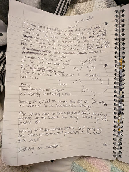
Final story layout as well as synopsis:
Story Layout:
- Illani sluggishly walking through the jungle finding an area surrounded by statues and a dragon fly weapon hanging in the middle
- grasping the weapon glows in a direction deeper into the jungle shaking to urge Illani to follow the green light the jade weapon is providing.
- curiosity outweighs concern due to her age and our brave Illani follows the light
- ending up at a large body of water with a temple in the center not seeing a way across she almost gives up though is tempted to jump into the water due to the. little weapon shaking and glowing even brighter than before
- jumping in the water she underestimated how strong the current wa and unable to swim against it she begins to drown thinking of her loneliness not wanting her life to end here she wanted a family at least before she died
- a jaguar and a woman grabs her out of the water standing on jade platforms that look magical though with the water in her lungs and the stress of what she went through she passes ou in the arms of the women
- waking up in a warm bed and stopping the smell of food she is given a choice, either stay or leave. eating the food she was given she thinks about her answer.
THE END!!!
Short synopsis:
Water calm but deadly a jungle with a hidden world. Illani is alone but fierce, a girl willing to explore the vast jungle for an ending to her story that is better than what she has now.
Actual Synopsis:
A hidden world blocked by dense leaves, void of light, and full of rushing water. A jaguar creating a bright path for the next kind soul who stumbles across the hidden prize... Illani, a girl who wants connection and care, is mysteriously led towards this brighter path. Though a bright bath does not come without trouble, in this case trouble that is fast flowing and void of warmth. Warmth that only a family could provide something that Illani has been striving for her whole young life, a determined fierce girl, is she able to get past the coldness and take the chance at having that family that love that care she so desperately wants or is she too prideful and fearful of a different path to walk than the one she is currently on? Get teased with this upcoming adventure with the short graphic novel "No longer Alone"


I now had the story, an idea for the front cover and a world to build off from. It was finally time to expand on the small thumbnail sketches that I did last week. These ideas were really just initial ideas and just to see if I actually wanted to use water colour for the background and not do it digitally. Well from these small experiments and ideas that were going around me head I learnt that the texture of the water colour compared to the digital smoothness that I would get if I did this digitally was a win, I wanted texture to be important for this comic to show the jungle from a different perspective, not just have i be the background but also like another character important piece to this story. I am also really trying with the difference in background and characters and felt like different mediums would be a good visual indicator of a background difference. Though even though I enjoyed the colour version with water colour I thought maybe i should try out grey scale i mean that would be a huge difference from the characters compared to the background but then it felt like the background was just a background there was no interesting features too it, no business that my work usually holds, nothing of visual excitement to look at.
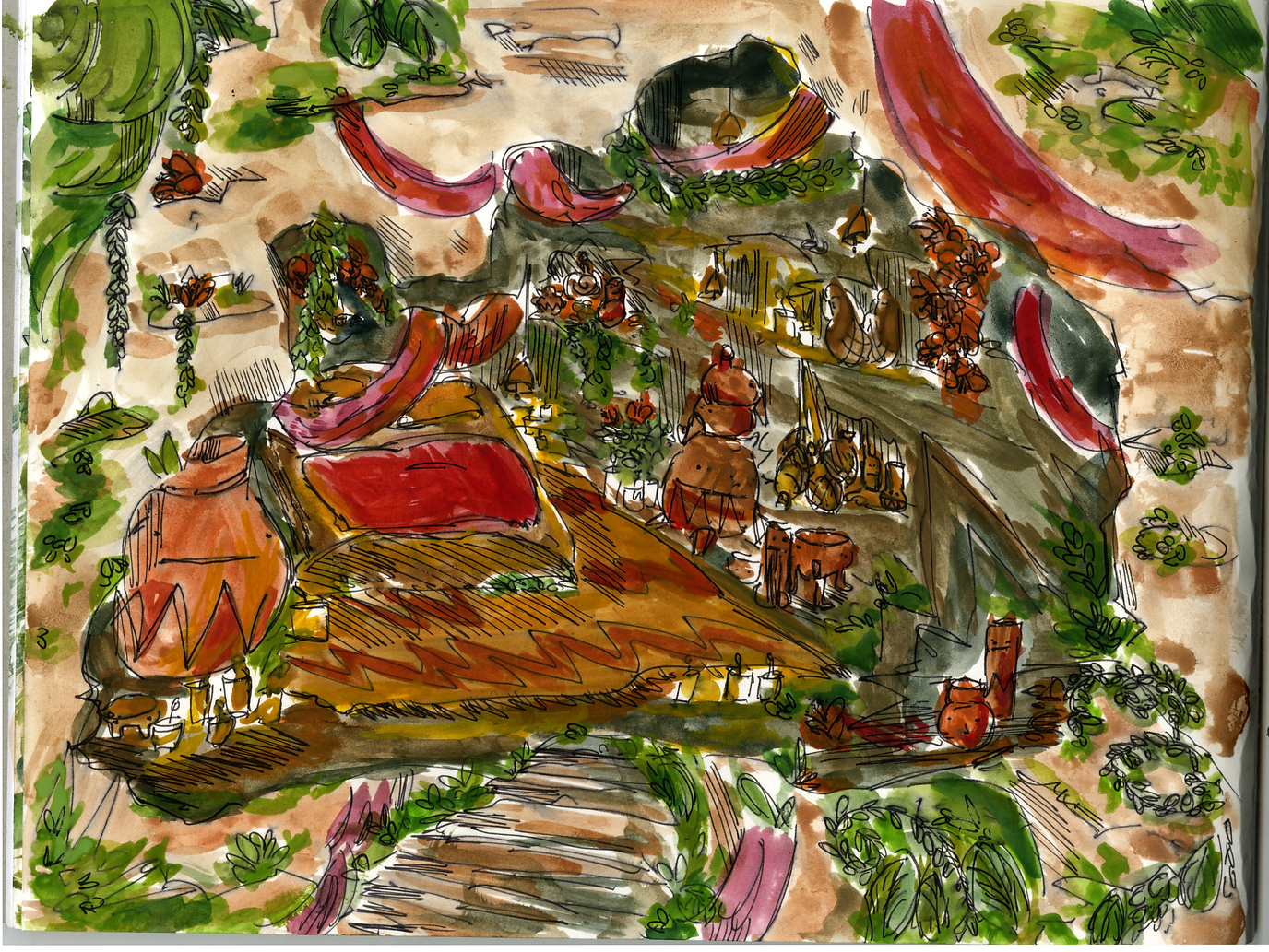
But something I did do in grey scale was do a quick painting o how i was viewing the temple in my head, I also did the silhouettes of my 2 human characters in grey scale as I had the thought of using the texture of the physical media in my character design see if that would make it stand out or fit in just a bit more. Though even with all of these initial ideas, I didn't have a place to expand off from so I made another moodboard, something that had the visual ideas of things that I wanted to include in my work and how I would make my backgrounds feel like a jungle. Something I also found out was pots! Now this is quite a weird thing to focus on but I want decoration of course in my temple and I knew pillars would be important for the temple to give it a powerful feeling but what about decorations?I found these funny pits with faces all over them and decided to sketch them from my moodboard into my sketch book to remind myself that these guys? These little pot people are something I want in my temple as I felt like it was the perfect addition to this magical hidden temple that exists in my world!


<--- this will take you to the mood board I made Please click it!!

﹌﹌﹌﹌﹌﹌﹌﹌⋆˙⟡
⋮ ⌗ ┆
✮ ⋆ ˚。𖦹 ⋆。°✩


Once I had gotten my initial ideas out, made a mood board and researched into funny pots I did some pen sketches of how I was now viewing the environment and these sketches felt fuller, more accurate and more consistent with the visual research that I did for this project. MY favourite thing that I drew was the temple idea that I had for this project. I used inspiration from one of the images in my mood board and morphed it into something to fit with the tiny sketch that I had done for the initial ideas.
I really like it and I personally believe this is what it will look like in the graphic novel from afar, i like that its a temple that feel natural and broken down but respected there's still a lot of grandeur to it a lot of worshipping like vibes to it something that was forgotten but still stands to those who are willing to find it I also enjoyed the sketch that I did with weird blobby statues as I mentioned I want the dragon fly weapon to be within a bunch statues to almost give its importance away to the reader immediately and the little sketch i did was perfect, I knew I wanted it to look like that a bunch of weird human like statues that kind of matched the funny pots i looked into so things that are in the temple link to the weapon visually without actually having to spell it out for the reader.
With these sketches complete and a clear direction that I wanted to go into I decided to make 4 larger concepts of the world but properly how I wanted it to look in the graphic novel. This is actually my first time really putting effort in with water colour its not a medium that I explore that often so it was a scary fearful thing to start I couldn't just make it look scruffy like i had in my sketches and initial ideas it had to look professional or at least clearer than random green blocks that sort of resemble a jungle. This task, even though stressful, was the funnest thing I have done so far in the project.
I can never really create good conceptual images. I always feel like they fall a bit short not truly my vision for what I want but for these. It was perfect i am really proud of what I have been able to make as well as I tried out the ink silhouettes in the backgrounds and i felt that the colours one weren't accurate to the final design turnaround I did no matter how much I edited the ink silhouettes but I felt the texture made it lend in way too much with the background and the sole purpose that I have done different mediums is respond to the feedback of making sure there is a visual difference.
With the turnarounds I did of the character I just stole a pose from each turnaround to place them in one of the completed concept backgrounds and I felt as though it was much easier to see and visually different as well as It had the accurate colours that I chose to user fo these characters without losing the brightness or the certain tones that I used. Knowing I only have 3 weeks left to complete this project the concepting background may be the final heavily influenced background for the graphic novel because I don't have the time to mull over the background over and over again I want to get straight into the graphic novel making so I have adequate time to draw all of the panels plan it all out and make it visually impactful and exciting to look at!


. ݁₊ ⊹ . ݁˖ . ݁
────۶ৎ────




Front cover!!


. ݁₊ ⊹ . ݁ ⟡ ݁ . ⊹ ₊ ݁.. ݁₊ ⊹ . ݁ ⟡ ݁ . ⊹ ₊ ݁.. ݁₊ ⊹ . ݁ ⟡ ݁ . ⊹ ₊ ݁.. ݁₊ ⊹ . ݁ ⟡ ݁ . ⊹ ₊ ݁.. ݁₊ ⊹ . ݁ ⟡ ݁ . ⊹ ₊ ݁.. ݁₊ ⊹ . ݁ ⟡ ݁ . ⊹

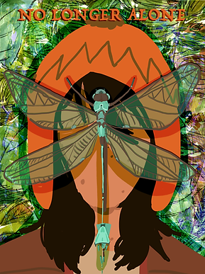
With my front cover as you can see from the plan that I did a couple of days ago I completely changed it. Why?? well I made the background physically and I really liked it but I felt as though just having a green glow would be boring I did sketch it out but it crashed so I wasn't able to save it in time, but the sketch just.. didn't feel right, I mean i liked the idea but something just felt more like an illustration than a front cover, something about front covers is they don't really show something they show like symbolism or just one aspect of it. So I looked back at my other plans that I did and I really liked the idea of including the dragonfly.
When I was doing this drawing I didn't intend for it to be a semi realistic dragon fly it was going to be the weapon she has but I felt as though the semi realism gave it more of a contrast ot the cartoon like character that i have, and it matched the semi realism line background I did. Because of where the dragon fly is situated I didn't want to draw the characters face as I thought well.. uh it would become really busy and confusing. Now the background isn't the same colour as what it is in the scanned version that is because I layered it multiple times and tried out a bunch of different filters until I got something that I liked because I felt that just as the scan it lacked personality and if I can edit it on photoshop why not. SO i did three versions of the front cover settling for the largest one on this page because the first one I did with orange text just wasn't it at all it was boring and felt that the text got lost, I asked friends and peers and they said to try it out in the middle, I thought that was more interesting but it felt sort of like a depressing front cover the text was so centred and in the face and covering the drawing that it gave me a trapped for of vibe instead of a girl who explores. Finally I tire out the lettering on the wings in my own handwriting.
I would have done it in text but I am not really sure how to edit text into a shape as well as I quite like using my own bad handwriting for things like this. I think it gives it more of a me style. Doing this idea was probably the best, it kept to adventure feeling with the different layers and overlays, made your eyes be able to focus directly into the middle with the dragon fly but also feel sort of like your inside the jungle area with her because of how busy it looks, as well as I thought that I was using negative space pretty effectively. When i have tried to make frontcovers or posters in the past I am never really satisfied with them I think there is still much more I can learn but for something where I really did try with editing this time instead of just doing a drawing and calling it quits I am proud and I hope to improve with this skill in the future but i really like what I have created, its fun a lively to look at but also feels mysterious just how i wanted it to feel!!
⤷ ゛ ˎˊ˗
﹌﹌﹌﹌﹌﹌﹌﹌﹌﹌﹌﹌﹌﹌﹌﹌﹌﹌﹌﹌﹌﹌﹌﹌﹌﹌﹌﹌﹌﹌﹌﹌﹌﹌﹌﹌﹌﹌﹌﹌﹌﹌﹌﹌﹌﹌﹌﹌﹌﹌﹌﹌﹌
Graphic Novel panel planning!!! - week 4
With the deadline of making this comic appearing rapidly only 2 weeks left after this week, I dedicated this entire week to figuring out how my story will be set out visually with panelling. Now I have tried panelling before with personal projects but I don't really do it very well. Something that I struggle with when making any story is lengthening a part of the story that sort of doesn't need that much exposition, I get quite caught up with one section of things wanting to expand on that solely but for this project it's sort of forcing me to not do that i need to be able to convey my story effectively in 4 pages.
Now I did write out my story plan last week and the week before and i do have a clear I idea on where I wanted to go from but something that I didn't have was a metaphorical episode system, I need to treat each page of my graphic novel like an episode of a show, it needs to have a cliff hanger or a want more aspect of it so people will flip the page, learn more. Something else that I looked at while making these plans is sometimes things bursting out of a panel is effective, I am going to be honest I really wanted to include that in this project because I thought it was really cool and I thought that it would make for a fun way to lay out my pages that I have to make.
So the episode system I wrote out what I was thinking so then i could take all of the 'episodes' and smoosh them all into 4 pages but with enough explanation or panels to understand what is happening with in the comic:
- Illani walking sluggishly through the jungle falling into the area with the dragon play weapon and it shows her a path way to follow (sort of forces her)
- path leads to an open area with a large body of water surrounding a cool looking temple
- the dragon fly weapon manages to escape Ilani's grasp and jump into the body of water dragging her under making her a visit being lonely just wanting to be saved
- Kuntur saves Ilani from her fate as she wakes up trying to leave the temple but is met with a magical jaguar in her way giving the graphic novel a mystery element to what happened next but ut having an ending for the main thing that was happening which was trying to get to the temple.
I thought this was a pretty effective plan to go ahead and try out but something that I instantly realised is this graphic novel 4 pages really isn't a lot of space but it is enough space I can see how to put it together just how much do I need to include in each page??
When making it to begin with I just sort of went in straight planning out everything that I was thinking for the first 2 parts of the graphic novel but I couldn't even get past the first part where she slips and falls into the area with the weapon. It was just too long, though after communicating with lecturers about what to do I had to look critically at things critically to see what could be removed, even though it may be A nice thing to look at and have if I had the space for it and it may be something that is nice to see the mood of what is happening but I don't have that choice I have to try and get it through 4 pages.
I felt discouraged and I was worried that maybe the story I had was too long, maybe I misplanned it though I didn't give up instead of doing massive pages of each idea I did the comic ideas that I had separated a whole page into 4 I don't know why this helps i guess its because I didn't have as much space on the ara that i was drawing in it helped me look at things critically and how to make the compact panels not too smooshed together but enough there to give the mood the idea the story and suddenly it clicked i felt comfortable with putting down all of my idea i had for each 'episode' of the graphic novel. Something that I struggled with was the third page where I really wanted a large space to be used for when Ilanni gets dragged into the body of water and I had a clear vision. It was just making sure the pose was an interesting looking enough pose and as well hopefully as a viewer you could read it.
Turns out my worries weren't actually that bad as I asked peers and they all said my first attempt that I had done was perfectly fine and that as the clearest version the other versions made it too confusing. I am really grateful that I asked others because by this time I had been looking at it for ages and I was just sort of exhausted. Making the final panelling for the final part I was worried, what If I could n't show the saving and the well very important ending and yeah it was hard but I realised if I just do what I had been doing making sure that i pur enough information but not too much that it because more key framing for an animation, or too many actions that just weren't needed to be seen in a short form graphic novel and I got it. After I had done that I had to go through everything that I had drawn and panelled out and planned to pick what I wanted to draw larger as the final plan for the whole graphic novel.


FINAL SKETCHED PAGES
⋆𐙚₊˚⊹♡
To make the sketch of the comic as I said I had to go through everything and choose 4 pages that I liked something that i had to make sure that I took into account is how we as westerners read graphic novels so the pages I chose to draw where mainly focused on the readability of it.
Once I had selected the ones that I wanted I just sort of used my sketch book as it was the correct size for how big the pages need to be and I carefully planned out all of the plannels drawing in each of them carefully, this took so much longer than I thought i would because i had top physically draw the boxes, and it was much harder to make a straight line with a ruler than I thought it should of been it may of been due to other external reasons with my health at the time but I was struggling, though I still managed to do it, as i said i really wanted to add the escaping frames where they came out of the panels that i had set for it and to ensure that the pages that i i chose i didnt just show it too peers at uni I showed it to outside peers that didnt know anything about my graphic novel i showed to to my parents throughout the stage just to make sure that it was visually understanding and appealing. I think with out all of the talking I did with everyone else this graphic novel wouldn't loo like this i think I would of gotten too caught up in one section of the novel but I am really really happy that other people assisted with me on how to make it readable for more than just me, it's something that i really do struggle with but I suppose it's pretty fixable when you just communicate.
Anyway, enough of that, here are my final sketches for each page of the graphic novel. I really like what I have produced and now the last thing to do is I'll actually make this in colour and complete 4 pages!!!!
────୨ৎ────


I think my favourite thing about my graphic novel is what i did for the sounds that i think are important to showcase, I didn’t know the work for it but apparently is onomatopoeia
Graphic novel testing what it will look like with a chosen frame... - week 4

So to ensure that I was making the right decision with how my comic will actually look, I picked a panel that I made in the sketch and did it 3 different ways, three different ways that I was still mulling over whether I should do it like that or not. I picked this scene specially because it has 3 different scenes in it and the idea is for it to be from morning to evening to show time passing that the trek was long to get to the three ways I wanted to try this out was with entirely water colour, then water coloured backgrounds and characters done digitally and I still wasn't sure if I did hate the ink idea that much so I wanted to try that out. Now for this comic panel I did it on a MUCH larger scale to what it is going to be as it is quite small in the comic so I won't be able to have nearly as much detail in it but this was also to ensure that I can actually put the detail in it. When I actually do this panel it will most likely be more blob-like then perfectly detailed as you just won't be able to see it all.
As you can see next to this text is the entirely water coloured one. Now I really really like doing this. I thought it was super fun and I didn't have to scan anything and merge different things together. The only problem is that the colours for my character weren't accurate to how I wanted it to look. I didn't spend all that time on a turnaround to completely ignore the accurate colours. I mean yes. was able to sort of match it but it wasn't as vibrant. As well as I realy liked how the background looked for this one, I did an underpainting of something like a changing in light and I think it was able to convey it pretty well. Something else that I struggled with this idea is because I lost the dragon fly weapon with in the background I literally couldn't replicate the jade colour at all I tried multiple times but layering it over and over again just made it too dark and you can barely even see it, the whole reason I was thinking about doing 2 different mediums was it ensure that the backgrounds and the characters were different from each other. I do like the line style and how it was completely embedded within the drawing but it was the colours. I am not opposed to this idea. I could go over it with the correct colours but then it would be just doing the next idea that I did anyway. Something that i did like about this one though was i didn't focus too much on the details but it still has enough detail and knowing that everything is going to be shrunk down i really need to think about that because if there is too many lines too many details you literally will not be able to make out anything.


The next thing I did was pretty much the same thing that I did for the other one. Instead of doing it all together I did it separately. Doing it separately gave it more of a comic feeling through the problem was I got list with in details and these are wayyyyyy to detailed for that the pane is but I think it's okay as this is just an experiment to see if I have made the right decision for how I will be making the full graphic novel. So this is what I want to go with before I did this task and I still think this is the best version of everything that I tried out I mean it has all of the colour what i want and it distinguishes the character from the background but the line art I was able to fo made it fit right in with the line art I did physically. I really like it all and especially I was able to get the dragon fly weapon to actually be visible compared to the background.


For the final version I wanted to do it in ink and re hue it in photoshop as i dont have come in but i thought i would be fun to do with ink and try it all out because I thought that the texture was bad when I did it originally butI still really liked the way that it looked with the washed out feeling?? These took so much longer than I thought it would because oh my gosh, making sure I didn't mess up in ink and so I didn't spill ink everywhere was very hard but once I got it down it was a lot of fun. I really like this technique of recolouring it in photoshop but I don't think that the style fits with what I am trying to make. It feels too soft and I want to make sure that the jungle feels crowded and over the top and this style didn't give me that. Though I am not saying it is bad I would love to use this for a different project in the future because I really like the way it all looks especially with cutting out some parts of the background and overlaying it on top of each other it gives it even more of a washed out feeling.
Overall I think i will be doing th water colour on because it gives off the correct vibe and visual feeling that i want for this graphic novel though something i need to make sure I remember is ot to overcomplicate the background like i have for the ink one and the just watercolour one because those would be easier to read in a smaller format, not too many lives more focused on depth and tone with the medium I am using try and use less lines!!!! So even though i sort of already knew which style to wa gonna go with, doing this task helped me understand what I really need to be able to do for the final novel because if you can't read it then it's pretty much useless and is a failure of a graphic novel.
⠀⠀⠀⠀⠀⠀⠀⠀⠀⠀⠀⠀⠀⠀⠀⠀⢀⣠⡀⠀⡖⢉⢲⠀⠀⠀⠀⠀⠀⠀⠀⠀⠀⠀⠀⠀⠀⠀⠀⠀
⠀⠀⠀⠀⠀⠀⠀⠀⠀⠀⠀⠀⠀⠀⠀⣠⣏⠰⠎⢀⣣⣈⣁⣀⣀⠀⠀⠀⠀⠀⠀⠀⠀⠀⠀⠀⠀⠀⠀⠀
⠀⠀⠀⠀⠀⠀⠀⠀⠀⠀⠀⠀⠀⠀⠀⠂⠍⠟⠉⣩⠖⠉⠁⠀⠈⠙⠦⡀⠀⠀⠀⠀⠀⠀⠀⠀⠀⠀⠀⠀
⠀⠀⠀⠀⠀⠀⠀⠀⠀⠀⠀⠀⠀⠀⠀⠀⠀⠌⣼⠃⠀⠀⠀⠀⠀⠀⠀⠘⣆⠀⠀⠀⠀⠀⠀⠀⠀⠀⠀⠀
⠀⠀⠀⠀⠀⠀⠀⠀⠀⠀⠀⠀⠀⠀⠀⠀⢨⢸⣏⠀⠀⠀⢠⣤⣤⠀⠀⠀⢹⠀⠀⠀⠀⠀⠀⠀⠀⠀⠀⠀
⠀⠀⠀⠀⠀⠀⠀⠀⠀⠀⠀⠀⠀⠀⠀⠀⠀⠈⣿⡄⠀⠀⠘⠂⣸⠇⠀⢀⡿⣀⠤⢀⠖⠀⠀⠀⠀⠀⠀⠀
⠀⠀⠀⠀⠀⠀⠀⠀⠀⠀⠀⠀⠀⠀⠀⠀⠀⠀⠘⠻⣦⣤⣤⡶⠋⠀⣠⣾⣿⡵⠦⢡⡬⠀⠀⠀⠀⠀⠀⠀
⠀⠀⠀⠀⠀⣀⣤⣶⡲⡲⡤⢀⡀⠀⠀⠀⠀⠀⠀⠀⠀⠈⠀⠀⢀⣴⣿⠋⡟⢧⠈⢂⡐⠀⠀⠀⠀⠀⠀⠀
⠀⠀⣠⠖⠉⠀⠀⠀⠈⠉⠪⢦⡙⢷⡄⠀⠀⢠⠜⠃⡠⠀⠀⣠⣾⠟⠁⠀⠈⠂⡆⠂⣀⣀⠀⠀⠀⠀⠀⠀
⢀⡜⠁⠀⠀⠀⠀⠀⠀⠀⠀⠈⠺⡐⢍⢆⠀⠀⠇⠢⠆⢀⣴⡿⠋⡠⠔⠒⠦⡄⠀⠀⠜⠻⠁⠀⠀⠀⠀⠀
⡜⠀⠀⠀⠀⠀⢀⣀⡀⠀⠀⠀⠀⠘⢮⢑⢆⠀⠀⠀⣴⡿⠋⠀⢰⠀⠠⢄⢀⠹⠀⠀⠀⠀⠀⠀⠀⠀⠀⠀
⡇⠀⠀⠀⢀⣾⡿⠛⠛⠷⣄⠀⠀⠀⠈⢮⡘⡄⠀⣼⢿⡇⠅⠀⠈⠳⠦⠊⡀⢰⠤⠶⢶⣦⡄⠀⡇⠀⠀⠀
⢧⠀⠀⠀⠸⣿⠁⢀⠀⠀⠘⡆⠀⠀⢀⠈⢎⢇⣸⠃⠂⠹⣄⡁⠂⠠⠀⢂⠔⠁⢀⠤⠀⣿⣿⡈⠀⠀⠀⠀
⠘⣆⠀⠀⠀⠈⠒⠚⠀⠀⠀⡇⠀⠘⠻⠀⠘⣿⡏⠈⣠⠤⢬⣝⠛⠛⠉⢁⡀⠀⠘⢶⣶⡿⠓⠀⠀⠀⠀⠀
⠀⠘⣆⠀⠀⠀⠀⠀⠀⢀⡴⠁⢀⠀⠀⢀⠀⣿⣡⠎⢀⠔⣤⠈⡇⠀⢄⠈⠑⢐⠄⠀⠀⠐⠀⠀⠀⠀⠀⠀
⠀⠀⠈⠷⣄⣀⢀⣀⣠⠏⠀⠀⣄⠀⢌⠸⠀⣿⣿⠀⠈⠄⠡⠌⠀⠀⡈⣀⡀⡁⠀⠀⠠⠀⠀⠀⠀⠀⠀⠀
⠀⠀⠀⠀⠀⠉⠉⠉⠀⠀⠀⠄⡃⠩⡆⡁⠠⣿⣏⠀⠀⣠⠶⠶⡄⠀⠁⢀⣈⣃⣀⠐⠀⠀⠀⠀⠀⠀⠀⠀
⠀⠀⠀⠀⠀⠀⠀⠀⠀⠀⠀⠀⢗⠉⠉⠄⢸⡿⢻⡀⠀⢿⣄⠇⡹⢠⣶⡿⠛⠛⠻⢿⣦⡄⠀⠀⠀⠀⠀⠀
⠀⠀⠀⠀⠀⠀⠀⠆⡈⣄⢴⠂⠃⠀⠀⠀⠠⣿⠰⠙⣦⠤⠤⠊⢰⣿⠃⠀⠀⣀⡀⠀⠘⢿⡄⠀⠀⠀⠀⠀
⠀⠀⠀⠀⠀⠀⢙⣻⡾⡛⠩⠉⠍⠙⡳⢦⡀⢻⡨⠁⠈⠳⡀⠀⢸⣿⡀⠀⢸⣋⠻⡄⠀⠘⡇⠀⠀⠀⠀⠀
⠀⠀⠀⠀⠀⠀⡴⢁⠁⠀⠀⠀⠀⠀⠀⠂⠙⢾⣇⠂⡎⣙⡟⡄⠀⢻⣧⠀⠀⠁⡰⠁⠀⢠⠇⠀⠀⠀⠀⠀
⠀⠀⠀⠀⠀⡸⠡⠀⠀⠀⠀⢀⣀⣀⠀⠀⠀⠀⠹⣦⡱⢬⡤⠇⠀⠀⠉⠛⠲⠉⠀⠀⣠⠎⠀⠀⠀⠀⠀⠀
⠀⠀⠀⠀⠀⣏⡇⠀⠀⢀⡜⠉⠀⠀⠙⢆⠀⠀⠀⠹⣟⠢⣀⡀⠀⠀⠀⠀⢁⣀⡤⠞⠁⠀⠀⠀⠀⠀⠀⠀
⠀⠀⠀⠀⠀⠣⡹⡄⠀⠘⣄⠀⠈⡁⠀⢸⡆⠀⠀⠀⠙⣎⢃⠊⠋⢍⣸⣉⡉⠁⢤⣴⣀⠀⠀⠀⠀⠀⠀⠀
⠀⠀⠀⠀⠀⠘⡂⢝⢦⣀⠈⠛⠈⠀⠀⡜⠀⣘⠂⢚⠀⠈⢧⡡⠠⠏⠱⣲⠙⡄⠉⠛⠀⠀⠀⠀⠀⠀⠀⠀
⠀⠀⠀⠀⠀⠀⠑⡡⡪⡫⡓⡦⠤⡄⠊⠀⠈⠁⢂⠊⠁⠀⠀⠹⣄⢇⡘⢶⣞⣁⣀⣤⣀⠀⠀⠀⠀⠀⠀⠀
⠀⠀⠀⠀⠀⠀⠀⠀⠑⠚⠒⠊⠁⠀⠀⠀⠀⠀⠀⠀⢀⣀⣀⠀⠈⠳⣌⠉⠁⢠⢒⣦⠀⢡⠀⠀⠀⠀⠀⠀
⠀⠀⠀⠀⠀⠀⠀⠀⠀⠀⠀⠀⠀⠀⠀⠀⠀⠀⢀⣾⠏⣤⣸⠇⠀⠀⠈⠣⡀⢹⣌⣁⣠⠎⡴⠚⠉⠑⢦⠀
⠀⠀⠀⠀⠀⠀⠀⠀⠀⠀⠀⠀⠀⠀⠀⠀⠀⠀⠘⢿⣄⣀⣀⣀⣠⡴⢶⡶⠾⣦⡈⠉⠀⠸⣅⢠⡄⠀⢈⡆
⠀⠀⠀⠀⠀⠀⠀⠀⠀⠀⠀⠀⠀⠀⠀⠀⠀⠀⠀⠀⠉⠉⠉⠉⠀⢀⠊⣀⡂⡀⠈⠢⢄⡀⠈⠉⠀⣀⣾⠃
⠀⠀⠀⠀⠀⠀⠀⠀⠀⠀⠀⠀⠀⠀⠀⠀⠀⠀⠀⠀⠀⠀⠀⠀⠀⠈⢆⣃⡼⠀⠀⠈⠀⠉⠛⠲⠟⠋⠁⠀
°❀⋆.ೃ࿔*:・°❀⋆.ೃ࿔*:・