SUMMER HOLIDAY WORK !!!!
⠀⠀⠀⠀⢀⣤⠤⣄⠀⠀⠀⠀⣠⠤⣄⠀⠀⠀
⠀⠀⠀⢠⠞⠀⠀⠈⢷⠀⠀⡜⠃⠀⠈⢳⠀⠀
⠀⠀⠀⣾⠀⠀⠀⠀⠘⡇⢰⠅⠀⠀⠀⠸⡇⠀
⠀⠀⠀⣿⠀⠀⠀⠀⠀⡇⣾⠀⠀⠀⠀⢸⠃⠀
⠀⠀⠀⢹⡀⠀⠀⠀⠀⡇⣿⠀⠀⠀⠀⡾⠀⠀
⠀⠀⠀⠸⡇⠀⠀⠀⠀⠷⠿⠀⠀⠀⢰⠇⠀⠀
⠀⢀⡴⠛⠃⠀⠀⠀⠀⠀⠀⠀⠀⠀⠘⢶⡀⠀
⢰⠟⠀⠀⠀⠀⠀⠀⠀⠀⠀⠀⠀⠀⠀⠀⢻⡄
⣿⠁⠀⠀⠀⠀⠀⠀⠀⠀⠀⠀⠀⠀⠀⠀⠀⣷
⢹⠀⠀⠀⢰⡆⠀⠀⠀⠀⠀⠀⢀⣄⠀⠀⠀⡟
⠈⢧⡀⠀⠀⠀⠀⠀⢄⡀⣀⠀⠀⠁⠀⠀⣸⠃
⠀⠈⠻⢦⣀⠀⠀⠀⠚⠙⠂⠀⠀⠀⣀⡴⠋⠀
⠀⠀⠀⠀⠈⠉⠓⠒⠲⠶⠶⠒⠒⠋⠁⠀⠀⠀
────୨ৎ────
This is my summer holiday work that I get set to do over the time I am at uni!! As I wont always have summer holidays but this is the perfect time to use and take advantage of and improve on my skills as an aspiring artist and animator!!
Of course what I do for uni work isnt ALL that I do in the summer I have been trying to improve my skills with personal projects and just keeping up with drawing almost every day that I can so my skills stay consistent !!
ᜊ( ' ⩊ '𖦹)ᜊ
⏔⏔⏔ ꒰ ᧔ෆ᧓ ꒱ ⏔⏔⏔
˚. ᵎᵎ
(♡ˊ͈ ꒳ ˋ͈)
SUMMER OF 2026!! ㋡
The brief for the work I needed to complete over the summer holidays was I needed to create a looping GIF of a character that I create from an interesting object that I own or a interesting area of where I live, an action that describes them as a person/character, a backstory and why tat character is the way they are.
Observational drawings ૮₍ ´ ꒳ `₎ა
For the observational drawing I wanted to make sure that I picked something I find interesting, I struggled a lot with the object picking task, where i live doesn't really have an cool places to look at it just is a bunch of hairdressers and boring looking houses (as i am back at my parents house for the summer!!!).
So I decided to go with an object, my original thought process was to use some of my dads tech stuff he has a lot of game consoles and a lot of old consoles or new things like a vr headset/vr controllers I thought they looked interesting but I just couldn't decide from the quantity of the things my dad owns. I do still want to try out that idea of making things from technology but I put that idea benched in my head for a later date to use at some point with something else as I like it but choosing was difficult. I decided well my own object and possession that I have that can be fun to use.
Now my room is very.. messy there is allot of things that are in there so i was even more confused on what to pick but something that is very important to me and my room and sort of anywhere where I it is stuffed animals/teddies and one of my teddies is a quite interesting thing to look at. I have had him since I was around 3 years old and he has been stitched onto a different body. I thought oh I could make him into a Frankenstein but that felt wrong. I mean its the obvious answer to go with because Pengy (that’s his name) is 2 different teddies as well as he is covered in pieces of fabric that I deem important that all links to my family, but for myself personally as I have had pengy for a longtime Frankenstein did feel right I mean it was of course an option. I was going to use it but this object doesn't only just look strange, it holds a lot of emotional value and has been there through everything so I wanted to showcase something of myself in the design that I chose.
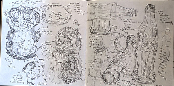
But besides that I had to start drawing him I needed to start observing what he looks like so hopefully more ideas can start springing into my head. Now as it was only one object I had an idea BUT one of my favourite things to collect is random things I just like things like glass and rocks and just anything really that i think looks nice. Now pengy already looks pretty funky butI felt like something was missing so i picked one of my favourite things i kept which is a glass coke bottle I thought it looked cool and e kept it to use for an art project I thought it would be a good thing to use so I decided to use it to this. Now the coke bottle isn't very interesting but I didn't care for the look of it. I care about what it did to pengy when he was behind the bottle. It made it all blurry and wobbly. I liked the way things looked through the bottle. which helped me to generate ideas in my head.
The Observational drawings were actually quite successful in my opinion. I mean usually I always struggle at the beginning of observational drawings and they don't look good but I just decided to draw what was going on inside my brain when I was looking at pengy and the bottle together. It helped me pick out parts of the items that I really liked and I thought I would like to incorporate into my design for the eventual character I chose to make. I decided to do the observational training in multiple different media just because I own the media and I wanted to use them. It was really fun to do and something that I did use that I have never really touched before was water colour, I have used it a couple of times but i didn't really understand wt though with this project I thought it would go quite well as the glass bottle has that water colour like feel with blurriness, I also really wanted to try it out, because I was inspired by other people online who I had seen use water colour.
I actually enjoyed using the watercolour and all the different media. It challenged me to look at things in a different way and not focus on small parts like I did at the beginning but how the 2 objects behave with each other and them as one thing not as 2 separate things. It was really helping me cook up multiple ideas in my head for the next stage which was initial designs/thoughts.
. ݁₊ ⊹ . ݁ ⟡ ݁ . ⊹ ₊ ݁.
͙͘͡★
﹌﹌﹌﹌﹌﹌﹌﹌.𖥔 ݁ ˖
. ݁₊ ⊹ . ݁˖ . ݁(˵◝ ⩊ ◜˵マ


(๑-﹏-๑)
──── ⟡ ݁₊ . ────


⋆⭒˚.⋆
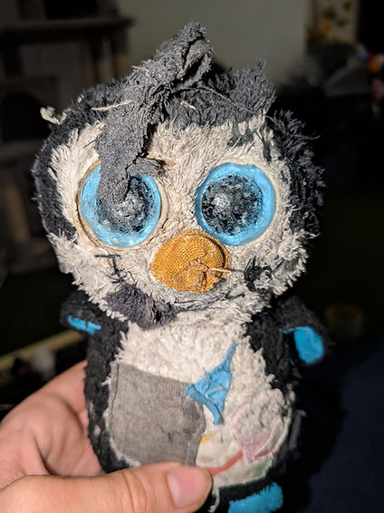

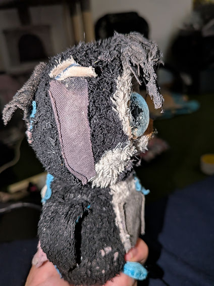
Here is pengy!!

Initial ideas !!
For the initial ideas. took everything that I was thinking about and just sort of vomited it onto the page. It was a lot of messy loose sketches not really thinking about how good they looked. When doing the sketches I tried to explore things that I don't usually think of as an actual penguin. I had this idea that I really wanted to do but here's the timing, I wanted to use this project as something to push myself to try and do things that I don't usually do. I really liked the idea of him being an experienced child though not only is that something that is quite basic for ME to do and it didn't include the blurriness of the bottle. I had more ideas of the bottle being an actual bottle so then I could make out pengy was a drunk but I didn't like that I mean usually in media drunks are depicted as abusive and pengy has helped me through everything even though he is just a teddy I didn't want him to perceive as that. It also didn't encapsulate the blurriness that the bottle created. I took the idea of the experienced child and the idea of a blurry memory of a drunk and created a sort of obsessive streamer who wants attention.
Now that I really liked that idea, it felt like there was that blurriness that the bottle created because social media fabricates everything as well as the need for attention is something that I can't relate to. Not that I want attention. I wanted it to more link to the issues that I deal with and the attention they grab. Specifically ocd. I felt with an experienced child's idea it would be pretty clean and for a drunk/frankenstein it's kind of gross and those things made me think about my ocd. Now that might not make any sense but personally with ocd it's focused around cleaning and the other thing that is never spoken about is the intrusive thoughts that you get along side oc that make you feel sick and gross. With this character I thought maybe i il keep the ideas of the experiment child of the eyes I really liked the idea of taking Pengy's eyes and making them to be loads but I felt like I didn't really like it, I mean I did but I wanted to try harder I don't usually make "normal" looking characters, they always have sort of power or are a mixed with another animal or something like that. I wanted to try out conveying the feeling of intrusive thought, obsession with cleaning and the constant fixation on safety that my ocd creates through just a normal person. Not someone who has cool powers to showcase it just someone who could be anyone like me.
I really liked this idea, I mean I do still wish i did the experimented child idea because cool powers and suepr heros and magic is something I really like but I think that's personally how I see Pengy to be honest i mean he has been through alot because of me, but including the bottle and the idea of blurriness as well as the challenge I wanted to do for myself which is not go for something that I always fo for. Made me think harder and more into the idea creating something that I think has a better impact as a character even if he is just a rural looking guy he is a good description on how i feel about my ocd sepsfically.. disgusting I hate it and I think that should be more normalised not making it out to be this funny disorder that is just to do with cleaning and you have to have things perfect.


"( – ⌓ – )જ⁀➴


‧₊˚ ┊

──★ ˙🍓 ̟ !!
“(ノ _ <,, )
Expanding the idea I had !!
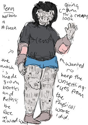
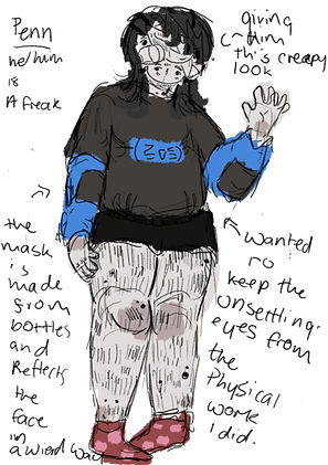
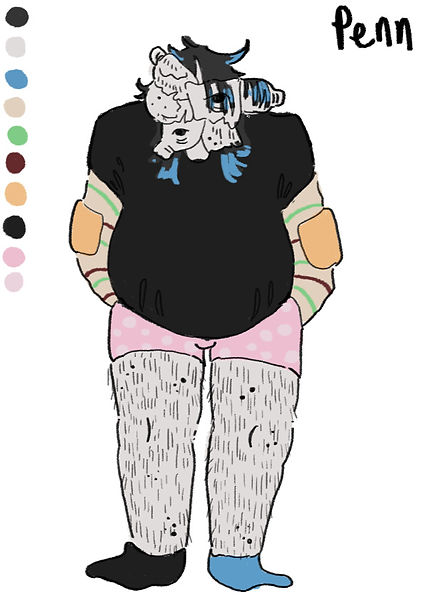
Now for the idea that I drew I made pengy really skinny,Pengy isn't skinny he is very round he has lots of stuffing and special plastic beads inside of him, I wanted to keep that visual look as I new that pengy is going to be a human character not an actual penguin. So for the design I decided to do a chubbier body when trying to figure out how he would look. The best way to describe the way I decided how he would look is I looked at myself and imagined him as a penguin and chubby. I tried out different outfits and different face/mask ideas as this part was important, usually when I design a character. I base their clothes and things off of their magical part of them. But his character is set in modern day and is just a regular person so the ideas for the outfits were more important to me than they have had before. I decided to go for an outfit that I liked with his fabric parts the cover pengy as they are parts of clothes from my family members and I thought having just a jumper and underwear was a good idea because usually the streamer isn't showing their legs just their half body of the top and I thought it would be like understandable if he just doesn't where anything there because he's next to a hot pc most of the time streaming. I also felt that with lame clothes it gave a moe of a repressed feeling just putting anything that you can because of the filth that he lives in.
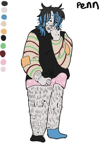
Due to the fact that I was expanding the ideas adding different colours though that art was quite simple I just copied colours from pengy, I didn't struggle with that [art because I was already given a pretty good colour scheme and I wanted to make sure that because this character int a penguin or like physically pengy I kept as many things asI could form actual energy to transition him into a human.
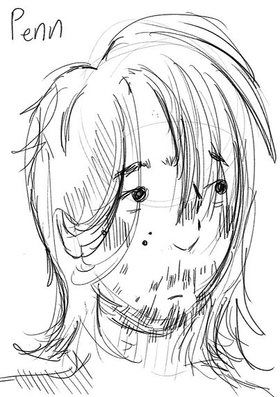
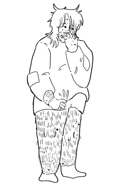
for this design I had quite a lot of fun, i mean it was difficult because I didn't want to add too many features that made him too "specail looking" I just want him to look normal. With the diesel I started to develop a full on backstory and reasons behind the way this character who I named Penn to fit with his teddy name does what he does! (see below what I wrote when I was first creating this character and I wrote it alongside while I was colouring things and figuring out colour schemes)
・・・・・ㅤ♡ྀི ₊౨ৎ
𑁍ࠬܓ


૮(◞ ‸ ◟ )ა
(˵◝ ⩊ ◜˵マ
⋆ ˚。⋆୨୧˚꩜






༘˚⋆𐙚。⋆𖦹.✧˚

✩₊˚.⋆☾⋆⁺₊✧
-ˋˏ┈┈┈┈
(っ- ‸ - ς)

Design for the background
For the background I wanted it to look a lot like my room but alot my parents room as well there is a pc in my parents room. I really like the ideas I had . It was all quite nice to do, I am not really that good at backgrounds. Personally I struggle with them quite a lot but I mean I spend a lot of time in both of those rooms so it felt easier to connect the 2 things to put together. I
t sort of taught me that if I am among normal projects that aren't this summer holiday project that I should really. used the real world. Usually I don't which I know isn't very smart but I don't really do it because I never know what to pick but fleshing out the story for who he was helped me develop the ideas for the background everything grew around the personality I had made. When I make projects I have always developed in tanadem with each other but I always feel like they fall short and don't look as cool as I want them to. But with the personality it's like that spread into the ideas for the background. Now I did actually plan to do more than one set of colours for the background to try it out but I instantly chose the green one that I did because it felt toxic and I want that sort of grossly sickly feeling because he lives in filth, the green also makes me thinks of computers the glowing sensation that green has and I thought that also fit really well. I also liked how the green I picked was indeed linked with Penn but they were just different enough to distinguish them from each other.

(⸝⸝⸝╸w╺⸝⸝⸝)
﹌﹌﹌﹌﹌꒰ᐢ. ̫ .ᐢ꒱
⋆。゚☁︎。⋆。 ゚☾ ゚。⋆


I liked doing the idea of multiplying wires in the area of the apartment that Penn lives in because it felt messy but organised I mean all of the wire would go to somewhere important but the easy ness I think visually represent how it feels to have all those intrusive thoughts with ocd those hurtful thoughts with depression and anxiety the worries that surround being exposed for this characters personality I just felt like have an organised mess felt like the correct choice.
૮₍´˶• . • ⑅ ₎ა


┈┈┈┈┈┈┈┈ ( ≧ᗜ≦)
⋆˚✿˖°
(# `Д ‘)
The completed drawings of Penn was to get an understanding of his character also so I could see him from all angles so when it came to the animation it would be easier. I had alot of fun doingthese drawing pen really feels fleshed out and like a character I could use for other things.
Planning the animation !!
This was the apart that I struggle with the most, I really like everything that i did and I had an idea for what I wanted the animation to be which is penn stretching it just felt right i Mean he is spreading pretty Much all day at his desk and streaming a good old stretch probably feels divine, I felt like that explain my charterer well enough as well as the fitting background. For the planning it wasn't what the action was gonna be I already had that down it was more of the camera angel, where did I want the camera to be situated?? At the pc MOST likely but I also had made a concept of a whole room I just wasn't sure where the camera position would sit for the animation so I tried it out in sketches until I ended up with the ine that I wanted it was a lot of trial a error. Though one i did it I did a little illustration to see everything together not in the camera angle I literally just wanted too see how penn looked like in his space. Something that I decided to and while doing this art of the planning, was well pengy is the humanised version in the this universe of my ocd and well pengy is gonna need his own version of pengy so. decided to make me into a teddy just like pengy!! now this wont be in the animation (you will see that in th planning I did think about putting me into the final animation set up but I thoght that I would be too distacting) I just thought it would be nice to have his own version of me, it felt like the character was complete with it an item they love as well as i hidden identity and a messy room it felt right. the ideas for the animation setting and how ti would all loo together is also limited to a very specific dimensions which would be 1080x1080 so the camera and perspective had to be with in the limitations which is also why I think I struggled with how penn would sit in the space with the camera angle.
Once i had done that and the illustration the final stg was upon me, the actual animating itself which proved to be harder than I thought it would be!


⋆.˚✮🎧✮˚.⋆
૮₍˶ᵔ ᵕ ᵔ˶₎ა


ﮩ٨ـﮩﮩ٨ـ♡ﮩ٨ـﮩﮩ٨ـ
𓏲 ๋࣭ ࣪ ˖
. ݁₊ ⊹ . ݁ ⟡ ݁ . ⊹ ₊ ݁.
(ó﹏ò。)
⏔⏔⏔ ꒰ ᧔ෆ᧓ ꒱ ⏔⏔⏔
This drawing was meant to be the perspective that I was going to go for but I didn't because I couldn't of been able to fit the movement in thatI wanted and I also really didn't like that how the camera was like that it just didn't look right it felt like he was enclosed in a time box area inside of an apartment so for the final idea i wanted to stretch the whole scene to be elongated so it felt more like a room and not a small little box. Also this illustration was really fun to create to see everything finally put all together.
ANIMATING!!!!
⭑.ᐟ
ꉂ(˵˃ ᗜ ˂˵)
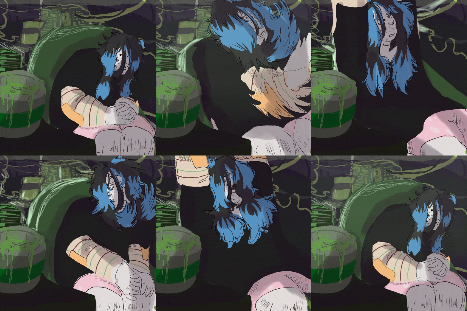
The animation process now was much harder than I thought it would be though once I had the hang of it I REALLY liked the final outcome. The animation that I started off with was a simple head turn because I decided to use tv paint and not adobe animation due to the optimisation it has and I used adobe animation before I just wanted to keep trying and developing my tv paint skills.
I did the head turn. It wasn't great, it was just to remind myself how to use the software. After that I got to the actual animating which was the stretch. Now there is actually a secret hidden reason I wanted to do a stretch animation because of feedback that I was given to do with my last set of work I wanted to try and include what I needed to work on. I know I need to work on things being clear and doing this simple movement is something that I assumed would be easy to not mess up but it's quite simple actually to mess up horribly. As well as i wanted to try and improve on the whole stopping starting kind of idea with stretching like it is a fast process but there are things that happen to our body like holding in certain places and your body being sort of bouncy, I also really want to get better at using key frames and planning things out I am so like comfortable with pose to pose but pose to pose doesn't always work for certain things and this time all of the planning really came to be suepr duper helpful I Used the past mistakes that I made and kept building on top of it having different layers to look back on, to make sure that the animation was better than the key frames or made more sense with timing for certain areas.
Now because it needs to be a gif this animation cannot be too big other wise the gif will have trouble exporting (i figured that out with a different thing I have done in the past) and because I was gonna fully colour it and try and make it look nice I had to limit myself to how many frames i could use and how many movements it could of been. I think I did alright to be honest I mean I know this isn't the best animation but I would say that the animation is one of the clearer ones I have done so far in learning how to animate better and I really like how everything works together. I am disappointed that I didn't get to do the experimental hold of version I thin if I could re do it I would of done that one because I believe it would of been more fun to design but I am glad i have just trying to make something outside of my comfort zone ago because it really made me think about what each step meant and how it all tied into the character and the story line.
Something I did try out in this animation was smear lines I have never really done them before and I was inspired but this animation I had seen on TikTok that yes. unfortunately didn’t save because I completely forgot to and there is no way I can find it now but it broke down smear process, doing the smearing made the animation feel allot more alive and bouncy I teally liked doing ti I definitely want to include it again in future animations to get better at it because it made the faster moment section of the stretch work better than i think it would of been if I had animated each and every single frame to make a "smoother" process of course I don't want to overuse them but its something I definitely want to take forward.
────୨ৎ────
⊹₊˚‧︵‿₊୨ᰔ୧₊‿︵‧˚₊⊹
₊˚⊹♡
As over the summer I have been working just overall on my art the way I did this animation was a little bit different to how I usually do my animations I decided to block in everything first with colour and the line parts I felt needed lining over the top, doing art this way has really helped me work on line weight and how to use different sizes of brushes more accurately I mean i am not saying i’ve mastered it because I definitely haven't I still have a long way to go but this work feels much more published and easier to look at than past animations.
FINAL PRODUCT!!!!!
⤷ ゛ ˎˊ˗
૮꒰ ˶• ༝ •˶꒱ა ♡
﹌﹌﹌﹌﹌﹌﹌﹌ᝰ.ᐟ
˙✧˖°📷 ༘ ⋆。˚
*ੈ✩‧₊˚༺☆༻*ੈ✩‧₊˚
⋆˚꩜。ּ
⋆˚𝜗𝜚˚⋆── .✦゛ ⸝⸝.ᐟ⋆
͙͘͡★
I really like my animation. I know it isn't the best like at all and it has a slight jigger to it but I quite like it a lot. I do think I need to work on lighting more. THough for putting a background and a character together and being able to visually understand the difference from them is a very big accomplishment for me, everything works together but also is separate enough that it looks good. I also tried making it feel more like it's real but overlapping the front cabinet over penns legs that were stretching because well it made it feel more like he was inside of that space he is always there and it gives it a bit more depth. I used lots of layers for this animation and usually I dot because I don’t see the point in doing it. I do now it makes things so much easier to modify and move around if it's on a separate layer so that is something I really am going to keep doing in the future.