⤷ Animation Skillz ୭ ˚. ᵎᵎ
- freyamanning0
- Dec 6, 2025
- 15 min read

WEEK 11 -
objectives:
- research into Joanna Quinn
- do research into the animation principle solid drawing
JOANNA QUINN 。゚(TヮT)゚。
After researching about Joanna Quinn I can see totally why she is as famous as she is and the fact that in British animation she is a big animator. Born in 1962, he found that she had a passion for art and continued to go for that ideal all the way into her adult life which led to her winning awards for many of her films getting funding to produce things by big companies like "Channel 4". She is known for her very sketchy and all over the place style, touching on real life and how it is to live as a woman and a lot of Feminist ideas that flow all through her work.
Coming from someone who has lived as a girl(i am trans) it's quite cool to see her films. I always wonder what it would be like if I wasn't trans and felt comfortable in my body. Through her short films it's almost like I can feel what it's like to be something I am not (a middle aged woman that is working hard to love herself).
Joanna's first film that she developed with during her graduation which is the film that got funding to compete by channel 4. Which eventually brought her into fame. The film is called "Girls night out(1986)" and apparently it's what started her career. After she made that film featuring this female heroine "Beryl" she built a studio after moving to Cardiff and founded this company called Beryl Productions along with a college writer that she knew, Les Mills. She then went on to creating another 2 films with her character Beryl and her most newset feature film that won A LOT of rewards and it was the first one i watched and was recommended to me by just the internet. "Affrais of ART(2021)" still following her character Beryl.
I know that her company is all based on her but it's sort of cool and awesome to see this character grow with the company going through different problems and dealing with it in a strong and feminist way. I don't want to be rude but sometimes I find feminist art a bit too overwhelming and it just sort of all feels cliche and always the same sort of vibe that is pushed through in the same way with women being strong. Now I like feminism. I am a feminist but the way Joanna does it, It just feels more natural. Seeing a normal woman that isn't famous, isn't someone who has to do this cliche "getting better' and 'loving herself' she has normal problems. She is just anyone out in the world who is well passionate about her feelings. It isn't overwhelming, is humorous and fun to watch. The message with the medium doesn't feel like it's the only reason behind the film, it also is just showcasing a British life with problems that arise, a woman who is aging but still proving you can do anything. Having a kid and a husband it just sort of feels like any British mum that is being showcased through Beryl.
All of the emotions and character designs are really, really cool. You can tell what kind of character they are just by silhouettes and the way their bodies move and they present themselves. I watched 3 of her films and all of them held this view of people that I think everyone sees. Seeing themselves as a different person from the world and thinking some people may be stuck up though also having people who you would think of as friends.
Something I realized about her art is that when a character feels an emotion it is all very stretched, and exaggerated, their personalities really shine through every part of their character design.
Now even though she is an animator on her own films her main job that I have found well on every website that I looked into is animation director. I actually found that she has a youtube channel which had this helpful video that I watched all about how she works with other animators to make sure her style gets used even if people draw differently. Her team isn't very big. I mean she may be in the spotlight but she isn't big enough to have a team full of over 100 people. She herself works on her animation alongside her small team. I really like the way she is really stuck in with her work. She will make the key frames and the storyboards with the help of her script writer.
Once she has given her keyframes to her in between artists the drawings don't look too different as the person who is working on it is using a light box and tracing but the difference is the shapes are much cleaner and there isn't this sketched feeling that comes along with it. She then gets it back and cleans them up a little, giving them to a different worker who cleaned up all of the in between and the well gets enhanced and out of digital software. I think that is something also worth mentioning: all of her films are hand-drawn. I find that people who are famous but not realllllyyy famous seem to still do things all hand drawn. I guess when it's a small team it's easier to work closer on a hand drawn animation than it would be for a big company. But even though everything is scanned digitally for big animation companies, usually things get cleaned up to remove the sketching feeling and make everything more well cleaner. But for Quinn's work all of her work just doesn't get cleaned up it stays as it is. From one of her videos I watched she said "when I animate the drawings that I create are the final drawings (2022)"I really like that as a way to animate it keeps the energy that comes along with sketching, of course it does get cleaned up by other people but even with the cleaning up suggest it still sort of just looks like Quinn's sketchbook pages. She works from, everything keeps the energy to it which makes it more unique and special to her
own style and makes her stand out from others.
So as always I watched her films ( i mean I did mention it above) I watched her most recent longer short film (she did a 58 second shot animated thing about Palestine but that isn't really a film that's more of well a short) "Affair of Art(2021)" I also watched "Body Beautiful(1991)" and also "Girls Night out(1986)".
Not only did I enjoy watching the short films but it was really cool to watch Beryl almost grow up?? I mean she is still a middle aged woman in all of the films but I meant like her body and her design sort of changes with her becoming more scientific through the films and her becoming more chubby and just feels a lot like a mother, a mother who just wants to have fun. All of the films and very crude drawings are super crude all over. With things like genitalia being drawn but not being something that is out of the ordinary I don't know it just sort of fits in with everything she draws. It doesn't feel like the animation shouldn't have it? Sometimes in animation people never get undressed at all but with Quinn's animation it just feels right and normal for it to be there. Something I really really like about an animation is when in a crowded area or if there is no voice over which is only in her newest short (but long) film. Is everyone talking over each other? It just makes everything feel more real? like within animation you don't usually have the ambiance of daily life, if you do it's usually on purpose but throughout all scenes there's always this ambiance that just feels like normal life, like when you go outside and you hear loads of people having fun or just random conversations.
Also I think all of the talking really helps show the middle aged woman's feelings. No offense but I've seen my mum with her friends and they all do the same thing, they all talk at the same time, laugh loudly, talk for literal ages and. make a lot taking ages to get to the actual meaning of the story they're telling. Just everything about her animations feels comforting, just feels like family I suppose.
To start off with I actually watched everything backwards watching her newest first then her oldest last, and I watched them all from her Youtube channel so this time it isn't taken from some random youtube uploading other peoples work (besides this one i am going to talk about because it is her most famous so I watched it from like big youtube channels).
The only difference from her oldest to newest, is that she found her style more and things became just clearer to understand (also there's more usage of colour).
Her newest animation "Affair of Art" showcases obsession and honestly I sort of understand it. Here's always some form of obsession in everyone and sometimes it is their whole personality. I mean I am OBSESSED with stories and it is something I am praying for.
Something I really, REALLY liked about his film compared to her other ones is the character felt much more thought through. Every character had this interesting backstory and it wasn't just Beryl who got the most fame and cool actions, all of the characters just felt lot more like characters that also exist in the world (compared to her other films where it just feels like Beryl is the main girl only, though there's nothing wrong with that as well she is the main character). I really liked the changing of the characters and the way they looked from children to adults. Having the children have this sort of gross but cute look I mean Beryl's sister was if I am going to be honestly ugly. He had funny teeth and made gross faces but because she was a child at the same time it had this sort of cute innocence to it and just cool to see children look like children, adventurous and gross but also quite cute. mostly in animation little tiny children have exaggerated proportions with big eyes making the mall cutesy but Joanna's children's drawings just felt like tiny humans which is what little kids are tiny little humans learning.
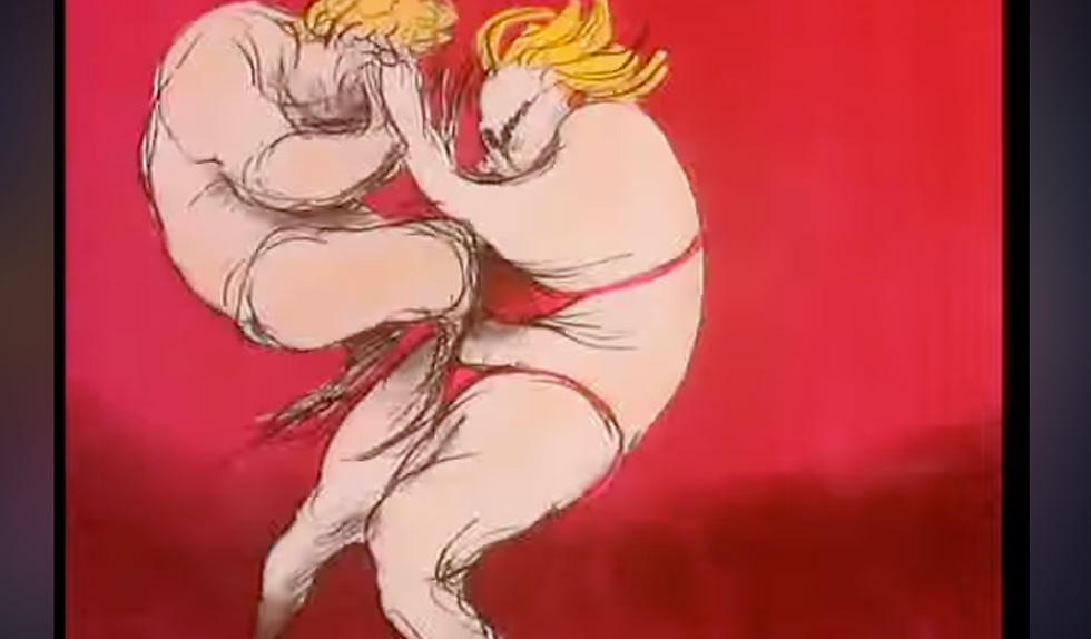
I think this Beryl design out of the three animations I watched is my favourite. She went through three different designs and with each design she just looks more eccentric and kind of like a middle aged woman going through a crisis, an age crisis but still absolutely rocking it and just everything feels normal. There were many exaggerated scenes and I really like how everything interacts with everything, especially the way fat on the body moves in this animation. I usually find when watching animation fat kind of stays still. It's the clothes that mode but Quinn's characters move so cartoonishly but also really realistically.
Something that is in this animation but I think is better showcased in the best animation I watched after this one is fish eye lenses and the exaggeration of things. Exaggeration is super important, making things feel like it belongs in reality but also in a different world than ours. I love the fish eye lenses used along with exaggeration. Everything about the usage of it all feels very much like British children's shows and television. It's crude, funny and is kind of boring but cool to watch.


The next animation I watched which is the BEST that showcased the fish eye lens and exaggeration thing I mention is "Body Beautiful" it is honestly my favourite (besdies the fact that it gets really racist by the end with some chinese characters I don't likethat ,but I mea nherar really rmeinds me of like potical newspaper art and sterotypes are what plays into that kind of art but I mean there was not really need for it at all). It has a cool rap that Beryl does at the end and I like how it focuses on weight but in the end Beryl doesn't become all skinny she is still her but just stronger. That's it. I think it's really nice because eating disorders and body image is something that is quite a big thing all over social media especially for young girls, and Beryl is an old middle aged woman just going for it, proving to people that bodies are beautiful. I kind of hate when people talk so much about bodies as I myself have suffered with an eating disorder and still do and it sort of makes me freak out but this animation kind of made it all funny and not so scary to think about the changes your body goes through. Everyone was just having fun and proving to people they are cooler than other people. As I said I think Beryl is definitely the main character in this with the evil main character besides her the guy who is OBSESSED with making fun of chunkier women but even so `i am sure he had more character development that could have been done. I mean her newest one every character even though their main personality trait was very strong they still had development that showed that, they had more than just that, but I suppose the reason behind this character is to show how his damned obnoxious people are who only focus on how they look posing it all on other people.


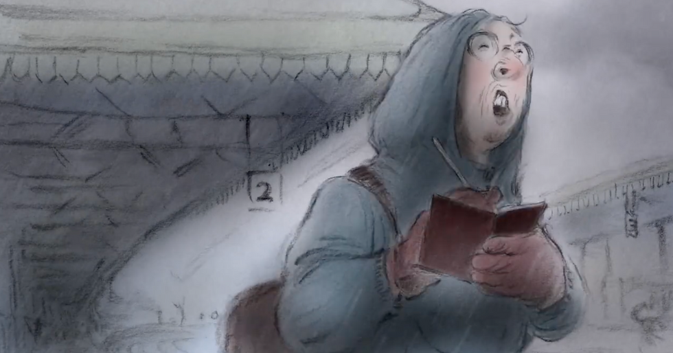
Finally I watched "Girls Night out”. You can definitely tell that it is older. Her style seems to still be in production but I really like how colour is used in this one. The clue is only used for things that I think would be what Beryl seems important. I really liked the stretching that beryls face did in this animation as well from when she laughed and was all flustered at a bar, it felt a lot more cartoony than here others. I mean the other animations are obviously cartoony but it had this realism feeling to it all. For this one I felt more comedy based. I mean I do think that's the whole point of this animation to show women's sexual desires but like I think the usage of comedy is really cool. Things like sexual desires are quite hidden away but for this animation it just shows people having fun. Learning things about themselves and showing that it's okay to do what you want. I really liked the background art in this, the background art was not really coloured like i said earlier the colour was only used for things Beryl seemed to view important. I mean when they wear art at a bar the characters in the bar in the background just looked like they were quickly drawn in with charcoal, there were smudges, the drawings weren't perfect or anything, it was just quickly slapped in there. Which i think is awesome because totally when people go out with their friends they only focus on the fun they are having.


Something I didn't mention at all that I think is a really cool stylisation choice is that in all of the animation I watched the backgrounds weren't all there. I mean even if they were coloured there was still a lot of negative space to it all. I felt like with that choice it made everything feel more personal; I mean usually in life when you are looking at something you don't see the whole room just the part that you focus on. It gave off this peripheral vision effect of things in the background that weren't there you could just sort of guess because your main focus is on the movement that is happening and the story being told.
As well as all of her animation start off on a black screen hearing voices of what is ahppening its sort of like an intro into whatyou are going to get to watch.
I usually don't say this many positive things about the animators I look into but I really, REALLY like Joanna Quinn's work. It's just so stylized and unique and it sort of makes me feel happy about what I want to do when I grow up. I really want to make a comic that is all stylized and I really like the way sketchy things look.
After researching about Joanna Quinn it just has made me feel so impressed that stylization doesn't have to follow the most popular works, it can just be things you like and if you are passionate about it go for it!! I think what I will take from Joanna Winn is I totally need to add more exaggeration and different types of camera shots in my work to make everything more dynamic and engaging to watch. As well as planning is important, even for someone with a sketchy style who likes to keep the energy of her work she does all of the different steps that you gotta do in animation (which is something I really need to work on, making sure I am doing all of the planning steps not just get excited and jump right into things right after an animatic still fo the eyes than inbetweens and the clean ups, even if it adds extra time to what you gotta do it just makes things clear and easier to understand from an animation perspective because I will admit sometimes I do get lost in my own work)
SOLID DRAWING ☆⌒ヽ(*'、^*)
Like always I and my class watched this video all about solid drawing. To be honest I was confused on what solid drawing is.. what so you mean solid drawing?? animation moves aren't illustrations that are solid and tell a story without movement. But the video I watched helped explain what it is. I originally thought it was like observational drawing practices put into animation. It sort of is. When doing observational drawings of course they are well solid they don't move but solid drawing in animation doesn't mean that, it means the space, weight and feel of the space they are in.
How their body moves in tandem with clothes or possibly the weight of how heavy or thin they are. It's making sure 2d drawings look like they exist in a 3d plane even though they are just drawings. Though for something like 3d animation solid drawing is used for mainly the weight making sure that the characters don't move their arms exactly the same as each other because. the uneven with being 3d within the software it just doesn't feel right so setting something helps in making solid drawing feel believable.
Now usually I would say that I did within my animation that I am doing as you know.. its animation skills but this week as I was doing flat colouring so I didn't really get to draw anything just do boring colouring. (I am super proud of the colouring i have managed to do because i stayed until very late to get done the colouring, because this is week 11 next week is the last week at uni and also my lecturer said that she believes I will be on editing next week and I wanted to work towards that goal and I think that I have been able to get to that point)
Even though I didn’t do drawing for animation skills I know that this isn't the same module but for a different module animation and illustration that I also do, I did life drawing all to do with motion and I practise solid drawing with out really knowing what solid drawing was until the end of the week when revisiting the video and doing this research. As it was all about motion I had to take in heavily the account of how the body exists within weight and making it look like a 3d drawing but on paper. What is helpful (which was also mentioned in the video) was breaking everything down.


(this isn't all the drawing I did but these are best ones i have that I think show solid drawing :D)
I already do that in drawing but in my life drawing and after watching the video and looking into solid drawing breaking things down into basic shapes with contour lines to understand how things move. Something that I am working on over all of my modules which links heavily to the solid drawing is hierarchy. Now it doesn't seem too important for solid drawing just to make things look like they belong in the foreground and background but the solid drawing that I have realised doing this research will help me a lot with that. Because solid drawing links to the way things sit around a character's body and having all lines be the same line width and not showing the difference in how folds of clothes work everything feels flat. That is something I definitely need to work on for animation skills. I mean I am already doing it in other modules but for my animation that I will be submitting very soon the one thing I forgot was to differentiate the line widths for the characters and the backgrounds. But the way I am going to fix it is that I have started this week and hopefully will continue next week (but I sort of like how it looks currently so I will ask my teacher). Is the lighting making everything in the background look like it's further away from the camera and everything in the foreground being brighter and bolder.
Something that I was told this week about my work which I am proud of is that I am getting better at timing after listening to my teacher last week about changing certain things which is why when I edit it next week I might have to alter some of the sound timings along with my animation. I thought it would be fine with the animation having the sound on it from the start but because I have exported it so much and it has been compressed multiple times the sound that is actually one the animation software is all crunchy?? and sound all wrong so next week I am going to have to take the silent version I exported and fix it all in premier pro. Which is fine I don't mind. I expected that I might have to edit all the sound anyway; it's just slightly annoying.
As you can hopefully here these sound awful but these are the flat coloured ones bellow is a silent completely coloured one which is the one I plan on editing in Premier Pro. Its reall wierd without the sound considering like that has been the base of this whole porjecrt. Thats what has controlled th pacing of the animation.
Comments