🃜🃚🃖🃁🂭🂺
Illustrations 。.:☆*:・'(*⌒―⌒*)))
𓆌
These are all of my illustrations that I have been working on for the time I am at uni! I really hope you like all of the drawings I have done and I am super proud of the small amounts of progress I am making each time
Something else that I am also doing but not uploading out of respect to the models is life drawing!! - they are nude so I am not showing them on my page or online but I am doing it so I improve my drawing skills wit proportion, how the body works as well as just getting faster and better at drawing ᯓ★
★
All of my illustrations shall be dated and have a little reflection on what I found to be challenging and what I found to be fun and just an overall what I did !!!
𓇢𓆸
═══════
🪼⋆。𖦹°🫧⋆.ೃ࿔*:・
(っ º - º ς)
week 1
Trimester 1 ꉂ(˵˃ ᗜ ˂˵)

.jpg)
These are A3 drawings that I did for the lined drawing task I had in week 1 (trimester 1) - these proved to be super difficult, I have a problem with the line drawing task drawing too fast and not getting enough detail or drawing to slow so I wouldn't catch the people that where in the environment that I was in. I did feel a bit weird doing drawings outside but as I kept doing more I felt much more confident. Even though I found these drawings difficult. I really like these drawings I am always afraid to do huge drawings and a lot of space is quite intimidating but I like these I just went for it I didn't try to perfect it I just went for it until I filled the whole page!!


These are all A4 drawings I did for the lined drawing task these ones I would say where much easier than the A3 though I did find with A3 it was easier to get proportions right because it was a larger and I had more room incase I messed up but with the A4 I mean it was much harder to get the proportions correct the size is smaller so I had to downsize everything making sure it looked normal. I think I did an okay job but I will say that drawing with the ink was much easier than the pencil. I was afraid when drawing with a pencil as it was a line drawing not allowed to shade it. I am actually not that confident when drawing with a pen but with this task I felt much happier to draw with it, I didn't have to think about the tone or shading which it what I struggle with the drawing with pen. I just drew lines


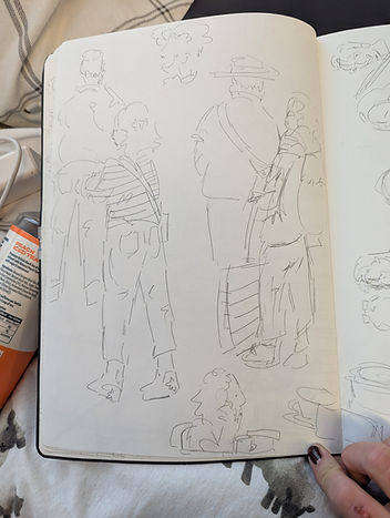
These are line drawing that I did in week 1 of the first trimester, I did these drawings in "class" we were walking around Cambridge market to draw it. It was really fun, but I found it quite difficult, I always find doing work in class really hard to concentrate, but this time it was even more difficult because I was in a market. Alot of these pages are really full of drawings and very messy. I was told to work on that , and make sure I capture the shape and form of people in the line drawings but also make sure it isn't too messy too make sure the drawing are understandable and as you can see from the drawings above I felt like I accomplished it!!
week 2
Trimester 1 (˶ᵔ ᵕ ᵔ˶)

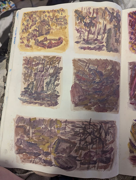
Now these might look like terrible random shapes on a page but these shot and quick small drawings are actually super important. For week 2 in trimester 1 I (and the rest of my class) had a task to do tonal drawings. Now tonal drawings are not my strong suit I always struggle with shading and making sure everything looks good so I made sure that doing these drawings I would work super duper hard on. These awful sketches are thumbnails to help me visualise what the final piece will look like where the shadows will be and where the viewpoint/camera would be when looking at my image. Even though this is only the second week into uni I have realised that I am enjoying the illustration side of the course much more, maybe its because I haven't really done a lot to do with animation yet or it is because currently my dream is to become a comic book artist. Its just I find dong illustrations and taking my time on them to be able to perfect it and being able to add details (which you can od in animation but there is so many more things you have to consider to make the animation creation time shorter) is just really fun!!


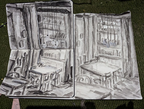
This is the classwork that I did for week 2 in trimester 1. Now as you can hopefully see there is a sort of theme that I need to stick by. The task that I had was to do tonal drawings using three medias, collage, ink and water and finally charcoal. Now in class I struggle with concentrating and actually doing work as I just get like super duper nervous. So to make sure I understood the task for the last half of the day I worked on a charcoal drawing. I am going to be honest I don't like it at all it is not good the phone drawing I did I like but the other one I hate quite a lot so I made sure that when I did my own independent work I would redeem myself !!


Now I thought this image deserves its own explanation, I did tis after coming home from university on the day I was set this task. I was incredibly overwhelmed and thought going to a coffee shop and drawing would help. This drawing is down right awful. It really isn't good at all I spent and embarrassingly long amount of time on this drawing but I will say just merging all of the media together and drawing did help me calm down :D!!!


This is all the work that I did for week 2's assignment now I was going to do three of each but for one of the collages I ended up doing it as a A3 size and it sort of took me a pretty long time and I thought that, that counts as 2 for me. I didn't have to do three off each the minimum was 4 A4 pieces that you should do. But as I explained beforehand, I want to get better at tone and made sure that I spent a long time on these so when I move onto other projects I can apply the knowledge of what I have done here to other things. Now for the ink and water I did end up doing 4 but the was because I wasn't happy with one of the paintings I did so I re tried it to make it look better. I really like learning and working in multiple medias and once Ive learned them I always want to do mixed media (which wasn't the task so I compromised with doing more!! and really pushing myself to learn what I needed to to). I am really proud of my charcoal drawings. I have never really used charcoal properly before because I am always afraid that. Will make a huge mess. I did make a massive mess when making the drawings but I felt like I really accomplished the task. I really focused on the tone and the lighting. I thought that this would be pointless, that doing this task wouldn't help me because I knew that. I'm bad at tonal and shading but looking at what I have managed to produce I feel much more better with my skills and what I have learnt from this task which helps quite a lot with future projects is:
- when working with darks and lights start from the light first and move my way into the dar because establishing where the light source first is, is super duper helpful !!!
Some of the images in this section of work do have the thumbnails with them, I just wanted to showcase the process I worked with
week 3
Trimester 1 ヾ(☆▽☆)


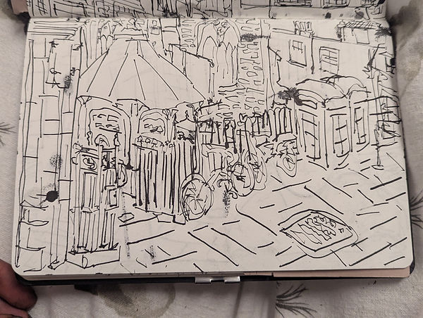
The task this week was to do line drawings of backgrounds. I honestly thought I would be terrible at this but doing these practice images showed me that made I east a bad as I thought I was I really like these drawings especially the one on the left I spent a really long tome on it. Sure it could be better and some of the portions on these 2 drawings are off and aren't the best but I am still trying to learn how to draw background all as personally I dont think I am that great at it.


These are the line drawings I did with pencil. Now even though pencil is my most confident media it is also my last confident because I am always afraid that I will lave to keep rubbing things out and going back and fourth and spending a long time done part of the drawing. So to make sure that isn't happen this time I used the pencil sort of as an ink pen tried to not rub out ,any things and be confident with the lines I placed down. I believe i was successful maybe not all the way I feel like the drawings could of been better but I went from practicing on a4 ti a5 and it was real hard to get he tail in a smaller page that you can achieve with pencil. I really lied doing all of these drawings but I didn't like doing the cut out method with the pencil. I just think it looks much better with ik because the lines are darker and more prominent on the page. I in't do as many of the pencil ones as I did the ink ones o a5 paper because I already did practice ones in class that were done in pencil. I really like doing this task as it taught me that I have a new skill which is drawing backgrounds. I have never really put th effort into drawing backgrounds and I ma not confident in my abilities to draw them at all but after doing this task I feel much more confident in my abilities and I feel like I could totally draw backgrounds or at least sketch some backgrounds for a illustrated or animated piece.


These are ink drawings that I did some with the cut out method some just buy themselves it was really hard to do the ink ones outside because it was just inconvenient to draw with ink and quill outside, it was also slightly embracing as people would lean over my page and look at what I was doing. I also found that trying other make sure `I was getting everything in the drawing was super har because I changed from a4 to a5 ad fitting everything an a5 drawing made it really hard as I am not the best at proportions os I kept drawing things wrong with the ink and one I have drawn it I can't go back and I can't rub out ink so once I had just done it, I went along with it and tried my hardest to correct my mistakes. I also found that drawing with the ink was super hard due to the fact that my the ink kept spotting on the paper and got all weird and would sometime over up some ink lines that I did which would make the drawing look a tin bit worse. I did try out different line weights just to make sure that I was really experimenting I sort of wish I di it for all of the drawings but I didn't and its okay I know for next time when working with ink to try out different line weights and make sure things feel different otherwise everything sort of merges all into one.
week 4
Trimester 1 ヽ(>∀<☆)ノ


This week I did these complimentary colour drawings. The assignment was well to do drawings focusing on tone. The ones you can see on this page accpomnaied by this text are the ones I did in class. This task was down right awful. It was fun like super fun and I enjoyed It alot because I finally got to use colour after 3 weeks of just using black and white. But starting on colour after just using black and white reminded me one how bad I am at doing colour and how difficult it is too shade with complimentary colours and specifically making sure it looks good and not silly or bad. Now in starting this task I was super confsued on what I actually need to deliver as a deliverable for the assignment so the drawings you see are A5 size. Now in terms of paper that isn't that big but when focusing soley on tone and value A5 suddenly feels like I am working on a A1 size of paper.
Sure it was my own fault for not confirming with my teachers but I assumed it was that because of all of the other work I did in the past four weeks. I think if I had smaller drawings I would have been able to focus more on the techniques for this task. The techniques was using more shading then filling in things with line, just layering colour until I got the desired look of the object I was looking at. Due to it being on such a big bit of paper it was hard to do that But I did do 2 smaller ones right at the end of the day which helped me a lot to focus on the detail instead of going quick and filling everything in with lines. In real life there is no lines that outline a person which is why this task aid super important other than not focus on the lines our outlines that people put Ito drawing just the tone/value and shape.


This is the homework I had to do, an may I say I think even thought sure the drawings really arn't that good and they could definitely be so much more, that I did do much better on the homework that I did the classwork task. I prefer these drawings so much more I didn't focus on the lines and going quickly I let myself slow down. I really like these drawings as well because it tells a simple story. That's thetas to tell a simple story and mine is just evolution but I think I told it in a cool way. I started with just normal shells I saw in a cabinet of a museum (oh and I didn't mention but as a class we had to draw in museums for the homework so I went with a friend to the Anthropology and Archaeology museum the class work drawings where actually from the same museum just from the Anthropology section and these where from the section that I didn't go to clearly the Archeology section cause its all bones) then from that I went to this crab fossil that gave me shell vibes and drew that, then found a nautical shell to link with the underwater theme but they where from earlier time period showing the evolution, then the next image I went with some random bones and teeth to show how the animals are evolving and finally I went back to the underwater theme and did a full skeleton of a underwater prehistoric animal.
week 5
Trimester 1 \(٥⁀▽⁀ )/


So the task for this week was to go to a river and draw but as you can seethes small detailed thumbnails arn't at a river they are actually at a graveyard it is because it wasrainign on the day we wanted to go as a class but there is a graveyard near ARU so we went their instead. Now the drawings I did first where with complementary colours just like what I did last week I didn't have to I just wanted to try out doing it again as I have never donut until last week in uni. I really like the orange and blues I think being able to use different shades or the oranges and blues this time made it easier to add details as well as the red and green versions arn't too bad I don't hate them like I do with my other red and green one I did last week. I enjoyed doing this because I don't particularly use colour that often as I get afraid will mess stuff up but with what I have been able to amen this week I am super proud off these drawings are done with pencil and these 2 A4 pages took about 6 hours all together I didn't think it was going to be that difficult but I think putting all that time and work into it all made it so worth it I vernally love the orange and blue ones I did. Usually I would try and do more than needed for the deliverables to make sure I am constantly working hard to get better its just these drawings I did this week took ages and I just didn't Abe time to try out more than three different medias.


Here is the second set of drawings that I did but instead of doing it complementary colours I was going to stick to just like simple of colours but I really wanted to use this chance to work on my colour skills with different mediums. I could of contained to do the complementary and that deifnetly would of improved the value and tonal stuff but I enjoy using oil pastels alot and doing this I was alot of fun just making it look like what I could see infront of me. I really like my drawings of the orange and blue but if I have the chance to do this again I am going to keep using oil pastel as it really helped me slow down as I had to keep building up the pastel on top of each other to make sure everything blended together right. I did get really messy it's just the only thing that isn't great is the fact that when I now close my sketchbook it is sticky. Oil pastels are my most favourite medium to work with as it is just cool professional crayons!!


This is my final drawing set that I did for this work and because I was really successful with the oil pastels (in my opinion) I wanted to try out a completely new medium I have never tried chalk pastels. I went into this completely blind I honestly thought they would work the same as oil pastels, they do kind of but layering is quite difficult once they had to much layers it would make a really horrible squeaking noise and I couldn't layer anymore ao I had toseally think about what colours to use. I would say that these drawings are good but for next weeks was which is all to do with imagination I want to do something with floods and I feel like this is the best medium to work with because its light and airy like making it easy to give off a water effect and having a blended environment that could show off the floods but in a really simple way.


These are drawings that I also did for this week. This was all classwork. The other stuffwass the homework but this classwork is here to help me and prepare me for next weeks task when drawing from imaginations. As a class we all did these tasks that where all memory based and trying to remember and imagination what objects that where in front of us would look like.
Now there were multiple different tasks, like drawing just from memory constantly looking back and fourth too and image until you remember it pretty well, completely trying to imagine what the objects I were looking at would look like from different angles. It was a really fun task. Sure challenging because everything was timed and the timing used was all in the range of 1-6 minuets so I didn't really have time to focus on a lot of things but I think that's what made it more fun to try and remember I would have to look at things for a short period of time and see what my imagination came up with. I also made it just that bit harder for my self by only using ink or if I where using pencil just use it to block in were things go because it is then harder for me to focus on small details and think about the whole picture as I am using a medium that I can't rub out.
It made me be a bit more confident and also just made it so I just had to trust in what I remembered. (Which I actually find super hard as I am pretty forgetful as well as I really struggle to view full I,ages in my head, its sort of like a collage of important parts that strike out to me and trying to build something from that in my head is a quite chanlenging but fun task!!)
week 6
Trimester 1 ₍^. .^₎⟆

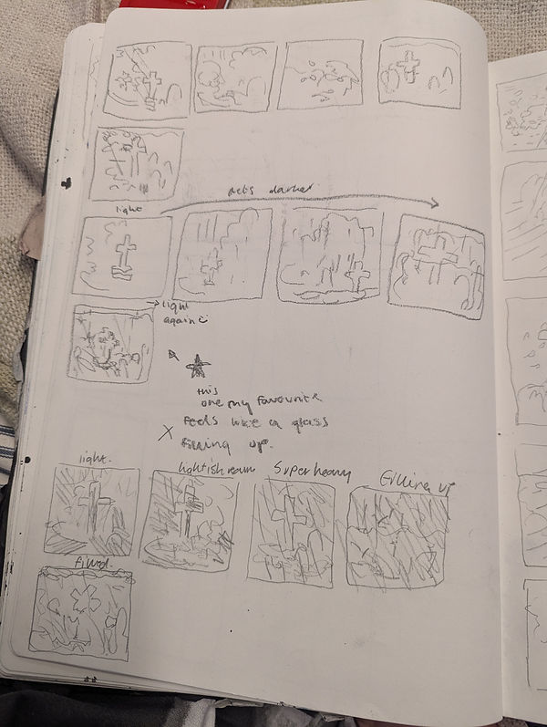


To start of this weeks illustration and animation practice, I was told (as well as my class not just me) that the work that I need to do is containing off from last week but this time it is the imagination technique. I have to imagine a neural distorter to happen and draw it in a sequence of 5 images. This week was pretty much all experimenting and planning what I am going to do for those 5 sequential images. I chose to do flooding and to understand floods I made a Pinterest board to refer to (link bellow) and these sketches, they arn't the best but to summarise it is just me planning how the images are going to look in a strip and the sizing, as well as how the progression of the floods going to be and if it is going to be a quick process or a slowly building up process. I settled with the idea of the first image being a nice scene and the middle three being the flood taking over and the last image being the one that shows the destruction of what happened. Now this just sketching was really difficult, it made me really push my limits of imagination.
I struggle to actually envision things in my head as it feels like a huge collage of images not the full [picture just the parts I focus on when I am looking at the full picture so it really pushed me to think super hard and plan tis correctly why is why there is so many different pages of these pretty bad sketches because... well I originally looked at it as a cup of water filling up and using the shape of the frame to show the flooding idea but after talking to my lecturer about what it should look like she told me that the area I was in isn't an aquarium I am not looking at it through the Fram imagine it as a real life situation and it helped me a lot to think about it and also in the planning stages I used the same image until the last sketch because I just wanted to make sure I understood it with one image and could apply what I learnt to the fact it has to be different 5 images in each frame to tel a story, like how I did for the museum work.


Pinterest board I made to help


For the work this week I also did a mark making workshop to sort of practice and see new techniques that could help me convey the imagination project in a more effective way with different strokes and aspects of different materials and mixed media to see if it showed off the sea of flooding well. I wanted to capture the destruction that floods create but also that calming and solemn feeling that happens after a flood has swept through and destroyed everything. I love, love, love doing mark making it is my favourite task ever to do so when doing this I sort of went overboard with the amount off pages I did butI was just having un trying out all different pieces of materials and mixing them in multiple different art supplies and creating cool strokes.
Of course some of the strokes I made or marks I hated but I didn't give up. I usually find experimentation super duper boring but mark making experimentation is the funnest thing I could ever do I have so much fun. I did get overwhelmed at one point because of all of the different textures but it's alright cause I think I definitely showed the different kinds of marks that show of different feelings.
My favorite marks that I did are the sort of long and swirly/dragging like ones because I think it just creates that flow feeing of the water really well. I also like when you hit something against paper fast it creates a sort of rain effect and I totally want rain in my drawings to show the impact of water on a place so I want to use that technique in my sequential drawings as well. I really enjoy the mar making becauseI rhino you can do both tonal values of colour but also visually different sections could have hierarchy because of the texture used for that specific place and that what I need to work on.
For this project I need to get better at tonal hierarchy and making things stand out more because showing my lecturer what I did last week shew sad they where very expression-ate but I till need to slow down and think of the hierarchy scene in different tonal values and shadows in an environment.
The image that is next to this text is where I tried out to create the feeling of the flood sequence I want with all of the supplies and different medias I had with me at the time as I did this workshop in class so I used everything I could to my advantage which helps me lead on to the ext thing I did this week. the actual planning and experimentation that I did for the final sequence.
The materials that I used for all of these mark making where things like cardboard ranging all the way to nails and random pieces of leafs, grass, sticks and string and cloth. All of it was successful in its own way but not all of the marks showed the feeling of flood. I did a lot of dar colours for the mark making workshop because originally I wanted to do this project with no colour just grey scale but I changed that when I tried out to create the feeling. I want to make sure I wam improving on my colour skills, almost everything you see is coloured nothing is in black and white and the only way to improve is too push me out of my comfort zone so for this project I am going to work with colour.


Here are the starting of the experiments that I mentioned in the last section of work. As you can hopefully see because I promised myself I would with colour this time I took what I did in lesson with the mark making workshop and kept building upon it. The drawings that I have done here are super blue and orange focused, I did briefly try out the purple and yellow because I really enjoyed that version of the complementary colour thing I did but I didn't chose to do it last sequential image thing because I felt it was to difficult.
I couldn't get the purple right and I went with the orange and blue and kept building I did try out just blue but I think to effectively get across my style is using the complementary colours.
I never mentioned this but if I could I would have just done the images normally but I can't it ether has to be monochrome, greyscale or complementary colours. I swear I will get better at using colour so the plan is complementary colours. I found these drawings too look cool but I have already done blue and orange I was just sort of tired at looking at that specific colour combination, it wasn't really giving me the vibe I wanted, I feel like it just looks a bit to whimsical and happy for the fact I want it to be a flooded area and the destruction. I mean it works well for the first image but after that I just don't think it shows what I want effectively.


This is the second part of the experimenting with the mark making and just how the final sequence is going look (hopefully anyway). Just like how I did try out the monochrome but just thought that more than one colour is gonna be needed to be able to effectively show a flood I tried out are scale wit h2 different mediums, charcoal and ink wash. I think they look pretty basic. I mean they get off the vibe and show what I want but there's not excitement not a lot of the drama I can get with colour. So because my only other option was complementary colour I tried out red and green hated how that looked, it just reminded me too much of Christmas and floods aren't very Christmas like and the last colour combination was purple and yellow, I had already tried it but I managed to hate it so I wanted to redeem myself, I kew I could do it I just had to take the time to slow down and chill.
That's exactly what I did I calmed down spent time on the purple a yellow and I loved it. I think because the purple feels more muddy like other are I was able to create the destruction and calming feel at the same time that I wanted to create. So just like the blue and orange I did some bigger versions and I loved them even more. I made sure to used mixed media for all of these experiments, I found most of it quite time taxing and just too much going but with the purple and yellow I thought it looked amazing. And so the mage next to this text is the pan of what I want the final sequence to look like I have made a swatch list of the materials and colours I hope to use (water colour, acrylic paints, paint pens, oil pastels). But who knows next week on week 7 I have another colour workshop and my idea might change with the materials and if I want it to be all textured and marked up. But currently I like the idea I have and want to keep working toward that!!
week 7
Trimester 1 (✧ω✧)


So this week I got completely confused on when the date for this sequence of images was due in. It is actually ment to be done by week 8 but I didn't realise until the end of the day. I went into the lesson thinking it was just going to be more exploring and experimenting. I wasn't wrong there I had to make colour pallets using complementary colours, but then I was told the hand in date I panicked. I mean I knew what I wanted to do, but in the morning my lectuner showed up this idea of placing a base colour down then painting or drawing over that base colour and I thought that was so amazing that considering in this sequence I need to show the progression of my flood I thought it would be a fun idea to work like that. So as a class we all ad to do the orange and blue colour palette to just get used to finding all of the different tints and colours that 2 compelmentary colours can create. I found the orange and blue one really helpful so I made purple and yellow ones with some of the different materials that Iv ws planning on using. Honestly I thought this would be the easiest as that. Was give this whole time at uni but honestly this generally took almost 3 hours because it wa so hard to get the right colours and to make sure that everything worked correctly. I actually had to re do the orange and blue on and I am not sure if you can se it well on the photo but I just stuck another piece of [a[per over the part that I failed at and just painted over it. I am not wasting a page I will just fix it.
I mena eve though this was usrpirizlingly difficult it really helped. Considering I wa told about the deadline it really started to shape what I wanted to do in my head. But my experimentation from last week was just a bit messy it needed to be refined.


After I made the cooler pallets this was the last bit of refining I did. I though I would try with out acrylics because I found keeping the right collar all the time was really hard because it would either run out or their would be too much of a homemade colour so none but me could use it but it also felt like a waste of paint.
I am really proud of these experiemts I feel like it is easier to understand what is going on. Like after I managed to understand that blocking colour down is helpful it just felt so much more easier and not too difficult. I really liked working without the acrylic paints, there wasn't as much mess and I didn't;t have to wait ages for everything to dry just the blowing of water colour to begin with then go in all Hands on with pencils, oil pastels, chalk pastels and paint pens. So I am still kinda using the acrylic paint just not normally with a brush.
Now doing this made me thin really hard about the final product I really like wanted to make sure it was understandable. I mean I was told that my work is very expressive which is fin but too many things going on at once takes not only the tonal and values away from the colour but also the focus of the the picture is about. I was told to pick on one thing in the references I was looking at and focus on that. I didn't think that would help I honestly felt really silly because others could understand it but once again I slowed and thought about it these experiments just felt fun and not too mcc like chore just to mark a text book to get a grade.
Refining it was actually really helpful I usually just don't do that for some reason, as long as I get it that's Keogh as others are gonna see my final product but in an industry I would have to communicate a.d if I want sometime to be loved by people then it needs to not be so confusing and overwhelming ot look at and this experimenting helped me really think about being the other audience not the creator but the viewer.


I actually stitched all of these images together after this because I needed a better way to carry with me to uni without running each drawing and keeping them all together in one place!!

So here is the final sequence images 1-5 bellow is them all next together it is a small image because the image had to be a certain size to be uploaded to my website and if I enlarge it, it goes all pixilated. So I uploaded the pictures I took of each separate images to make it easier to look at. I am so proud of what I made like vernally. I tried to focus really hard on the tonal differences even if I did do it in a very expressive way. I think out of everything I have been learning these images are sort of okay to understand th foreground and background etc. It's something I have always struggled with and I am still trying to get better. I wouldn't say all of these images were the best to show that but I did try really hard. I didn't use any acrylic paint in these final products because I felt it looked better with out the acrylic paint with it.
After doing the colour palettes that I did, I found it easier to understand the tonal values of the colours that I needed to do because I could use more than just one version of the colours I wantd to use. Gernally I am really proud of this I used os many different and new techniques that I learnt in these last few weeks. The way I hopefully managed to. convey the change in the images wit the different colour backgrounds. Was the technique I was shown. I have never done something like that but I completely understand why it is a practice that people do. It s really easy if you block out different shapes a where light an dark parts are going to be before you actually add detail because its just like having a game plan to go with the shading. Shading really isn't something I am good at but I feel like pushing myself to use the colour for thisprohect even though I could of done greyscale, has been helping me alot to understand how tonal value works. My work ad definitely improve it really isn/t that good at all there are so many things I wish I did better.
Even though I like the tone I wish it was better and still not so lost in the paper an colours and mark making but like I really like the still and I will keep working towards background design and making cool looking illustrations because I want to work on a comic or a illustrated book so badly and finding my voice in the course is what I hope to be able to do and feel proud and confident in the skills that I have as currently even though I ay always try to be positive I am disappointed in many of my pieces but I wont let that stop me I am gonna keep going !!
week 8
Trismester 1 ૮ ․ ․ ྀིა
.jpg)
.jpg)
.jpg)
.jpg)
.jpg)
.jpg)
.jpg)
After doing my sequential image project I went in an had do life drawing for 3 hours. Now I have been doing life drawing quite a lot at uni anyway so it really didn't bother me, but the model was a little bit late so to being with as a class everyone draw out teacher. Now I though that the drawing we were going to do was just normal line drawing no. it had to be conutinus line not lifting my charcoal of the page. I thought it was going to be absolutely awful. Like actually awful but it turns out that it was actually pretty fun and found it so much easily than drawing with disconnected lines. usually with disconnected lines I panick and I am pretty slow with starting incase I get the proportions wrong. But with the continual line I had no choice but to just go for it. As it was easier I decided to continue with the whole disconnected lines for the rest of the drawings but realised it is quite difficult when you have to do it with a longer time because the technique is kind of built to go fast not slow. But it certainly helped doing it for the shorter drawings.
Now this week I ran into a problem my phone has completely broke it just randomly black screened when watching TikTok and wont turn on or charge or anything so I don't have anyway to take photos currently but luckily these photos I uploaded to my laptop before I ran into this problem. The only way I can think to fix this problem is too get someone else to take photos for me or get a camera from media services at uni. This is sort of inconvenient as everything I do is online and I really need my phone to also do my instagram blog but I will find a way around it even if it is inconvenient for now I just have other wait until I can get a new phone.


Last week I "completed" my sequential image project and was quite happy with it but I brought it in and realised I still have a week left (it is due in on week 9) so this week everyone used it as a feedback week incase we needed to fix certain things for the images we made and if there's things that could be better.
Now I thought what I did was pretty good though once every had given feedback I was sort of crushed but in a good way. almost everyone liked the colours and th way I made the work but nonbod could understand what my idea actually was and was too hard to just decipher any of it. To me I thought it was easy but I suppose I know the way I work and if you are an outside viewer things need to look cool but also be simple to understand.
I talked to my lecturer and honestly he was avoiding the whole "redoing" aspect but I didn't really want to go over the work I had already done because there was already so many layers of different medias that drawing over it would be impossible. I am more for people just telling me bluntly what I need to do. SO after talking for a bit he told me that I could keep the first image that I did because it was clear but the rest of them need redone as they just where too muddled up and confusing.
Now originally I didn't see the it needed to be redone. But I mean after I cut out new squares/rectangles paper and talking to friends and looking at other peoples work. I realised that yeah maybe it does need to be changed. Not only did I re do the drawings but I also changed the sizing of the images. I wanted it to be read as the disaster was a fast thing so I made the flooding wave section smaller than the rest because when looking at them all in a line it made you read it fast just like how a flash flood works, quickly.
I really like the Redone versions. Sure it may be annoying that I had re do it all but I am glad I was give the feedback because I improved a lot after checking in with others and seeing what everyone else's looks like. I think this has taught me a big lesson that not only when the image is done stop adding more marks and things all over it, sometimes less it good as well as, ask others on what looks good and take a step back from my own work to try and think about other peoples views. Stand in other peoples shoes and try to understand that my work might be the first time someone will see it and don't know me personally so wont understand that I am a very kinetic and expressive worker, and just be confused with all of the everything that is my work.


This is the sequence all in a line how its ment to be and it is so much easier to read than the other one I didn't realise that hierarchy in colours was this important, I also like that I changed the sizing of the flood part because I feel like you read it how I intended it to be. I wanted it to be read fast when the flood happens because its a flash flood and the old version was all the same size and you read it slowly but now its smaller I feel like it visually feels like a flood :D!!
⋆.ೃ࿔*:・
Visual Hierarchy Project ―୨୧⋆ ˚
♯┆Here is my first illustration project !! It is a sequential image project again and It is all about how a character does different movements in one space sort of telling a story of what the person is doing in sequence.
I am very excited for this project because well I can change the character to one of my own characters that I have ゛ ⸝⸝.ᐟ⋆
ˎˊ˗╰┈➤ Trimester 1
⋅˚₊‧ 𐙚⋆˚꩜。🍓
WEEK 8
˚₊‧꒰ა ☆ ໒꒱ ‧₊˚
The starting of the planning was just doing pretty much normal research, I had to draw people doing a sequence in a specific place with out changing the place/ the camera angle just the people in the space.
Not only do I need to do the main action of the person but I need to include a secondary action. I had no idea what a secondary action was at all. But it is like if some curtains flap in the background due to the wind. So the secondary actions that I included seemed to all have to do with making food or drinks (unentinonally, I really didn't mean to do that) but I mean at least it makes it easier to understand what I need to do as the y'all sort of are the same just different senarios.
I did one where my friend was making waffles after being at a sleepover, one of my friends playing with dogs while making coffee and then barristers at a cafe as well as someone ordering drink as the other people where talking and laughing in the background. I thought these drawings where going to be easy I mean I have been doing line drawings and drawing people pretty much this whole trimester but actually capturing ultimo moment's that are different and trying to do the fast to actually capture it all was super hard. I decided to use the technique I used in the life drawing that I did (the continual line drawing) because it made the whole process simpler and easier.
I think the one I like the most would be the one with this couple I drew who ordered and sat down. I just think the interaction is really cute I am not really sure if I will change them?? I want to have one of my characters to be some of my characters as I can change it if I want to be I am just not sure I will have to try it out :D
Planning the sequence °❀⋆.ೃ࿔*:・


‧₊˚ ┊
๋࣭ ⭑
─── ⋆⋅☆⋅⋆ ──
જ⁀➴

˚ ༘`✦ ˑ ִֶ 𓂃⊹
When I was in the cafe with the couple and drawing them I came home and drew the sequence a bit better to understand what the favourite sequence out of them all looked complete together.
I think that this sequence is the best out of all of the ones I chose because I really want to work on hierarchy (I mean that is the project name) but If I really work on it even if it ment to draw things on separate pieces of [a[aer and layer them that's perfectly fine, I just really want to improve because if I don't I am worried that when doing animations and other illustrations in the future people just won't be able to understand any of it and I want my work to be mainly in comics an books so I feel like it NEEDS to be understandable by a large majority of people.
ִׄ˚ • 𖥔 ࣪˖ ⭑ ₊ ⭒ *ೃ༄
‧͙⁺˚*・༓☾ A pencil sketch of the full sequence as well as a character design !! ☽༓・*˚⁺‧͙
Here is the planning for the final sequence. Now this was actually harder than I thought because I thought I was going to keep it the same as the oringal not even draw new characters but once I finished drawing the background image in the cafe I was in as I was walking home I realised I could do wizards just in a cafe.
I vernally have always wanted to do a wizard project and I am really glad this is the one I decided to start with because its illustration. I really like wizards os I made these 2 old men wizards thatar going to walk into just a normal cafe and the secondary action I have to include is going to be a person in the background reacting to these 2 cool wizards.
I am really proud of the deigns I came up with I just think they hold so much character and I want to include smoking in this sequence so I have decided that when they sit down one of them makes a potion while the other drinks tea and smokes.
the bottom 2 images is the sketch pf what I want the final sequence out look like, I apologise or the fact that all of the sketches are really messy and don't look very good but this is all the planning stages I am going to make them look good once I have talked to my teachers and asked them if it is okay if I do this idea because if it isn't then I will have to completely change it and I don't really want to make a fleshed out version if I can't even use these characters.
As I know that they still have to look some what real and I am thinking this idea might be too much but I really like it so I will ask and see what I do next week for work.


-ˋˏ✄┈┈┈┈
✩₊˚.⋆☾⋆⁺₊✧
WEEK 9
˚₊‧꒰ა ☆ ໒꒱ ‧₊˚
What the sequence was going to look like /ᐠ > ˕ <マ ₊˚⊹♡

°❀⋆.ೃ࿔*:・°❀⋆.ೃ࿔*:・
So last week a I said I was going to do my wizards in the cafe well during the lesson that I did this week I realised maybe it wasn't the best idea, but before I completely srapped the idea I made surety I at least tried out things, so I tried doing a blue and orang colour scheme and it just didn't work there was too many things happening around the image, it was super complex to paint or ee draw the same 6 different times. There was too many characters in the images and it made it hard to distinguish the main action form the secondary action.
I had a conversation with my lecturer and we decide it was best if I re did my obersvations and if I came up with a new idea. I did get a bit upset because well I do like the idea of the wizards in a cafe its just it is quite hard to do in the last three weeks as well as it is just quite a complex and difficult idea.
Though from the experimenting for this idea I realised that for the colours the I use I really need to focus on the difference between the tonal difference not just the colours themselves but the final values and Thought I was one pretty well wit hit from last project but I mean I did have re do it because it was too difiicultto understand and I managed to do it again. The whole thing with clout an tonal value has really been a learning curve for me and it has been super difficult for me to actually do it effectively but constantly checking in with teachers and doingalot of planning has been helping me visualise and see what I need to focus on and do for colour.
ก₍⸍⸌̣ʷ̣̫⸍̣⸌₎ค


Colour and tonal experimenting I did in class ⋮ ⌗ ┆


♡ ╱|、 (˚ˎ 。7 |、˜〵 じしˍ,)
As I mentioned I did colour scheming in class and here is what I managed to produce there is A LOT of notes around them all telling me what colours worked and what didn't I Oirngally thought when I entered the lesson that it was stupid that I had to re make a colour wheel as I have already dome one before why would I have to do it again.
But actually doing it, it really helped. I know I keep saying I am bad at colour but its the truth and doing simple taks like making colour pallets and revisiting how colours work on a wheel and tp change the tone of them by making colours cooler and warmer really does help.
I always forget about the fact there ar warmer and cooler colours I usualy do cooler because they come out muted but ware colours are cool too and creating different palettes was also just really fun :D
Re doing observations and choosing what the sequence will look like !! ⋆。𖦹 ˚ 𓇼 ˚。⋆

˚ʚ♡ɞ˚


𝄞⨾𓍢ִ໋

Here are the new observational drawings they where super fun because I actually focused on the detailed and the way they looked when the people where doing the actions and I did a man sitting on a bench then getting on his bike that one was actually quite fun to draw but in the conversation I had to make my drawings better the character had to activate the space and yes he did because he walked to the bin its just it felt really boring and I couldn't think of what to do with it because I wanted to change the character as I had the options, I also did those drawings at night so my lighting really wasn't that fun to think about how I would make the drawings tonally different.
I wanted to try and redeem my self for the cafe so instead of trying to do it from the inside I did it from the outside so there wasn't too many different elelements going on and. Iid really like it and I thought that was the one I was going to do because it was simple and I felt like I got to redeem my self for the other cafe drawings.
The deliverables are 3 different observational drawings, I only re did 2, and Was stuck on what do for the 3rd. Well I went to a gig and when people are playing instruments they really engage the space and move around a lot and I actually do have characters that are 3 band players so I thought this is perfect I drew these band players just well preforming and the secondary action was going to be the drummer and. I still think that could be the secondary action but I decided in the drawings of the sequence I was going do with the characters that I would add a cup being thrown on stage.


────── ⋆ ⋅ 𖤐 ⋅ ⋆ ──────

These are the chosen sequence drawings with the characters, I think it is generally so much easier to understand what is happening and the background is so much simpler to draw sit is just a stage that was all one colour as the gig was in the basement of a pub. I really enjoy this sequence and I do still want to use the 2 wizards I made at some point butter this project I can't I have made a new idea I swear on it those wizards will get used they are just going to be put in a box for now and I will get them out later.
As these are already existing characters the already have names, lore and also colour schemes - they are robots that are idols called red, ruby and rose and are all different shades of reds which I also think is really good for this project as its all about hierarchy, tonal value with colours an how colour can create an emphasis.
Experimentation/planning .𖥔 ݁ ˖ ✦ ‧₊˚ ⋅


๋࣭⭑


This is all the experimentation and planning I did for the sequences I know that its super messy but I was told it was okay for it to look lie it as all of the planing and experimentation is all about just tonal ho the colours look together. I wanted to try out as many different things as I could think off that fit within the final project.
I am really lord of what I have done this week. it has been tiring but rewarding to see everything ad all of the planning that I am doing. I would never usual go this deep into planning because I mean I find it stressful and too much because the nI don't know hat to chose but doing all of this planning helped me think more about the colour differences and what different tonal values look like together.
When doing this at some points I thought it was stupid to continue the experimentation because I didn't 't like all of the colour blobs but I wanted to try incase I did like it because the colour scheme I ended up choosing to look more into with coloured pencils over the top is the one colour scheme I said I wasn't going to use but abasing all of the other colour scheme's that I did it just looks the best and works the best for the kind of party, concert vibe I want.
૮ ․ ․ ྀིა


Final sequence planning ✧˚ ༘ ⋆。˚
໒꒰ྀིっ˕ -。꒱ྀི১


Here is the final sequence planning, I chose a red and green colour scheme which from the last time I did red and green it really made me angry because I found it super hard but for this work it just felt right and worked for what I wanted to do. I really like all the experimenting I did with the colouring pencil layering, I think the green and red as the most tonally different but also blending in giving it the feeling that it was dark there but fun lights and it was super fun.
All of the coloured pencil things I practiced the larger drawing is all of the colours that I want to use. I am aware that the drawings arn't the best and are just blobs with not alot of detail but they will look better the nthis for this fine pieces of work. They will be detailed and will hopefully look os much better than paint blobs and HOPEFULLY I wont have to re do it lie I did last project because it is too difficult to understand I am really making sure that I keep in mind I have to think of others when doing my work
WEEK 10
˚₊‧꒰ა ☆ ໒꒱ ‧₊˚


Referencing and making the final sequence realistic ⋆𐙚₊˚⊹♡


So last week I thought I was done with planning and I was going ti be bad to start my final sequence but as you can see here I had to do more planning. Though the planning that I have done doesn't include colouring. (until later on that I did this week). The planning was mainly all making sure it looked realistic and breaking every step down to respond to feedback. Was given in marking for my first 4 weeks in animation and illustration practice.
As my idea is now a concert and when I did the original sketches I mean they are the clearest sketches I did for this project its just I needed reference material of someone holding a guitar because it is quite hard to ge the body proportions correct with a guitar. I also have to make sure that this project can look fantasy like or have different characters but still follows the rules of like observational drawings of it being realistic characters.
So to solve this problem because I was really struggling on how I was going to do the sequence I thought, well I have a guitar myself and I can't play very well but. I can pose in poses that look vaguely like my original sketches. As I couldn't observationally draw myself I took photos which I know can make the images look weird bit it is manily just to help my understand what m characters boys will look like, how much will be covered and how the y would hold the guitar.
I would say using myself as a reference really did help. I made sure I did sketches of the characters that I am using with the guitars in their outfits and everything and this whole process was just really helpful. the feedback I got back form my first few weeks of work is too make sure everything is understandable and not too messy so I think taking this extra week to make sure I plan things and hopefully respond to feedback effectively to make sure my work imporves is fine and I still have next week and the week after to finish this project and I believe I could do it!!


(๑>•̀๑)
Breaking down the different parts of my final sequence ˚˖𓍢ִ໋❀


After I had figured out how my characters were going to look I broke everything into stages as everything had to be in the same environment just using the space around them to show the main action.
This broken down stage first was drawing just the main action. I wanted to make sure I could apply the knowledge I learn from drawing myself. reference into my work and being able to change the proportions of things so they look like they move around the environment they are in effectively. Something that you can hopefully tell is I haven't included the cup that was going to be secondary action. I am aware that this fine project has gone through so many different stages and changes but I talked to my teacher and my friends on what they would think would be an effective secondary action that you could tell was an action but wouldn't get lost within my work. (as that's that I need work on anyway so asking people helped), we all decided that maybe the lighting should be my secondary action that I worked on because then it also helps me focus on hierarchy of colours/line and making sure that I can do lighting properly but without loosing my expressionate style and mark making I enjoy doing!!!
🎧ྀི♪⋆.✮


This is the next stage of breaking down what I need to do for this project. I wanted to make sure I got the background correct and I did take pictures at the concert so I briefly looked at the pictures I took (they where super blurry so it was a bit difficult) and I drew the background 3 times to make sure I could get detailed, but not too detailed that it would be super difficult to draw 5 different times as well as it needed have the vibe that it was in the dark environment that I concert is in so I made sure that there wasn't too much going in the background. I think these drawings are pretty good and understandable and I quite like them.
I think breaking everything down like this is really helpful for me because then I don't panic on what the backgrounds are going to be and if I can even do it right or make sure the characters all fit.
ദ്ദി ˉ͈̀꒳ˉ͈́ )✧


Finally the final stage of breaking everything down's actually putting together the broken down stages into 5 different drawings. Last project. I did the weather thing. I never had a clear plan. and I think that might be why I had to redo it because I was just sort of guessing as I didn't break it down enough. But I have broken it down for this project because I have tried to listen to everyone's feedback, and getting feedback is sometimes annoying because then I have to change the way I work and I get annoyed and upset.
But in the end the feedback is generally helpful and is helping me improve quite a lot. I am really proud of these drawings that I did, even though they are a bit messy it is so clear on what I need to do compared to my last project that was just like a vague plan! I think this time maybe this project will actually go okay the first time round and I won't have to redo it (even if I do I don't mind I mean I still have time to improve 2 weeks should be enough get everything done and maybe improve just a little bit!!)
ᕙ( •̀ ᗜ •́ )ᕗ
Planning for the secondary action and seeing the colours together ✶⋆.˚


(っ˕ -。)ᶻ 𝗓 𐰁

(•˕ •マ.ᐟ
The final thing I did this week was I was going to do a whole final mock up sequence but when I did the first image in the sequence I realised I really need to focus on the lighting and the secondary action. So instead of doing everything the same I decided to try out 3 different ways to do the lighting and the last 2 images were going to be the one of the secondary actions that I liked the most.
Hopefully as a viewer you can tell I chose to do the light green. I decided to take the knowledge of the colour wheels and cooler and warmer colours against each other for help. I am really, really bad at making sure that colour schemes work together and having colours that convey what I want clearly. Well I think because I did a lot of planning and made sure that I really thought about the colours I went into planning the lighting properly, knowing I wanted to use more than one colouring pencil form my planning last week and sure it didn't start of great but, I decided to use a really bright green colour because the concert I went to well it was late at night and the only lighting was spotlight I thought the green would give of this black light feeling which you get from being In the dark. Sure when I was at the concert it wasn't black light but the colours I have gone for the main base of everything I needed to make sure the colours I use were clear enough to distinguish and not be too messy and get lost within the rest of my work.
As this is still all planning the drawings aren't the best drawings ever and next week don't worry I plan to start the actual final sequence now I have a solidly planned through idea and I will make sure I add lots of good detail.
The green spotlight idea I really like it show hardly from the background as I am going to use red for the background (as red and green are complementary and you can't really tell but I did go over the background with a darker purple Pashto make sure it felt a lot light spot light and I super duper love it. The green just makes the main action pop and the secondary action you know it's the spotlight but it doesn't over power the main action it just assists it to make it clear to the audience.
to make sure I didn't get lost in one idea only I did try a blue and orange colour scheme but the blue and orange yellows I used just sort of blended too much with the rest and the green was still my favourite so I contained with the tree for the last 2 images in the sequence and all of the posts notes on top of everything was me just writing down what I felt each colouring technique I did felt as spotlight !!
Overall, next week I feel much better about what I need to do for the final 5 images. I mean it was going to be six last week but I made it less because I thought it just worked better as well as I feel more confident because I have made sure I really have thought the whole idea through. Of course I think the idea could be better but. I am trying my hardest to work on hierarchy and colour which is a skill that I use aren't good at but if I combine it with cotter skills that I actually enjoy like line work I feel like it works more effectively. I don't have to completely stray away from what I like. I can do both and I have and I really like it!!
₊ ⊹
𝄞⨾💿✮˚.⋆
What actually prompted me to really look into the lighting for this project ⋆˚࿔


✮ ⋆ ˚。𖦹 ⋆。°✩
I was going to upload this anyways but this actually prompted me into doing the lighting for this weeks work because just like I did a line workshop for a 3 hour life drawing session a few weeks ago I did a tonal one this week and I think either next week or the last week of the trimester I will be doing a movement life drawing workshop. But this tonal workshop showed me I really need to work on it and I know technically the final difference I have done for this project is line but like I said I want to do things I like but also work on other things that people want me to get better at.
This workshop really like angered me because I just couldn't get it right and I felt a bit stupid that I couldn't do it so I used this week to work upon this skill I am trying super hard at but doing more planning and I would say doing this workshop and all the planning I have done this week of course I am still no amazing at it nor am I even close to getting it right I am just happy that I feel like I am getting better.
૮ ྀིᴗ͈ . ᴗ͈ ྀིა
WEEK 11
˚₊‧꒰ა ☆ ໒꒱ ‧₊˚


Life drawing - motion ୭ ˚. ᵎᵎ


꩜
𖦹 ׂ 𓈒 🥞 / ⋆ ۪

This is the second to last week. Kind of crazy I am literally right at the end now. It feels like it's been ages but also not a time at all. Like when I look back at what I first did that feels like forever ago but it also feels like just yesterday I joined.
But besides that I did my final life drawing session of the year as well when I go back it will be the new year. I really enjoyed this life drawing that I did as it was just really challenging and usually I hate challenging things but this generally made me so happy to see drawings work together when someone was moving.
My favourite thing was just how messy everything looks. It looks messy but it's really exciting. I feel like it captured exactly how I was feeling that day.
I was super happy and I felt like I managed to show that thigh my work. Something I felt like when I was doing it is, I am so much more confident in where I place my lines. Before I went to life drawing a lot and well before I started really taking in people's opinions of my own work I would hesitate but now I mess up it isn't like the world is ending I just sort of keep going and hope that I will learn from my mistakes.
I am like the worst person ever at taking compliments and constructive criticism but I think just trying hard has really been helping and through this life drawing I just kind of let my mistakes stay instead of getting rid of them. Really like the drawing where all of the figures are all in different places (with the yellow and purple drawing in the corner) that life drawing piece was all about compassion and of course that composition really isn't great but at the same time I also think its really cool because every way I turned the paper regardless that rehire was so much everywhere it turned into a new competition and the mistakes I made just kind of all blended in and worked well with each other. .
Life drawing has definitely helped me with my confidence in my own work and how I draw things
(„• ֊ •„)
Doing the final sequential images .𖥔 ݁ ˖


⋆꙳•̩̩͙❅*̩̩͙‧͙ ‧͙*̩̩͙❆ ͙͛ ˚₊⋆
𓏲 ๋࣭ ࣪ ˖
As last week I completely finished the planning (or so I thought but that later on) I started working on the final sketches now these sketches the ones on the left are the originals and the ones on the right ar th edited versions because I needed the editing version to refer back to when I painted overt all so I knew where things had to go if the under sketches became too faint after apply different layers of paint over it all.
I thought these sketches were going to come out awful, I am not really sure why I was just nervous that none of this would work. All of the planning I do and everything that I have been trying was all of a sudden going to fail and I won't be able to complete it. But the sketches were actually the easiest part of this whole process, it was actually quite relaxing to be asked. Considering all this week all I have been doing is focusing on animation but doing a simple illustration take just helps calm my whole self down.
I never planned to paint over the sketches, it's actually something I have never done before. Usually I just draw it once to get a new piece of paper and try to colour it the best I can but I thought it was probably the time I should try. Something different So all of these sketches took about 3-4 houses in total to get correct and I was using Axl of the planning I did to refer back to overhand over again to make sure I was doing exactly what I wanted to do. Now in the sketches and actually throughout all of my planning there was a microphone but it eventually disappeared.
𓆝 𓆟 𓆞 𓆝 𓆟


⠀⠀⠀⠀⢀⣤⠤⣄⠀⠀⠀⠀⣠⠤⣄⠀⠀⠀ ⠀⠀⠀⢠⠞⠀⠀⠈⢷⠀⠀⡜⠃⠀⠈⢳⠀⠀ ⠀⠀⠀⣾⠀⠀⠀⠀⠘⡇⢰⠅⠀⠀⠀⠸⡇⠀ ⠀⠀⠀⣿⠀⠀⠀⠀⠀⡇⣾⠀⠀⠀⠀⢸⠃⠀ ⠀⠀⠀⢹⡀⠀⠀⠀⠀⡇⣿⠀⠀⠀⠀⡾⠀⠀ ⠀⠀⠀��⠸⡇⠀⠀⠀⠀⠷⠿⠀⠀⠀⢰⠇⠀⠀ ⠀⢀⡴⠛⠃⠀⠀⠀⠀⠀⠀⠀⠀⠀⠘⢶⡀⠀ ⢰⠟⠀⠀⠀⠀⠀⠀⠀⠀⠀⠀⠀⠀⠀⠀⢻⡄ ⣿⠁⠀⠀⠀⠀⠀⠀⠀⠀⠀⠀⠀⠀⠀⠀⠀⣷ ⢹⠀⠀⠀⢰⡆⠀⠀⠀⠀⠀⠀⢀⣄⠀⠀⠀⡟ ⠈⢧⡀⠀⠀⠀⠀⠀⢄⡀⣀⠀⠀⠁⠀⠀⣸⠃ ⠀⠈⠻⢦⣀⠀⠀⠀⠚⠙⠂⠀⠀⠀⣀⡴⠋⠀ ⠀⠀⠀⠀⠈⠉⠓⠒⠲⠶⠶⠒⠒⠋⠁⠀⠀⠀
(っ˶ ˘ ᵕ˘)ˆᵕ ˆ˶ς)
Something that I enjoyed about these sketches was using myself as a referenceI mean I have done it before when I was in year 11 but this is uni it was cool to do something that I did when I first decided that art was my thing.
⋆˖⁺‧₊☽◯☾₊‧⁺˖⋆


Here are the painted over versions I was and still am super proud of these paintings. Even though they may look completely different now that I have altered them, I really like these paintings because I felt like it really shows that I am trying my HARDEST at tonal hierarchy and making sure things look good and understandable.
Even though I do like it a lot I don't like how bright the background is. It is meant to be darker because these drawings are based on a concert and they are usually quite dark, but even though it's light I really really really like the silhouettes. I always find trying to draw convincing silhouettes to be really hard and especially for characters. Silhouettes are super important to make them recognizable but I think these silhouettes are pretty good. I can feel that these characters are having a good time just by the way the gravity affects the silhouette. It's almost like it goes from being calm to the fun part of the song by the end.
I think going for a strict colour palette was definitely working for all of this. The only thing I am a bit upset about is that the green isn't as green asI want it to be. I want the background green to still be seen as green but it kind of gets lost in the painting.
✎ᝰ.
૮꒰◞ ˕ ◟ ྀི꒱ა


A huge mistake 。°(°¯᷄◠¯᷅°)°。


‧₊˚✩彡
This is where things went completely wrong and I had to restart the whole thought process on how I was going to tackle this project. Now I thought, why not try out something quickly? Just make mock ups of how the final drawings will work together but what it's like if I keep layering things over it all. Completely disregarding the whole tonal hierarchy plan that I have been working towards this whole project but of some reason it never crossed my mind. I liked that the layering looked a bit on the mock ups . Instead of drawing it separately better on a different piece of paper I just went straight into the final image.
I literally don't know why I didn't even know if this would look good when I added all the detail I guess I was just confident? Well I actually think that it is more to do with the fact that I was super tired and most likely sleep deprived when doing this because beforehand I had done a load of research as well as I cleaned my entire apartment and went shopping and I was doing this at around midnight. I just thought it would be fine, who cares how tired I was gotta keep ion I need to get this done. I made a stupid mistake containing and not going to sleep because I ended up just layering os much that it because not easy to understand and instead of stopping when I thought it looked bad I just kept going adding more. I have literally been told NOT to do that. It's overworking what I have done and making it look too busy but I just kept going. I was working on this until 2 am, getting more and more frustrated that it looked bad so I just gave up and got all upset. though because I don't know I was frustrated I refused together defeats so i drank some coffee and completely restarted that image it was too confusing to look at and too many things going on, I even tried to look at it from far away and it was just an absolute mess to I re sketched the first scene and used my pictures the painting I did before I completely ruined it go paint over it and a I mentioned in the painting stage I really didn't like how bright the background was so at 4 am, I finally had something I was proud of a new painting to work on the next day and something that was still understandable.
I think the problem was just that I decided to focus on one thing, meaning I got all caught up in the details. I have found that working on everything all at once instead of focusing on one thing helps me think about everything together in a sequence to make sure the drawings work and not look confusing together.


‧₊˚♪𝄞₊˚⊹
Working on everything at the same time ᕕ( ᐛ )ᕗ


Considering I messed up I went into working on everything that I needed to work on with a pretty negative mindset I was so nervous that I wan't going to make it look good an instead of just having re do one f the images I would have to re do every single one of them. But my knowledge of eta I have learnt over the past few weeks I have learnt that working on everything REALLY, REALLY helps me and it has. I really like the background in this.
As you can tell I made them darker and added more green because I said specially I wanted to do that so maybe making that mistake was worth it because it made me really think about what. needed to do to improve the things I didn't like about the paintings. working on everything together and breaking it down into sections (so only doing the backgrounds first but taking my time) really helped me. These did take a while but I am glad the did because I am happy with them, I am no just happy but believe it could be better or I should change something I actually o just like them!!
⋅˚₊‧ ଳ ‧₊˚ ⋅
The first completed images but the aren't completely done (-_-;)・・・
⋆。゚☁︎。⋆。 ゚☾ ゚。⋆
*ੈ✩‧₊˚


As breaking things down really helped instead of working on all of the images at once to complete them I decided to just do 2 for this week so I could really make sure that the work is good and I don't make the mistake of making it too busy. Even though that yes all admit its still busy I really like these, I feel like that I kept my creative voice but also worked on the tonal hierarchy and instead of panicking over the word concentrating and taking my time is working, I think I keep saying that in all of my work, and for some reason I STILL forget to do it even though I keep realising that I need to stop just like trying to do it as fast as possible I can. I also feel that it's easier to understand. I will say sure maybe I still need to work on keeping it simple but I REALLY LIKE IT compared to the one I completely messed up on. Now in the title it says not completely done because I have planned that once I have completely done all of the images I shall put them on black paper in a comic strip as well that is what it is a comic strip!!
I also think that it shows all of the things that I have been doing in the past first trimester. I guess that's sort of the point of this project to combine everything you know but I tried to work on tonal things of the background, line drawing for the characters because it turned out to be ,y favourite thing I did this trimeter and the strict colour pallet as much as as it annoys me really helps me think about colour pallets and how things look together. I am nowhere near the level I want to be at but I feel like I am slowly getting there. I have always wanted to work with colour but it never goes right but this time I feel like it has gone just a little bit more right than their attempts I have done in the past.
WEEK 12
˚₊‧꒰ა ☆ ໒꒱ ‧₊˚